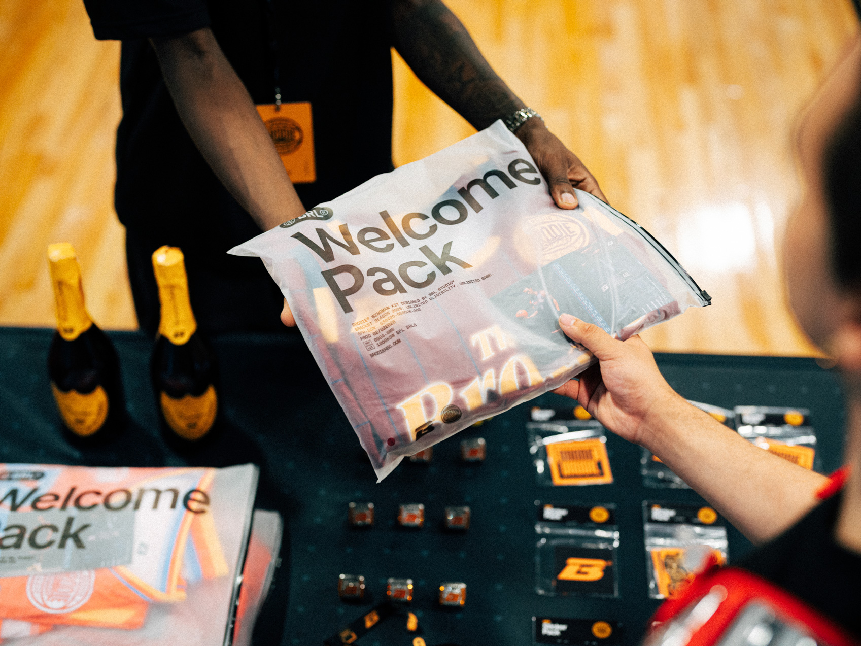
The Pack Is The Promise
What ten pieces say about what it means to be a Brodie Athlete™.

SEASONS
NEWSROOM
COMPANY
SEASONS
Summer ’26
Fall ’25
Winter ’26
Spring ’26
Every July, Las Vegas becomes the centre of the basketball universe as NBA franchises descend on the desert to audition the next generation. A collection of undrafted prospects looking for a lifeline, second-round picks trying to prove the doubters wrong, and two-way players one performance away from guaranteed money. Summer League is the proving ground. The court where athletes bet on themselves and GO ALL IN.
Brodie Summer lives in that energy and the Summer Big 6 collection translates it into a uniform collection that connects the basketball culture of Summer League to the iconic gaming heritage of vintage Las Vegas with a connective thread between the Strip and the teams that occupy Vegas each summer.
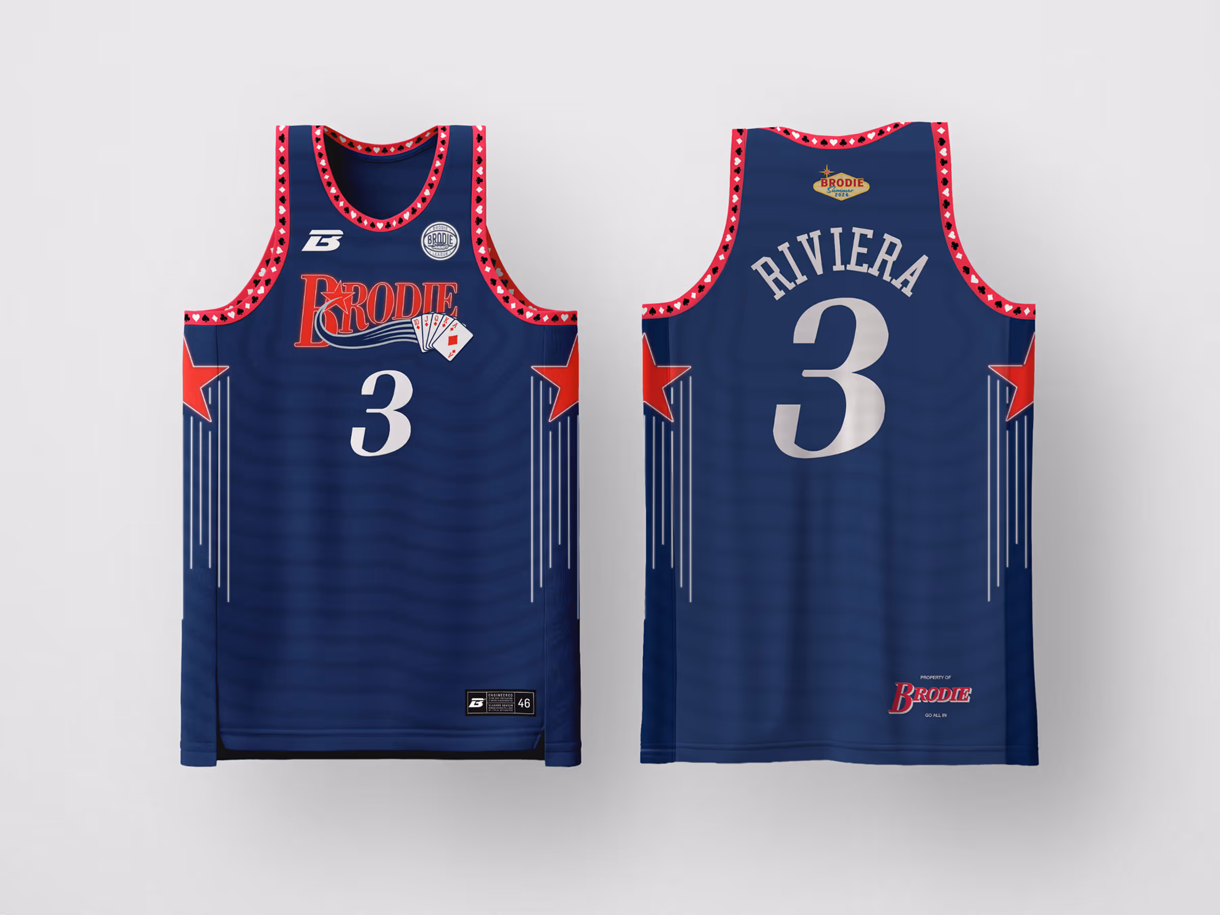
The Riviera Edition is the third reveal.
The Inspiration
Every Big 6 edition is built on a connected thread: a landmark casino from the golden age of the Strip and the NBA franchise whose Summer League aesthetic echoes that property's visual DNA. The Riviera Edition connects to Philadelphia — a franchise forged in resistance, defined by the refusal to take shortcuts, and powered by the understanding that what is built the right way does not break. A city that does not hand you anything, and celebrates you forever once you earn it.
The Riviera Hotel opened on April 20, 1955, by going where no one on the Strip had gone before: up. Critics and engineers had argued that the desert soil and underground water table of Las Vegas could not support a skyscraper. The Riviera proved every one of them wrong, opening as a nine-story tower — the first high-rise in Las Vegas history, the tallest building in the city until 1956, and the property that gave the Strip its first elevator. On opening night, entertainment director Maxine Lewis had paid Liberace a then-record $50,000 a week to headline the Clover Room. The naysayers predicted financial ruin. Liberace packed the showroom every night and the Riviera put that performance on live network television — the first Strip resort to ever do it — making the hotel famous across the country overnight. The Riviera's original neon sign spelled out the hotel's name across casino chips, a three-colour design that would go on to directly inspire the most iconic sign in Las Vegas history: Betty Willis's Welcome to Fabulous Las Vegas. The Riv's second sign from 1957 — an angular column topped with a star — was Willis's own acknowledged starting point. The hotel that dared to go vertical built the visual language the whole city would eventually inherit.
The Design
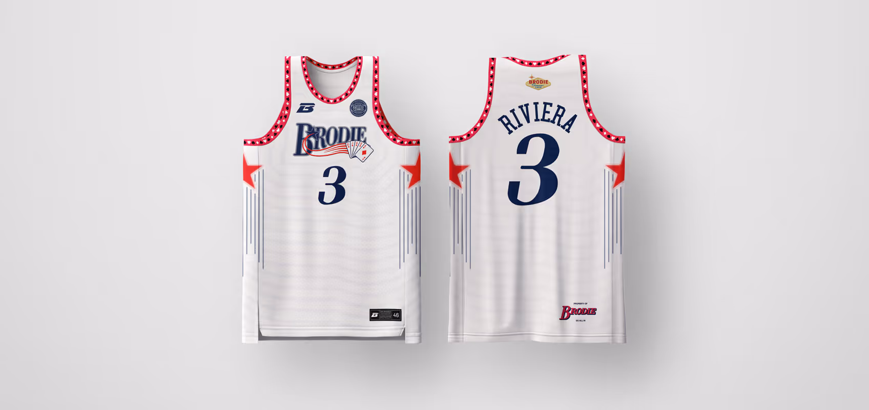
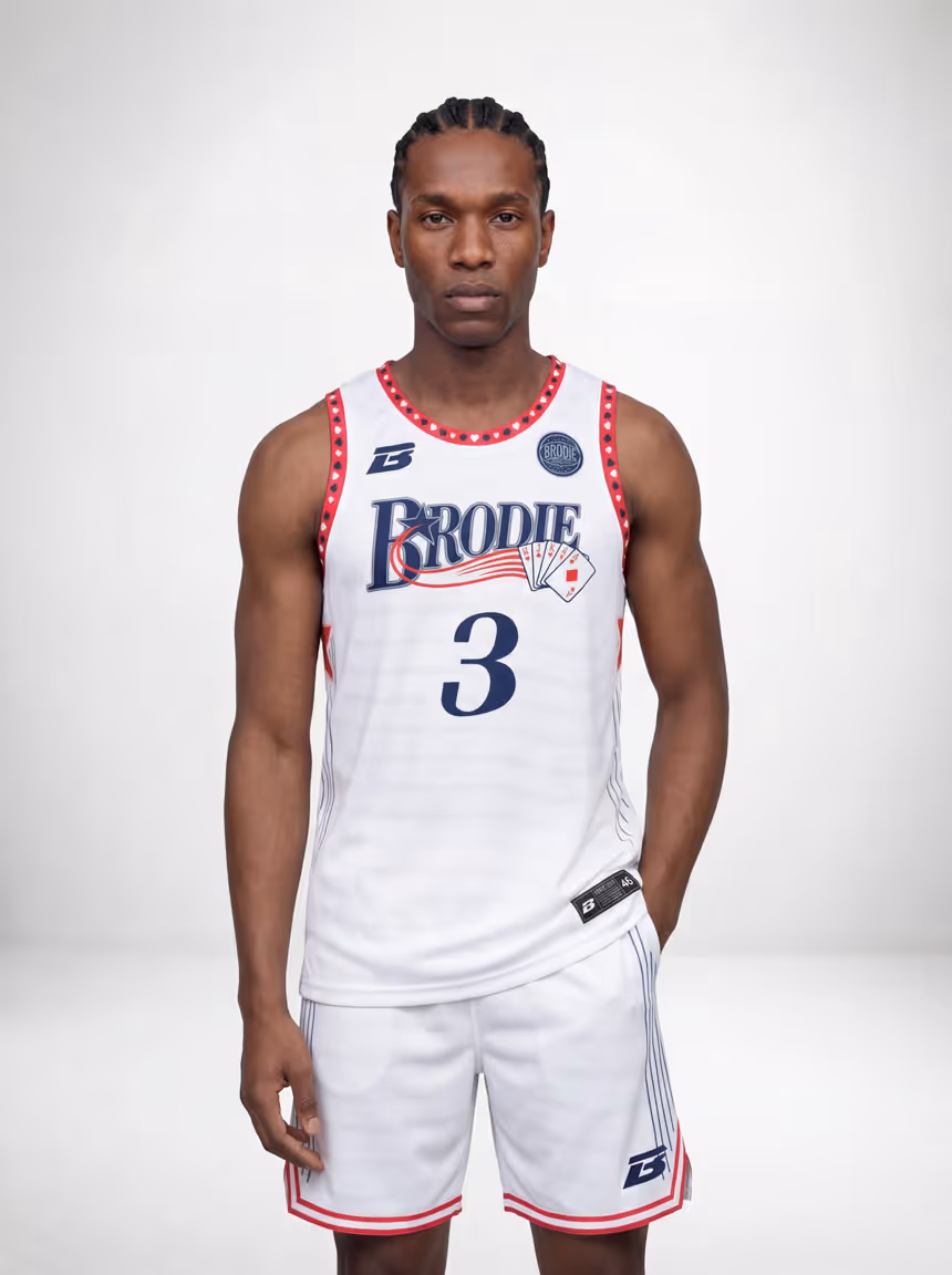
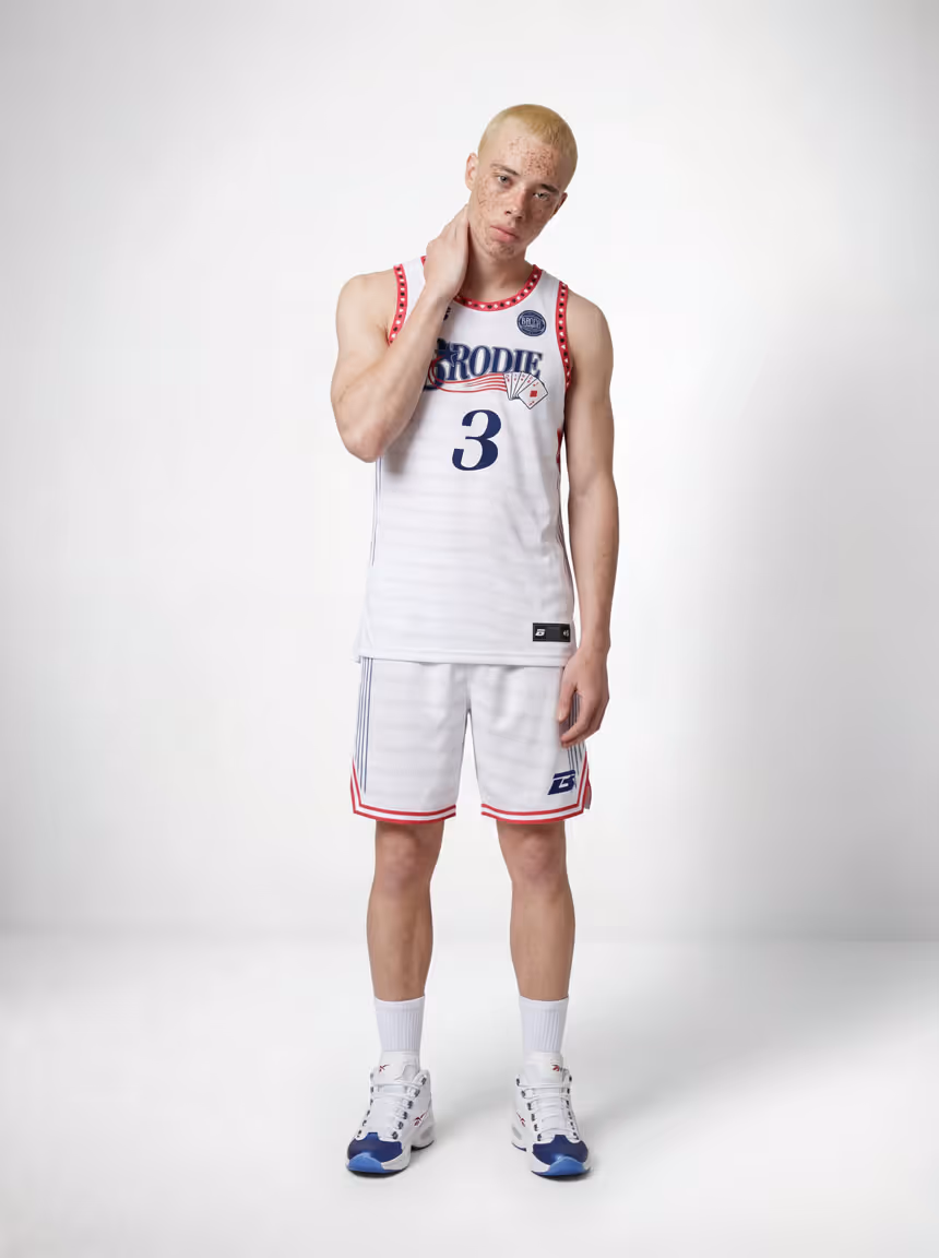
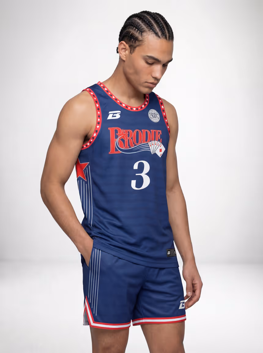
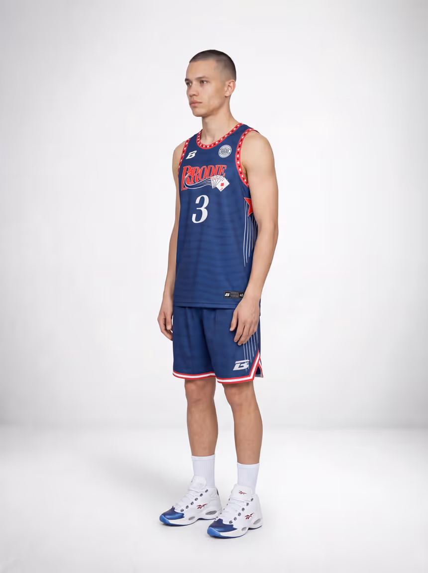
The star is the signature of this jersey, and it earns that position. A bold red yoke runs across the upper chest and shoulders on both the front and back, carrying a repeating band of large five-point stars in red and white. This is the Riviera's neon star motif translated directly into the uniform — the same star that sat atop the Riv's 1957 sign, the same language that fed into the Welcome to Las Vegas sign, the most recognized piece of neon in American history. The stars are not decorative. They are the design system's foundation, running the full width of the jersey at the point where the eye naturally lands first.
The Brodie wordmark on the front is embedded with a playing card fan graphic — a full hand of cards fanned out as part of the logo treatment, the casino floor meeting the court in a single mark. The number 3 sits centred below in navy. On the back, RIVIERA arches across the shoulders in the same navy, framed above by the same star yoke that runs the front.
The side panels carry thin vertical pinstripe lines in tonal grey running the full length of the body — subtle texture that gives the jersey depth without competing with the star trim above. The pinstripes reference the horizontal banded windows of the Riviera's original mid-century modern tower, the sleek lines of a building that looked nothing like the low-slung properties surrounding it when it opened.
The Brodie wordmark appears at the lower back chest. Co-branding badge at the chest.
The Details
Each of the Big 6 editions carries its own tail tag mantra: a custom motivation paired with original artwork that pays homage to the Strip and the passionate players who put it all on the line for the game. The Riviera Edition tells its athlete exactly who they are the moment they put it on: Go All In.
Every detail is custom. Custom patterns, templates, from digital design to fabrication and finishings. This is not a blank pulled from a digital catalogue. This is a uniform designed from concept to finished product with the same conviction our athletes have to our league and brand.
Flip the Switch
For the first time in Brodie history, every squad gets the opportunity to Go All In with a home and away jersey. That is a franchise-level offering. Professional teams have home and away. College programs have home and away. Now Brodie athletes do too. The call to action for entire squads is "Flip The Switch."
The Big 6 collection brings this to life through a creative system of litemode and darkmode.
Litemode is the home design. Clean white ground. The red star yoke blazing across the upper chest. BRODIE with the card fan in red and navy. Number 3 in navy. The tonal pinstripes running the side panels. This is the Riviera in full Nevada daylight — the white tower rising above everything around it on the Strip, the star at the top of the sign catching the sun before the neon even needs to switch on. The Riv proved the doubters wrong in broad daylight. Litemode carries that same energy.
Darkmode is the away design. The same star yoke, the same card fan wordmark, the same pinstripe side panels, the same typographic system — but the ground drops to deep navy blue. The red stars hold. The white type holds. On navy, the stars do what the Riviera's neon did every night along the Strip: they stop being a design element and start being a signal. The angular star column that inspired the Welcome to Las Vegas sign looked exactly like this against the Nevada dark — red and white blazing off a deep ground, announcing something worth stopping for.
Home court, you are the tower — white ground, red stars across the top, the first thing on the skyline that makes people look up. Away, you are the signal — deep navy, stars lit, the same mark that told a generation of travellers they had arrived somewhere that was going to change them. Two jerseys. One squad. The switch is yours to flip.
The Commitment
The Big 6 collection exists because we refused to accept the standard this industry set. Other leagues offer off-the-shelf blanks with a screen-printed logo and call it a uniform. We chose a different path — one that demands more time, more craft, and more conviction, but delivers something an athlete has never held in their hands from a recreational league.
The Riviera Edition carries the energy of the property that looked at a low-slung Strip and decided to go vertical when everyone said the ground wouldn't hold it. The Riv did not ask permission to be first. It built the thing, opened the doors, put Liberace on live national television, and let the result answer the doubters. Every athlete who pulls on this jersey carries that same answer — not a rebuttal, not an argument. A performance. Go all in and let it speak.
This is where athletes bet on themselves. Where every player goes all-in on their number. The Riviera Edition is the next card on the table.
Go All In.