The Pack Is The Promise
What ten pieces say about what it means to be a Brodie Athlete™.

SEASONS
NEWSROOM
COMPANY
SEASONS
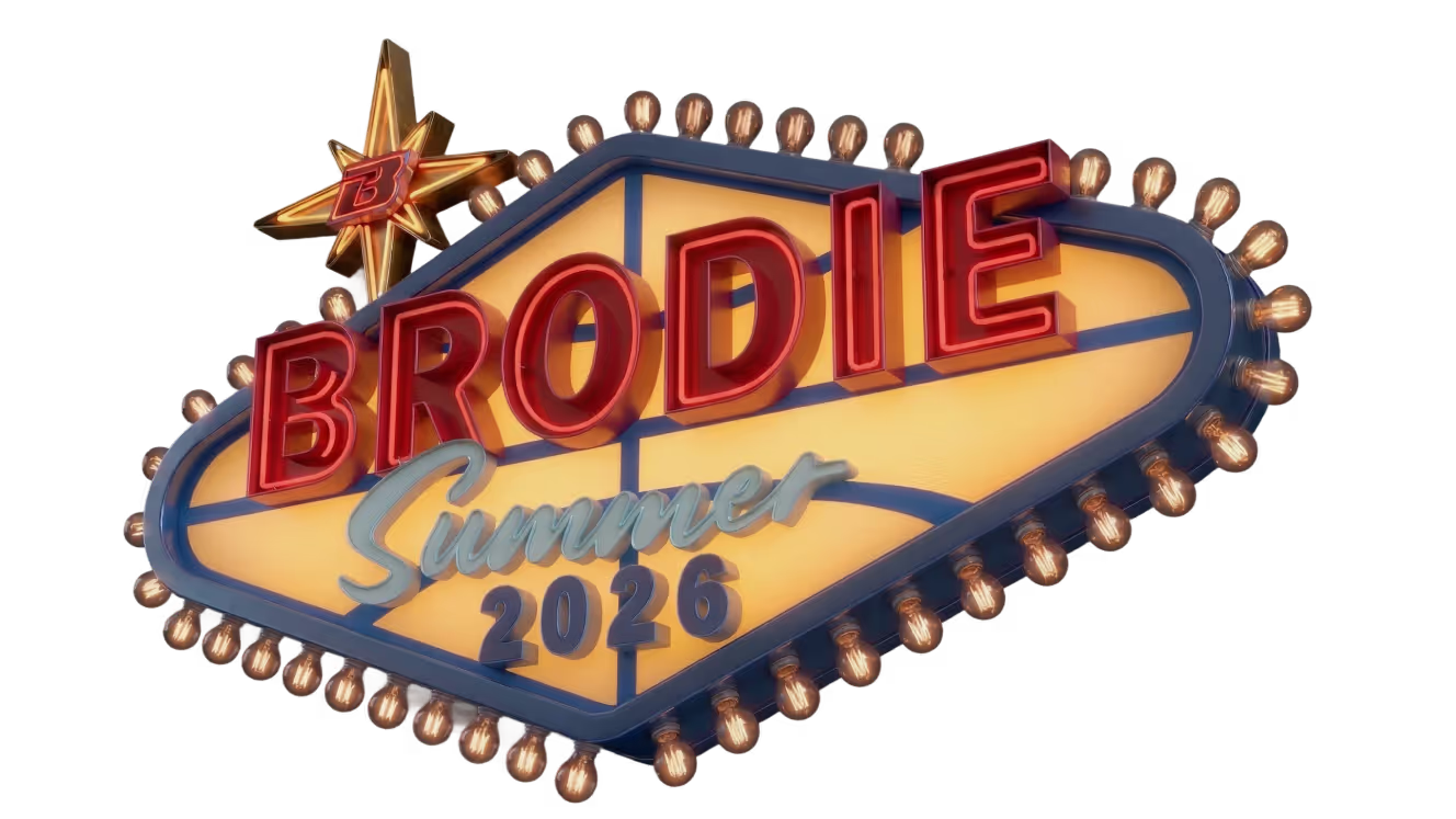
Summer ’26
Fall ’25
Winter ’26
Spring ’26


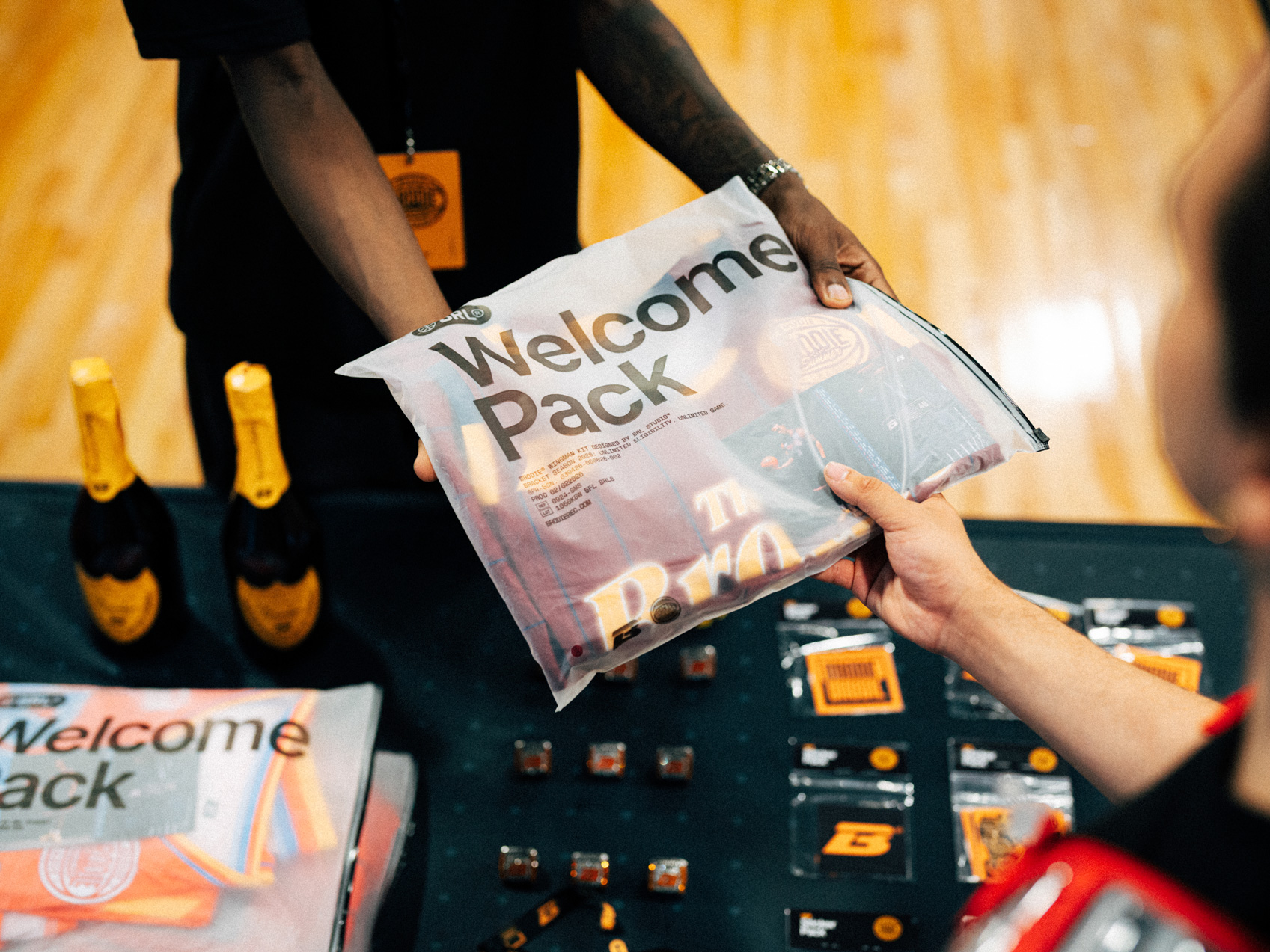
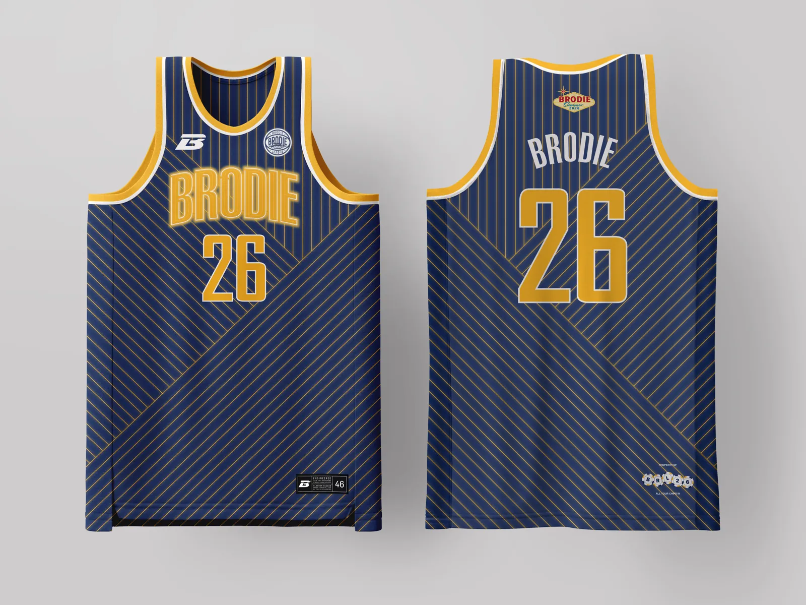
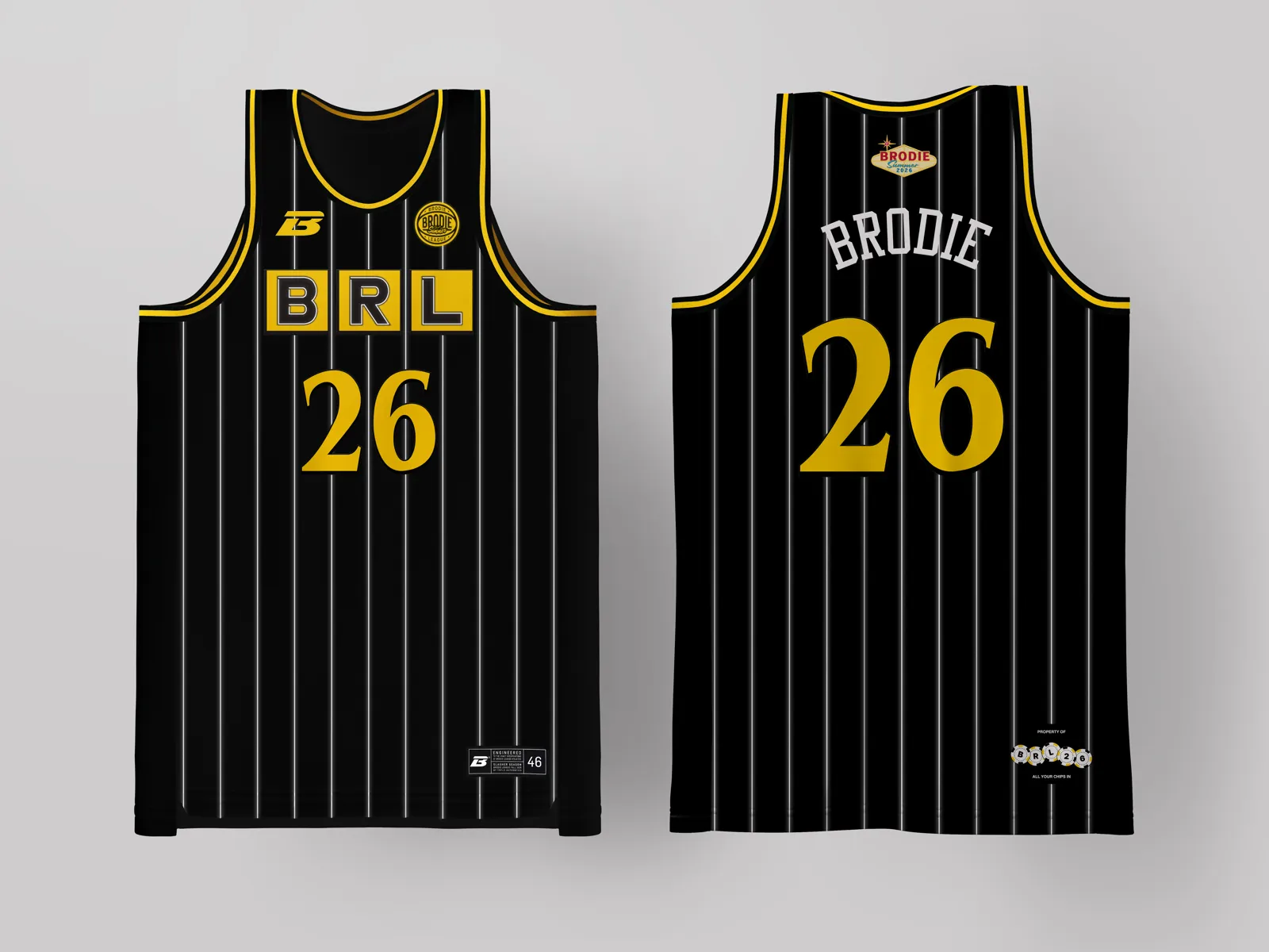
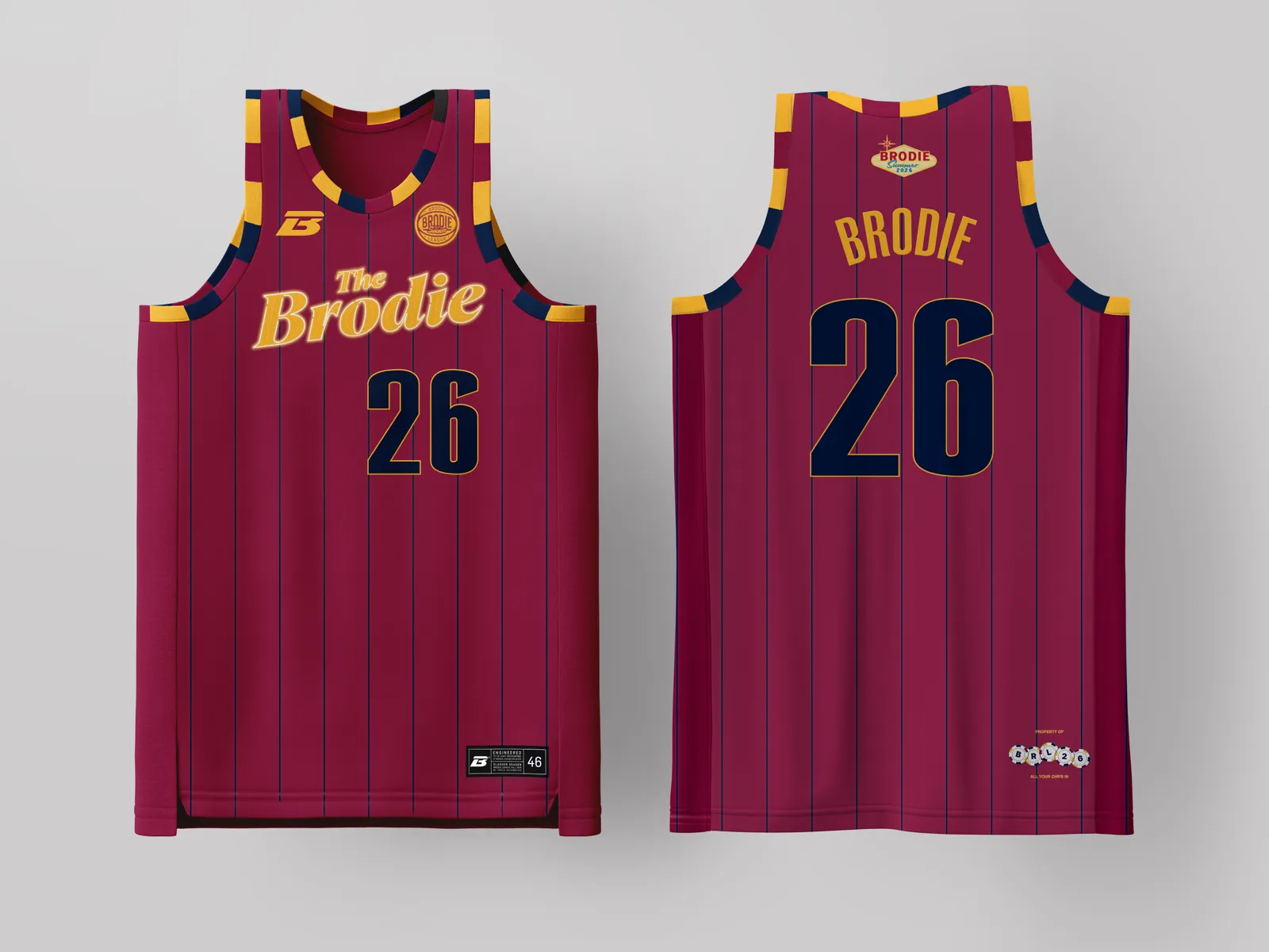
Welcome to Brodie Summer
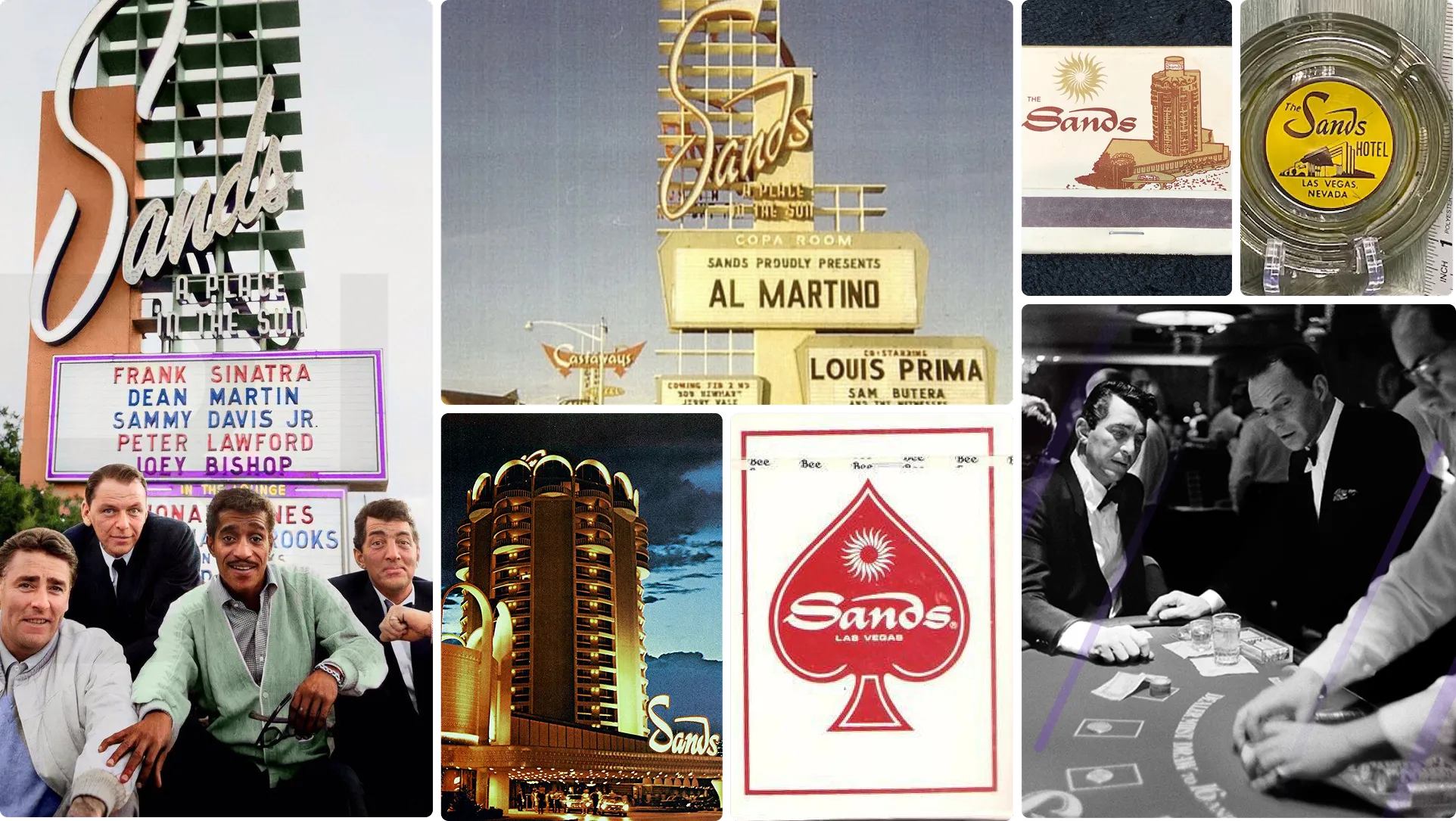
Every summer, the basketball world turns to Las Vegas for Summer League. The moment athletes bet on themselves, go all in on their number, and put everything on the table. 'Brodie Summer' taps into those stakes and adds a spotlight glow and electric energy inspired by the golden age of the Strip, where scale, spectacle, and illumination defined a legendary landscape.

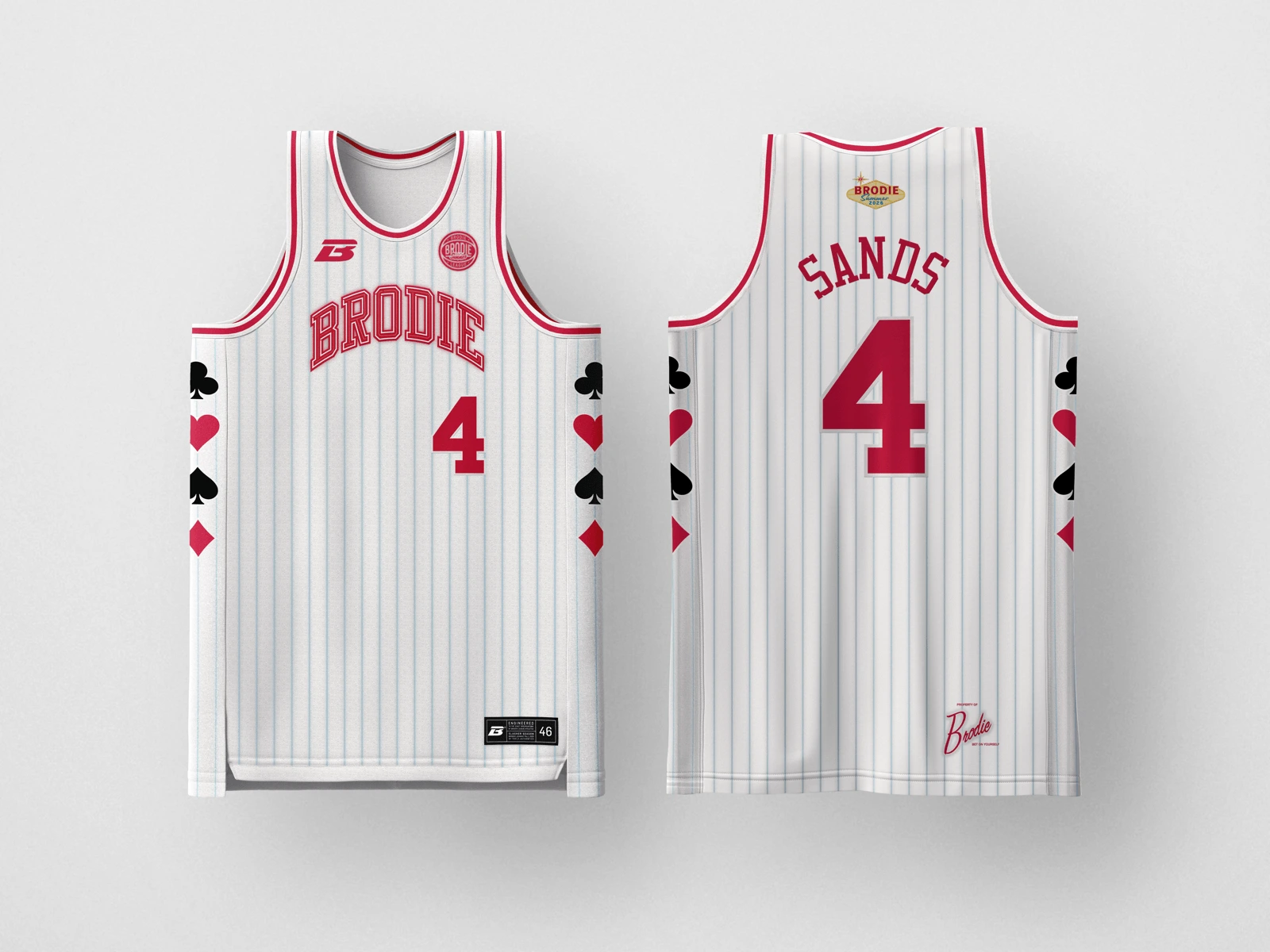
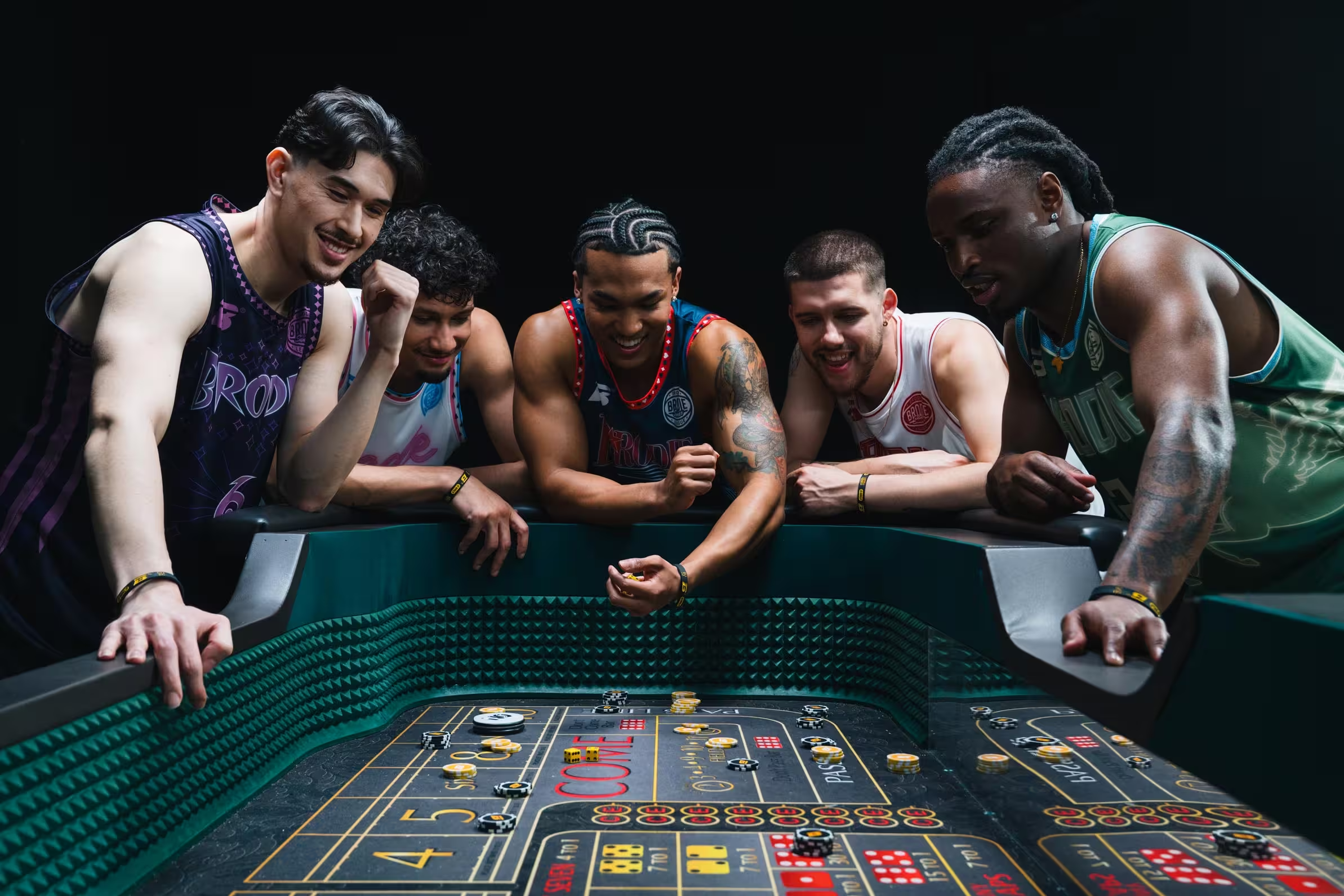
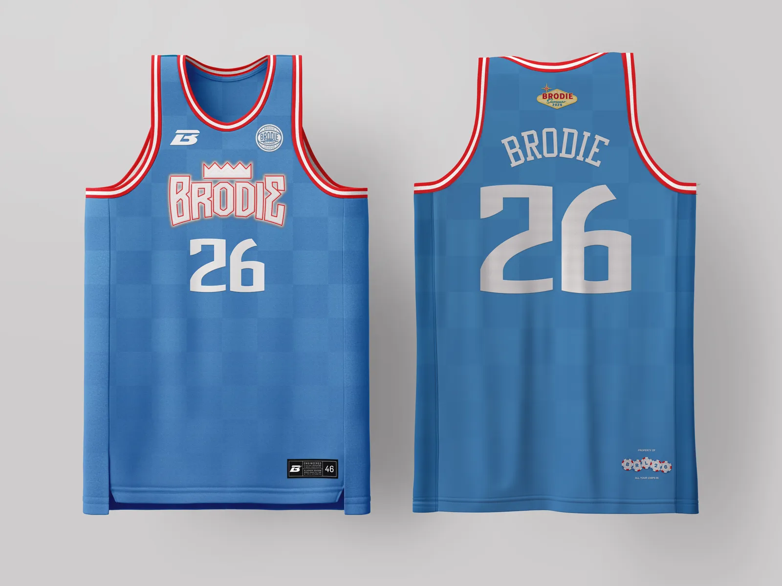
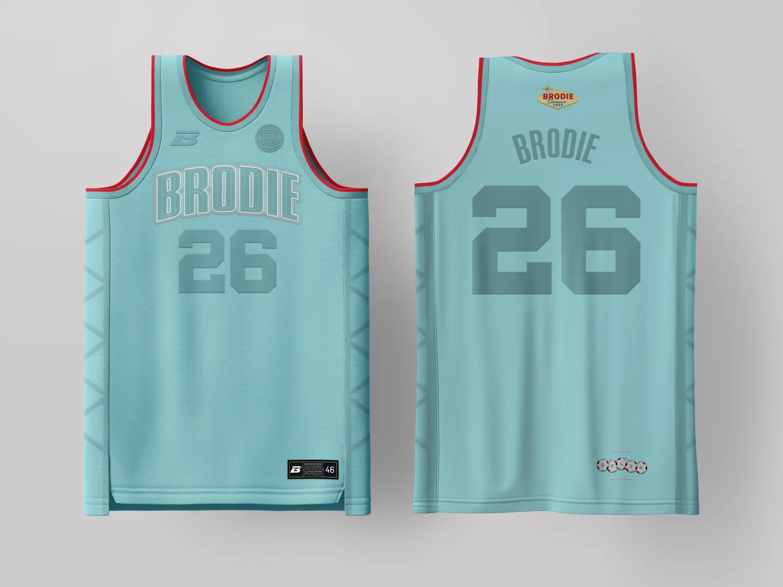
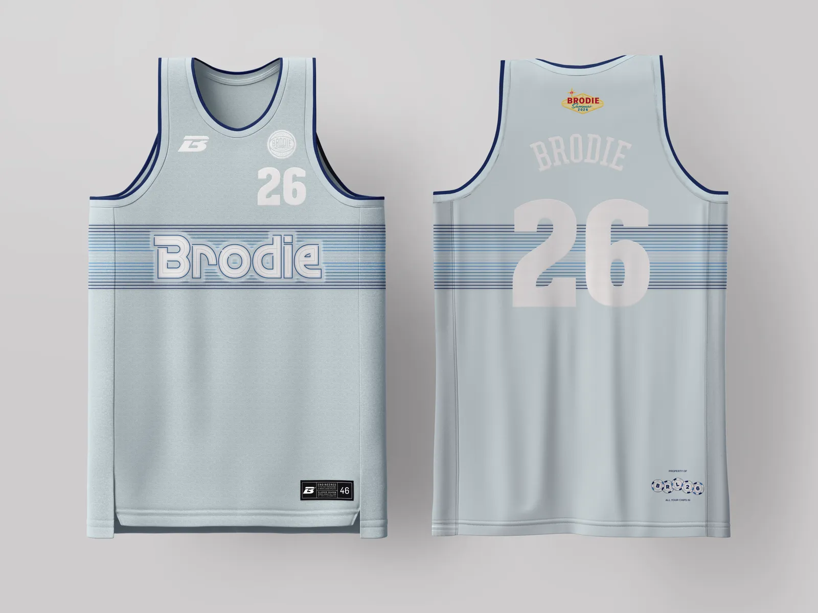
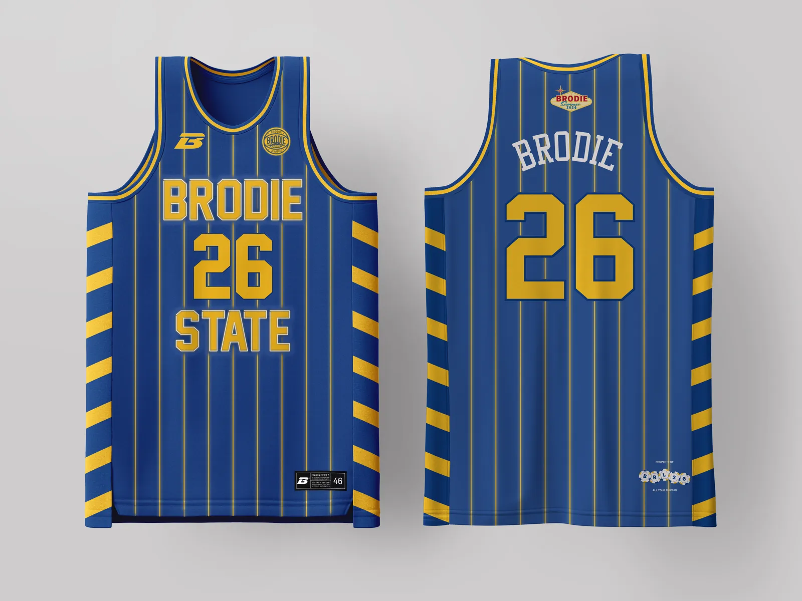
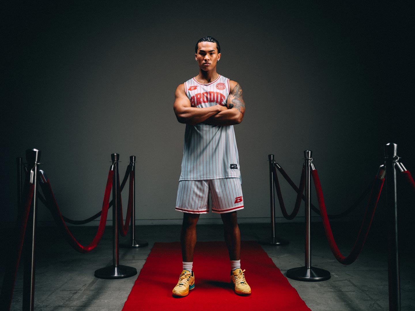
Rat Pack sophistication meets Chi-Town cool. Powder blue pinstripes, red iconic arched lettering, and card suit detailing down the panels evoke the elegant exclusivity of the Sands’ Copa Room, tailored for the city that invented the two-piece.
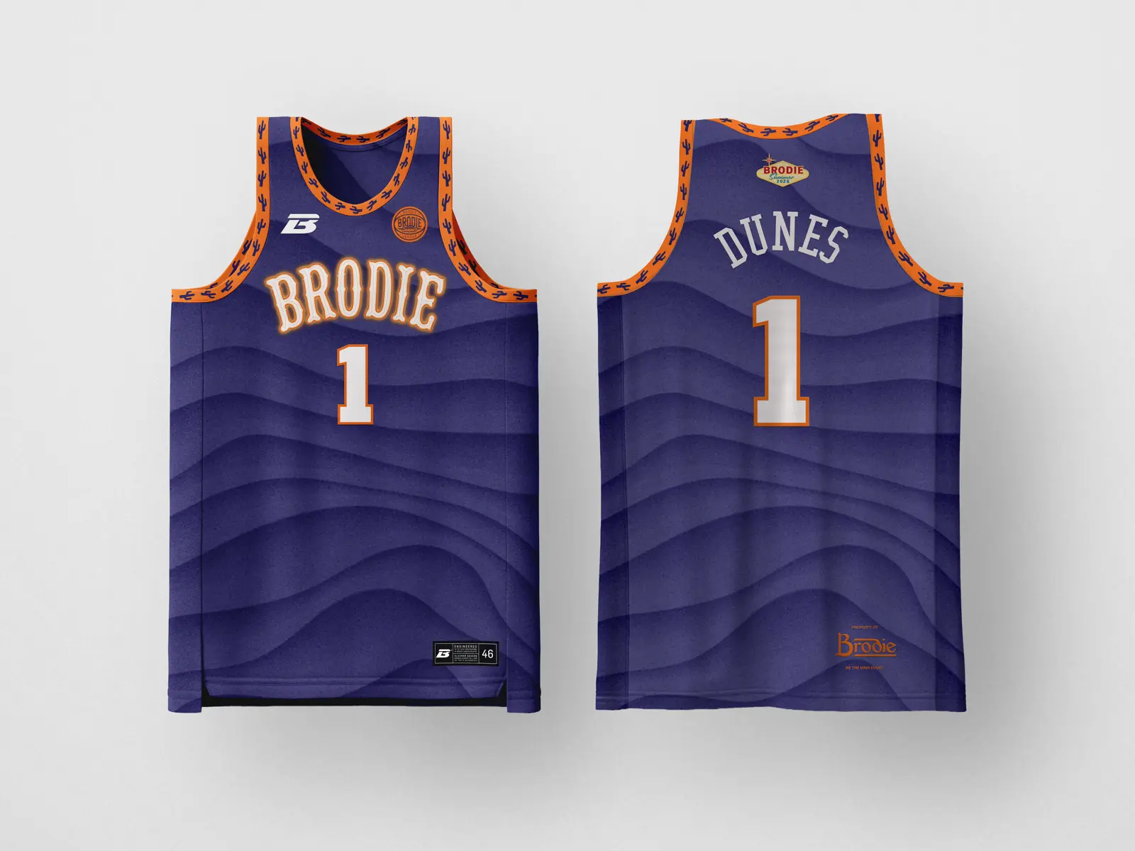
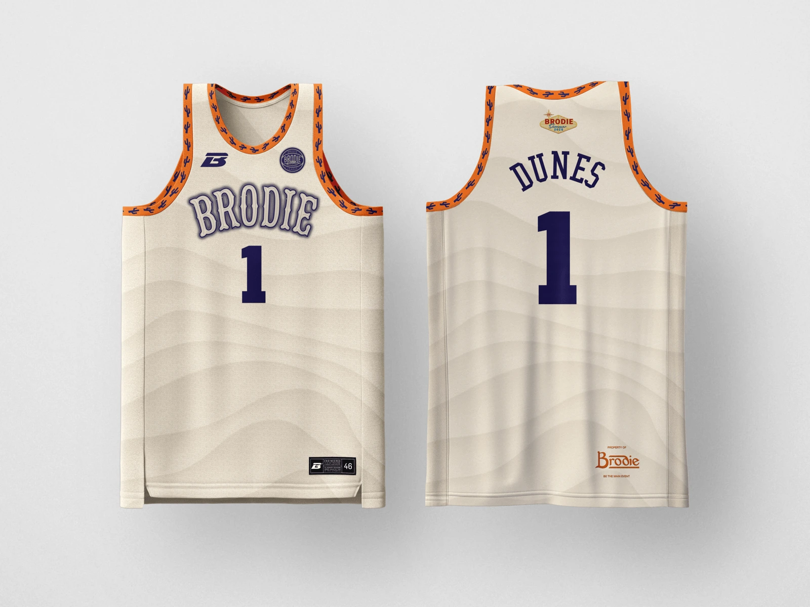
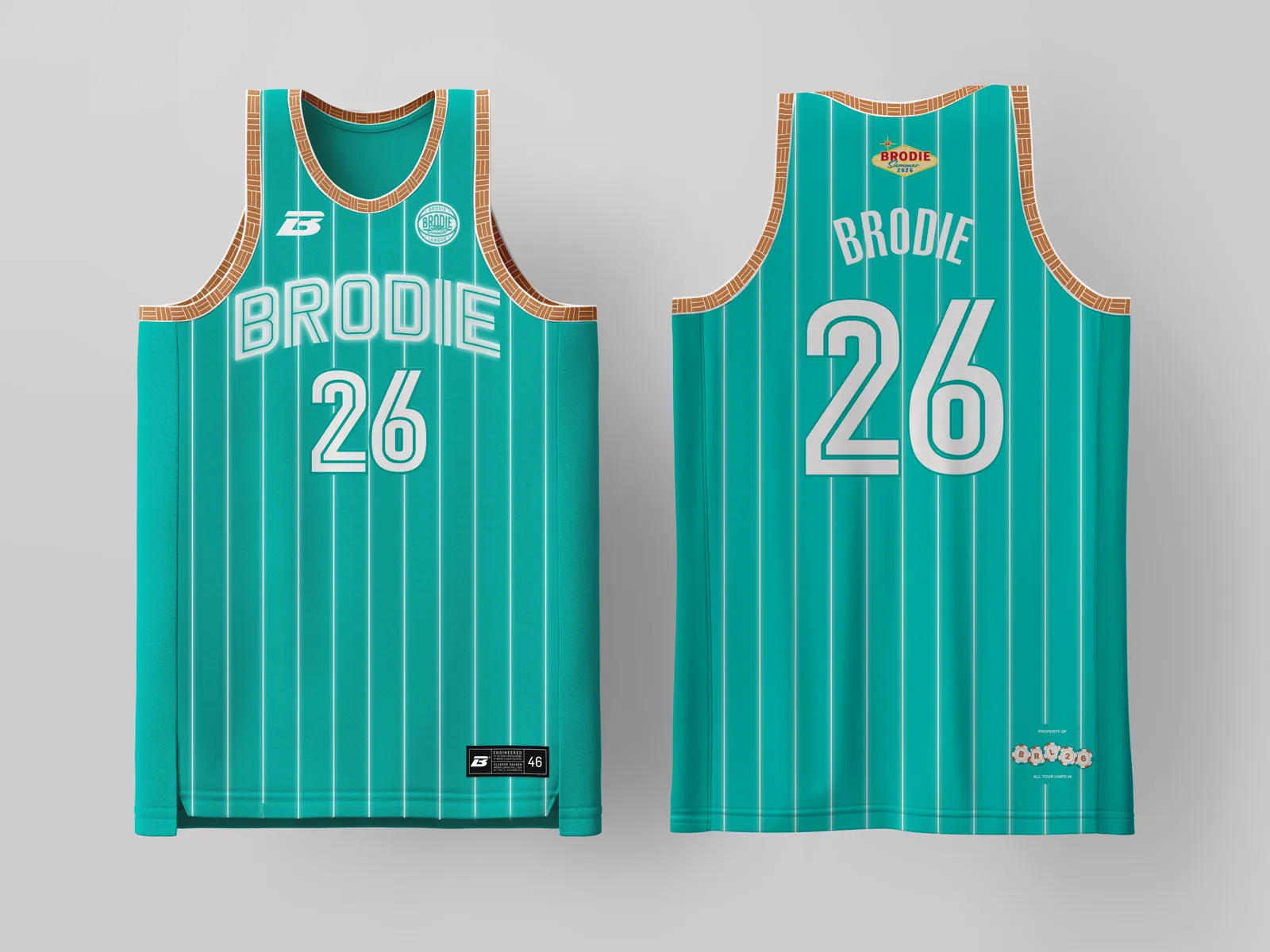
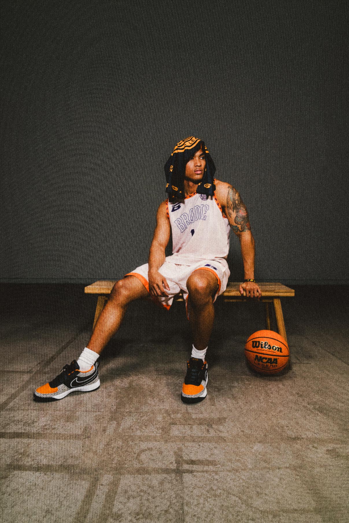
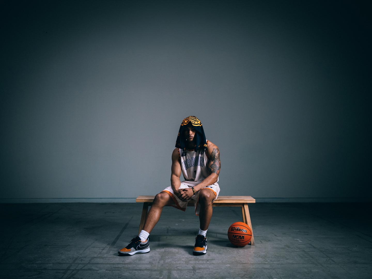
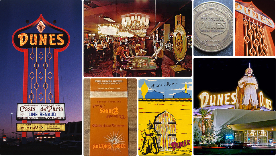
Desert mythology in wave form. Shifting sand dunes with burnt orange trim and saguaro cactus detailing that channels the Dunes’ Arabian Nights escapism under a Sonoran sky. Sun-bleached by day. Moonlit ridgelines by night. No ocean in sight but these waves rock the valley.

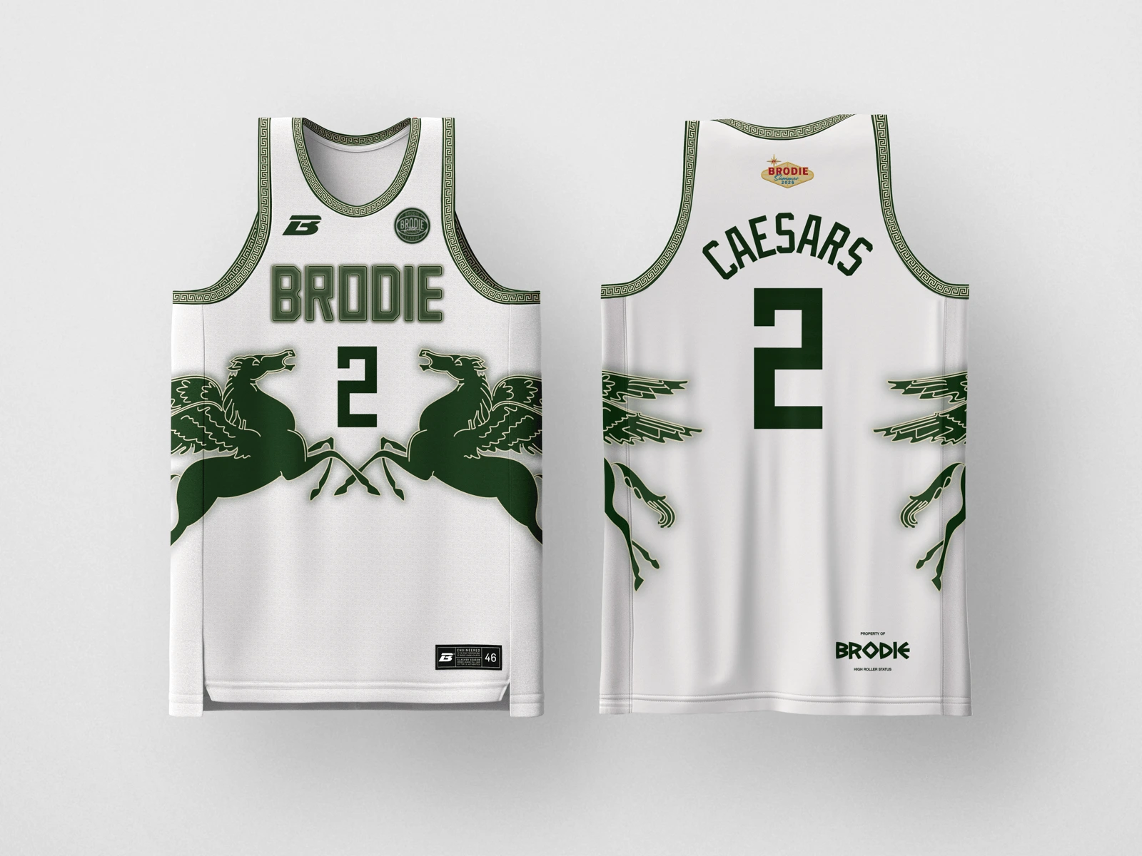
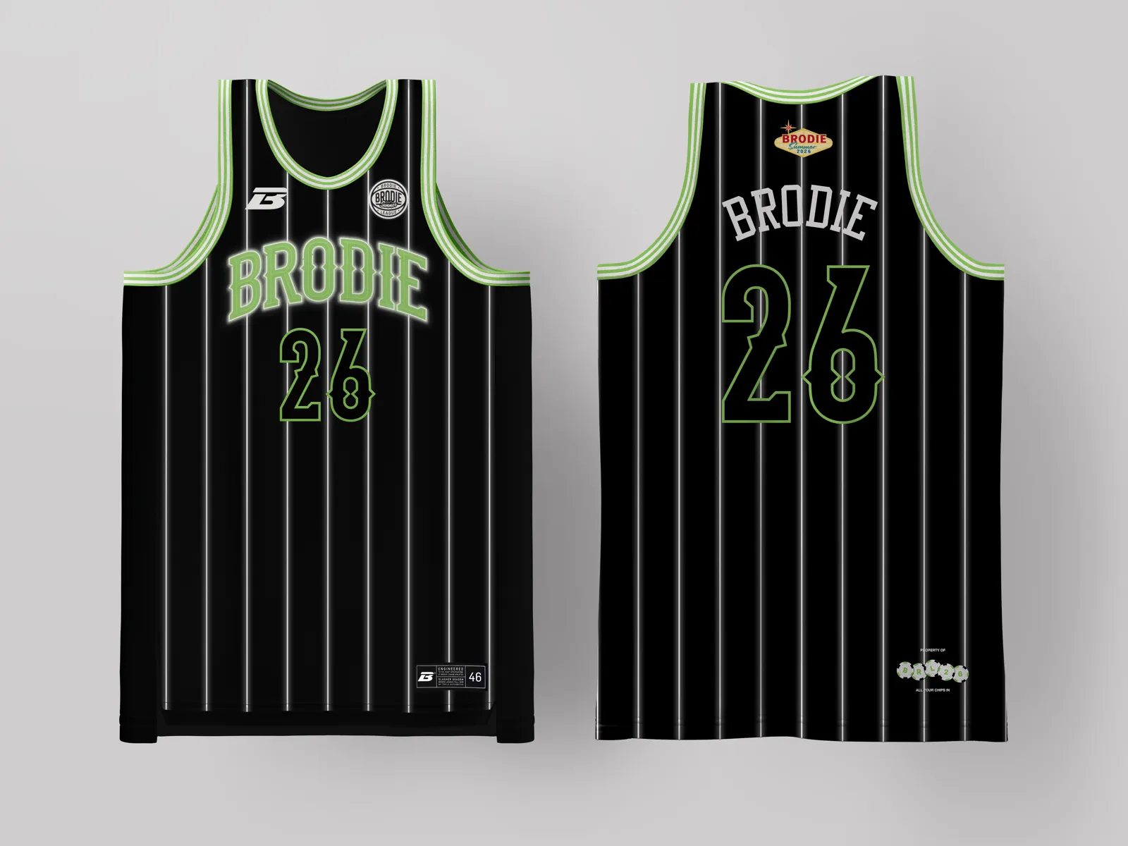
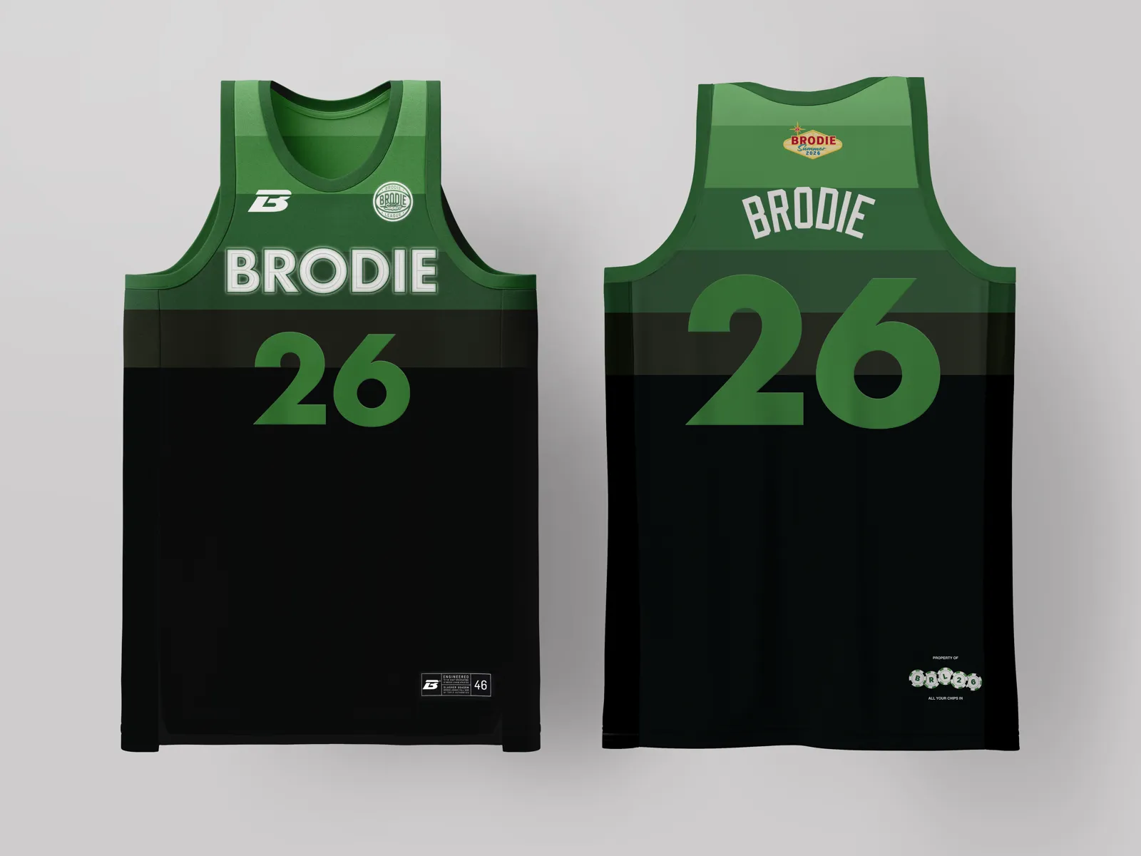
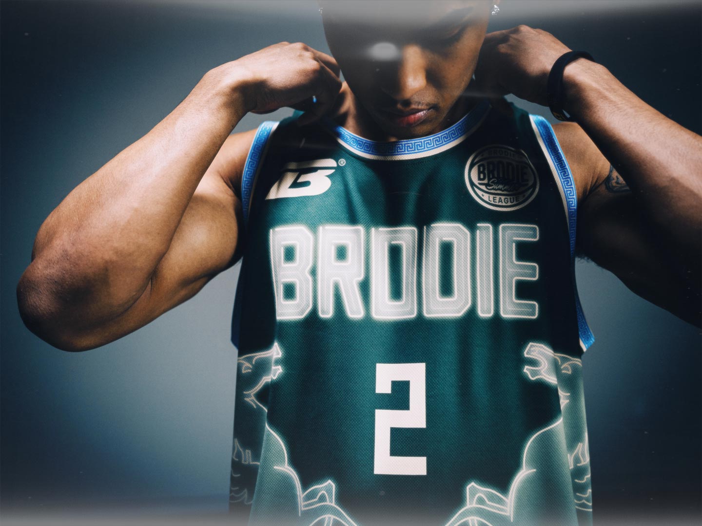
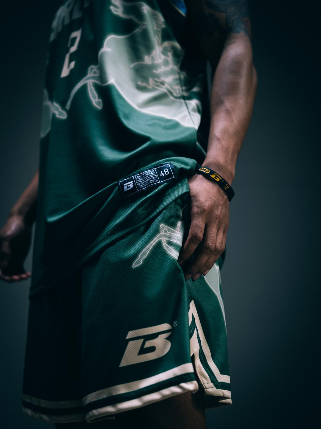
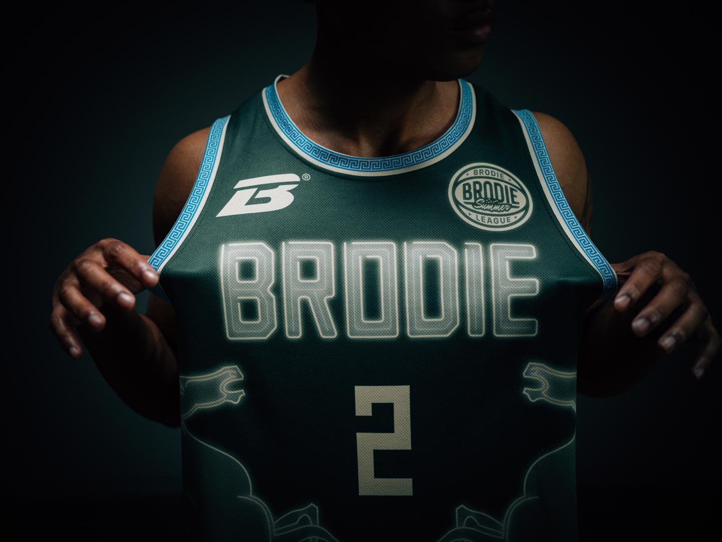
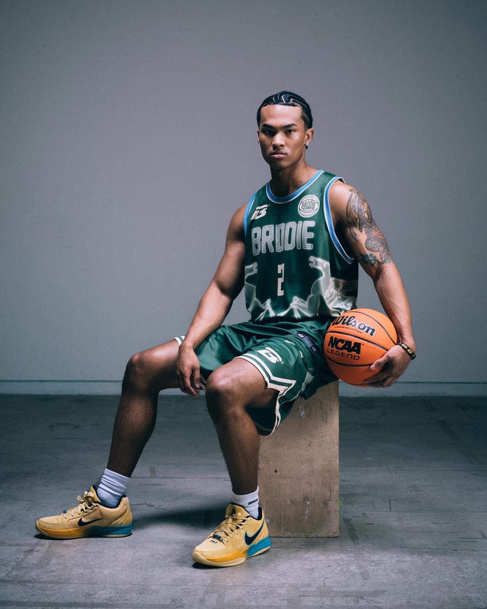
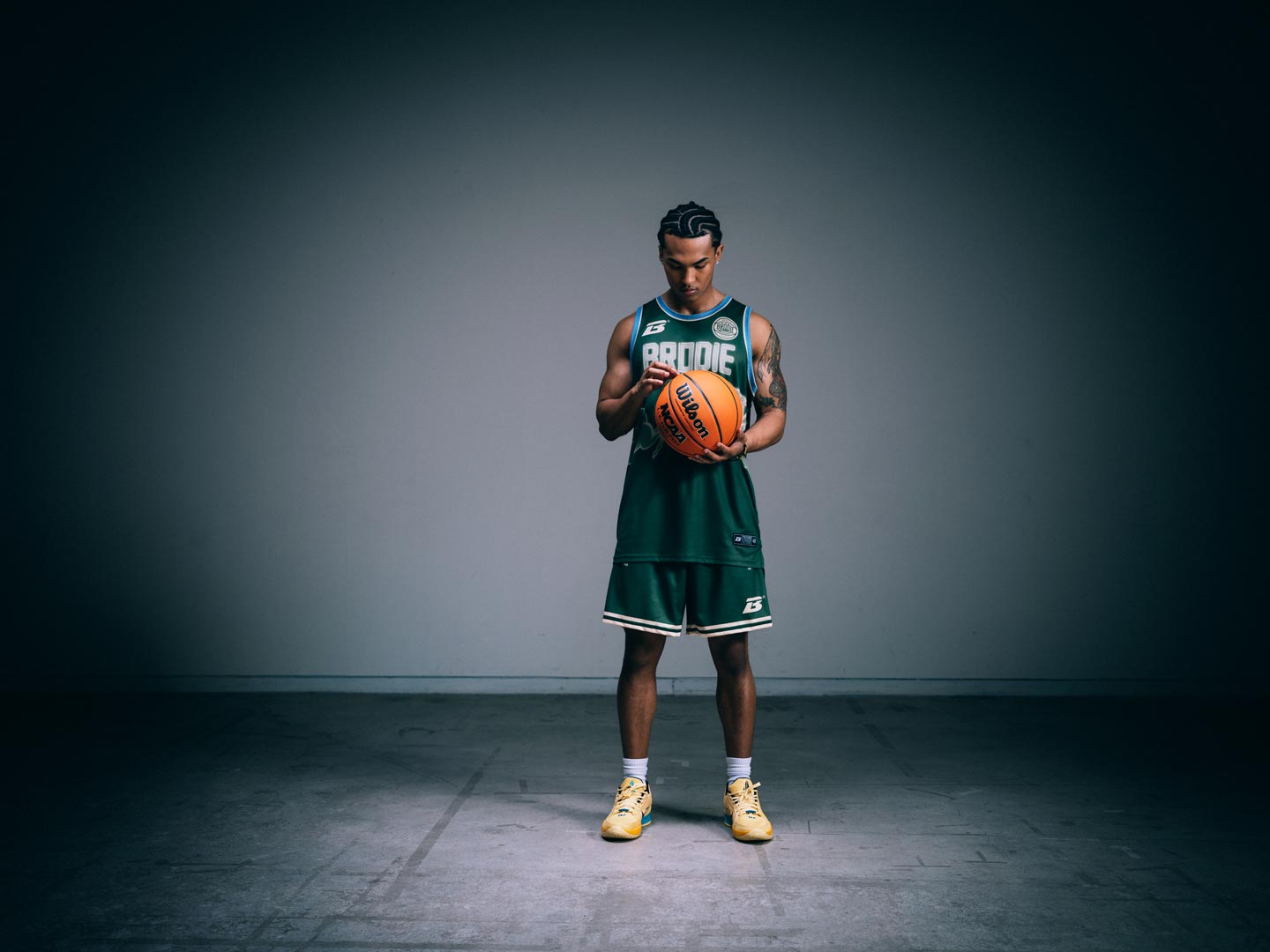
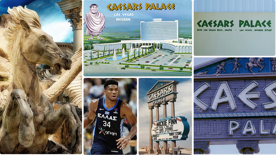
Imperial grandeur for the Cream City. Forest green with neon-lit Pegasus wings and Greek key trim pulled straight from the palace floor, a bold pattern and claim on the throne. The kind of jersey that should come with a laurel wreath.
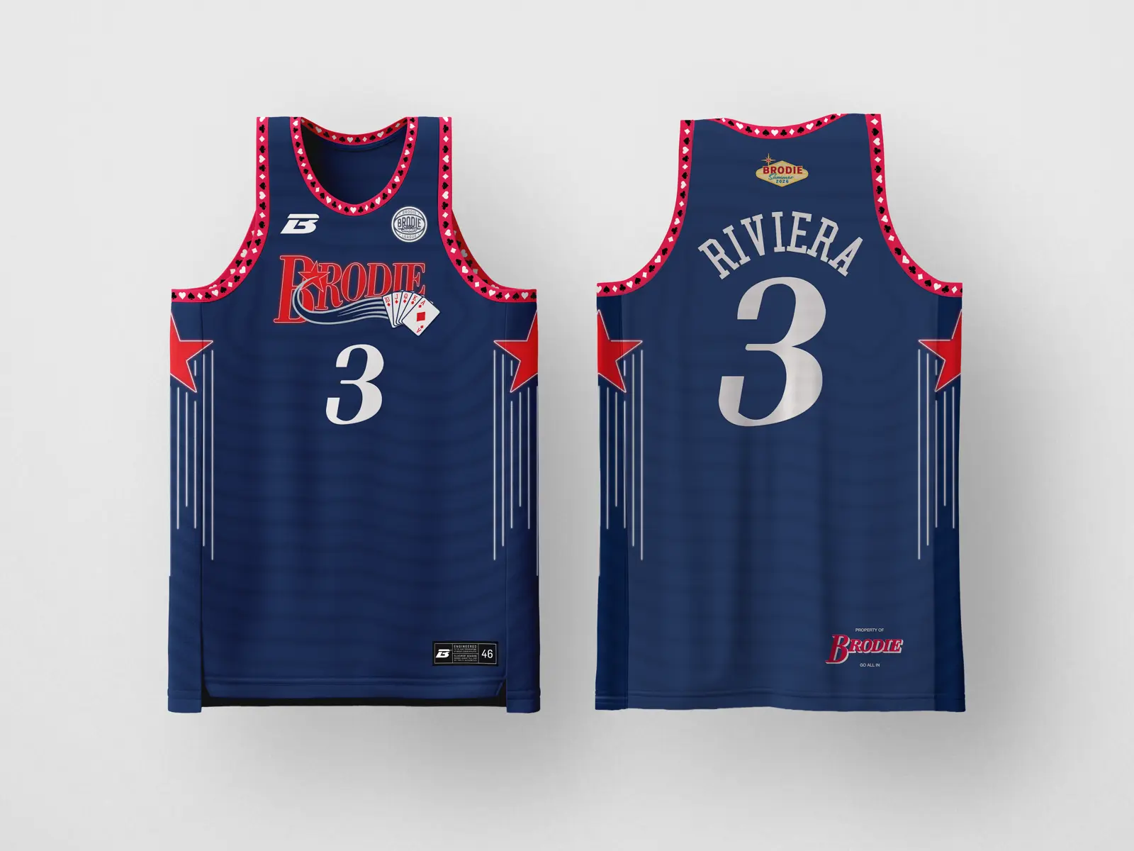
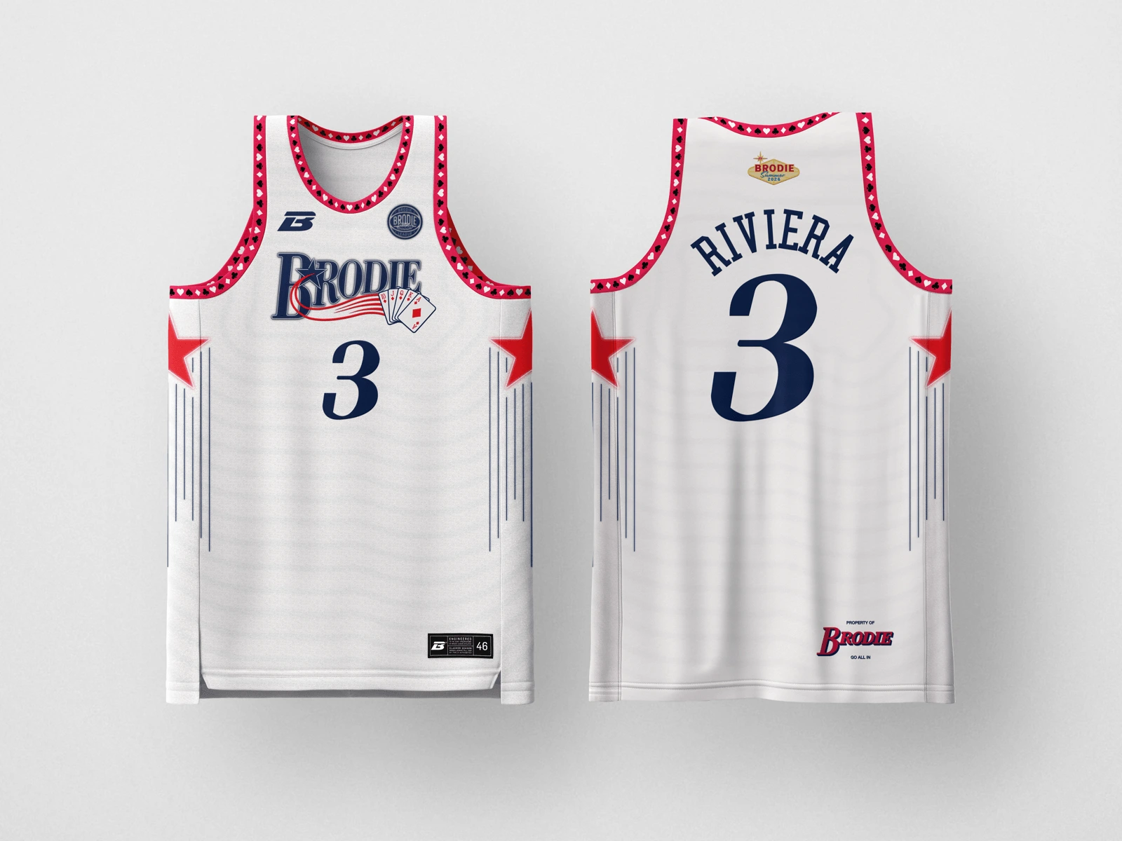
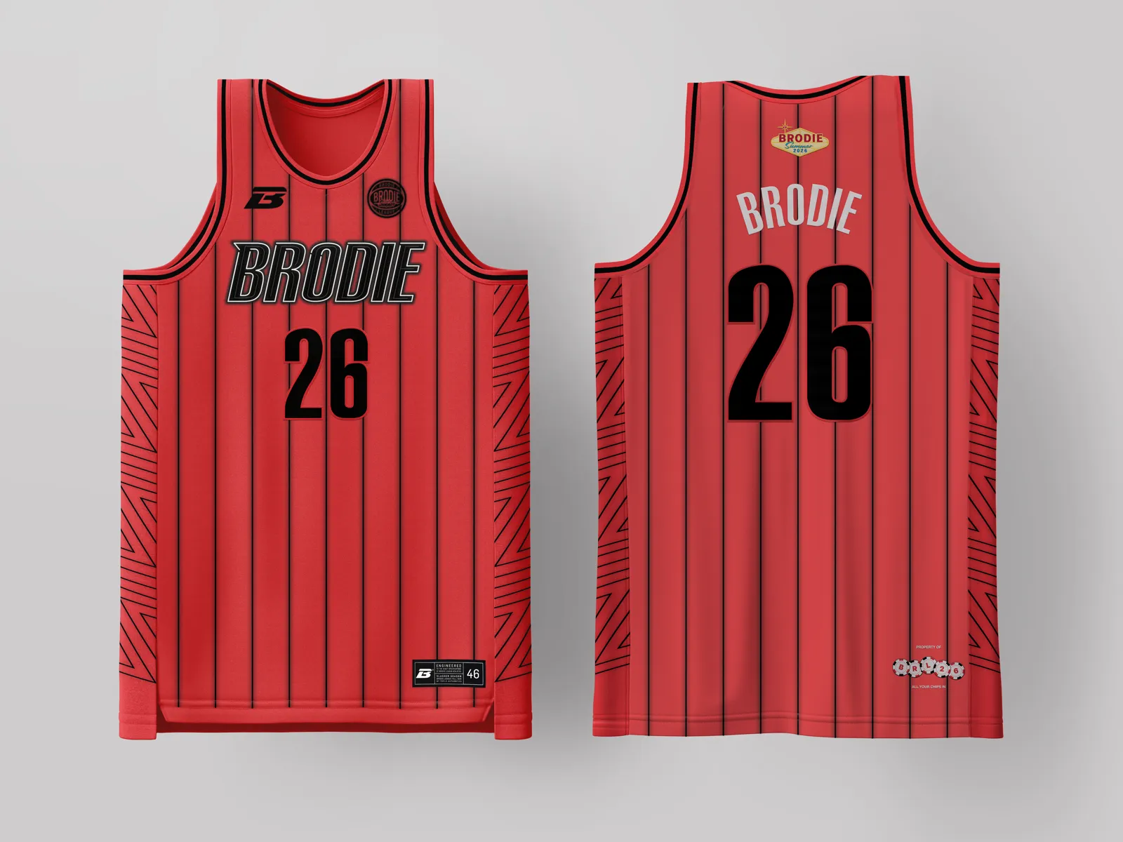
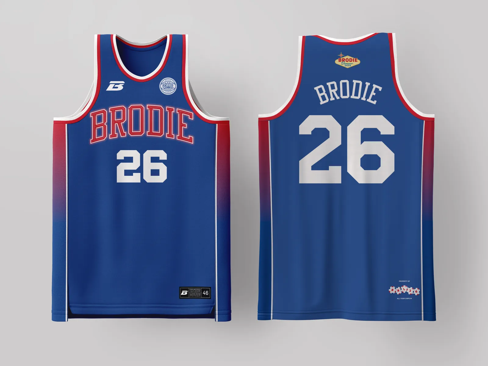
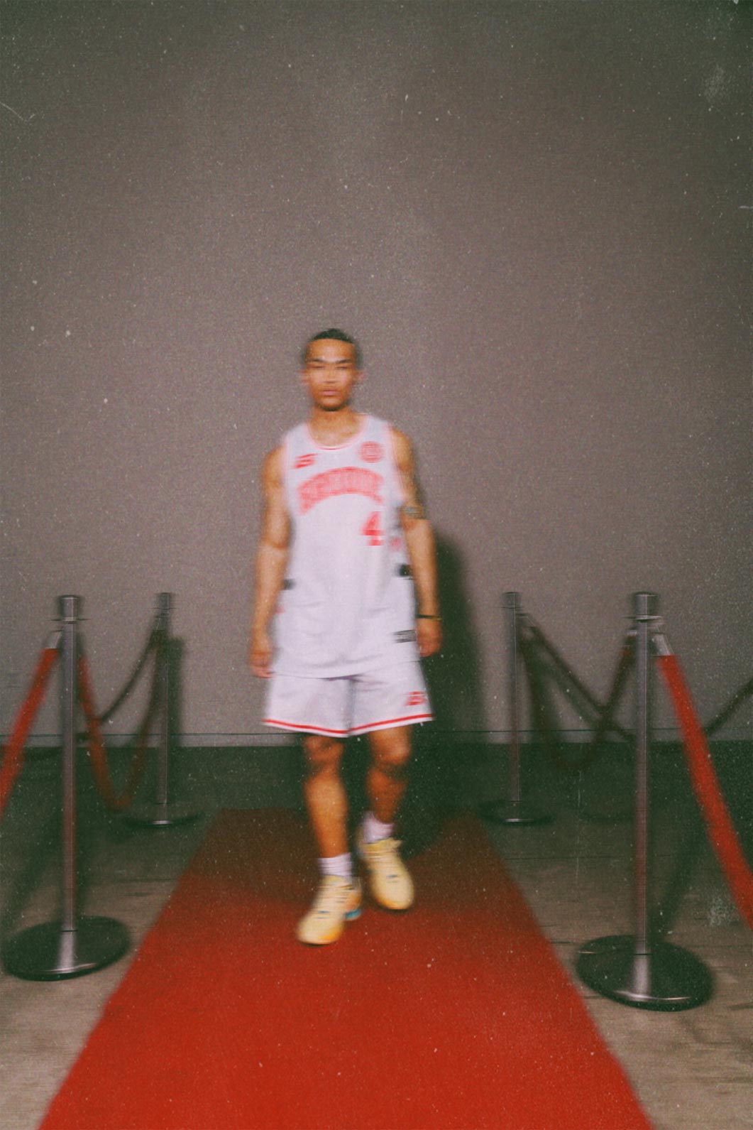
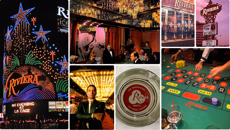
Old-school neon brilliance in Philly navy with throwback red star burst, and a resplendent royal flush built into the wordmark, and a card suit collar that carries the swagger of a casino that never played it safe. The table’s hot and you’re not leaving. Practice? Nah, this kit is game-ready.
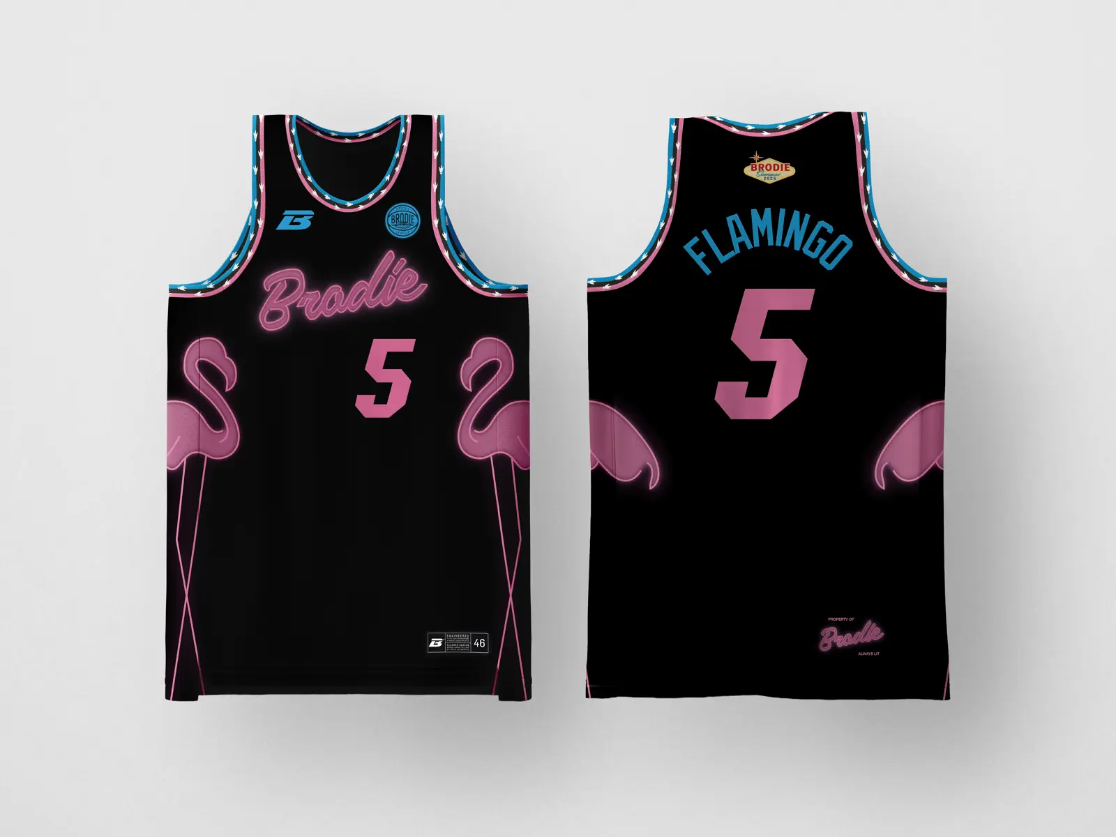
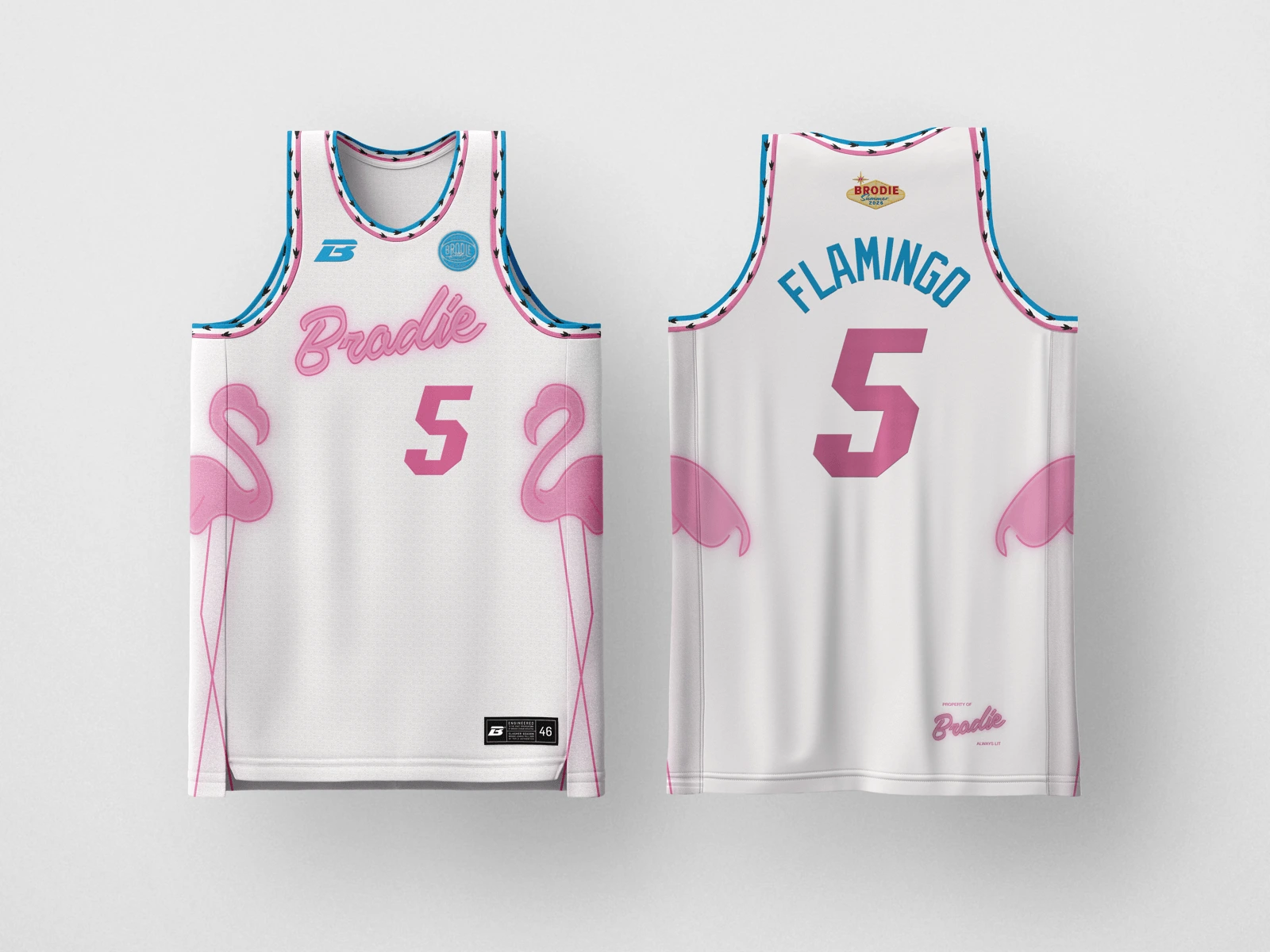
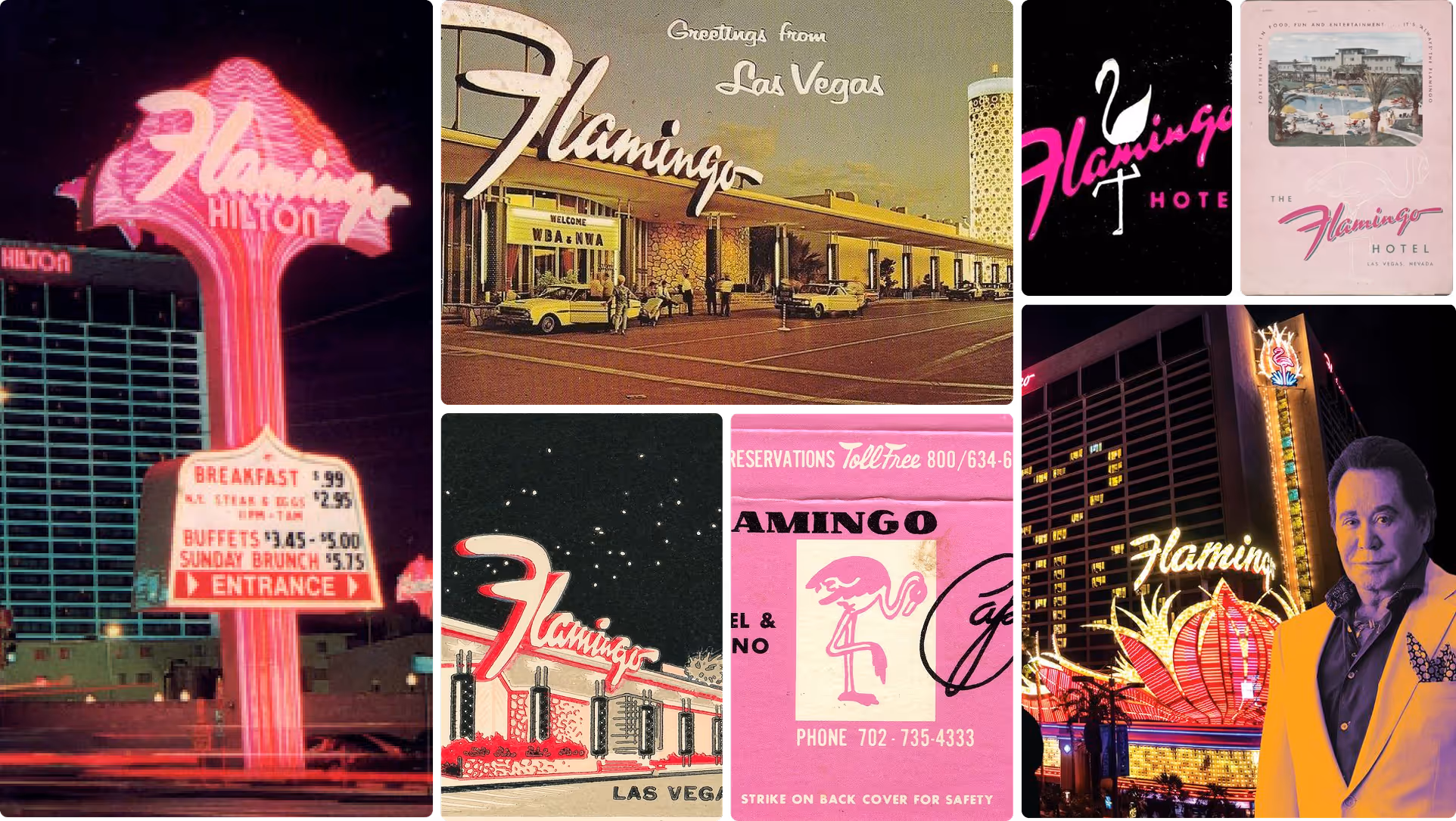
Bugsy’s neon fever dream brought to the 305. Black base with glowing pink flamingos and script lettering that bleeds light like a sign that just flickered on at 2 AM on Collins Avenue. This is the jersey that walks in, and the room already knows.
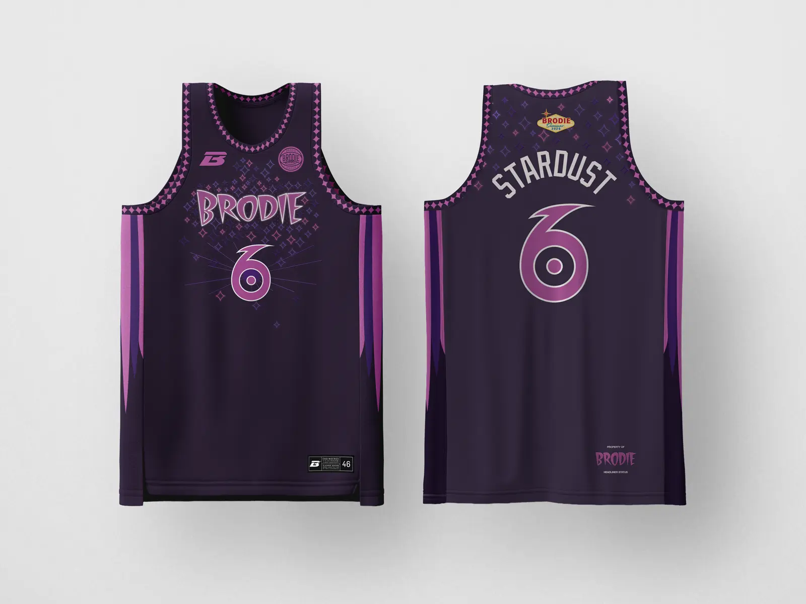
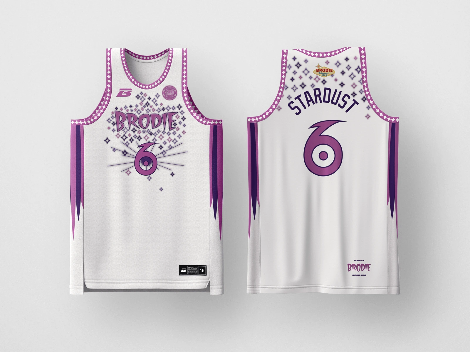
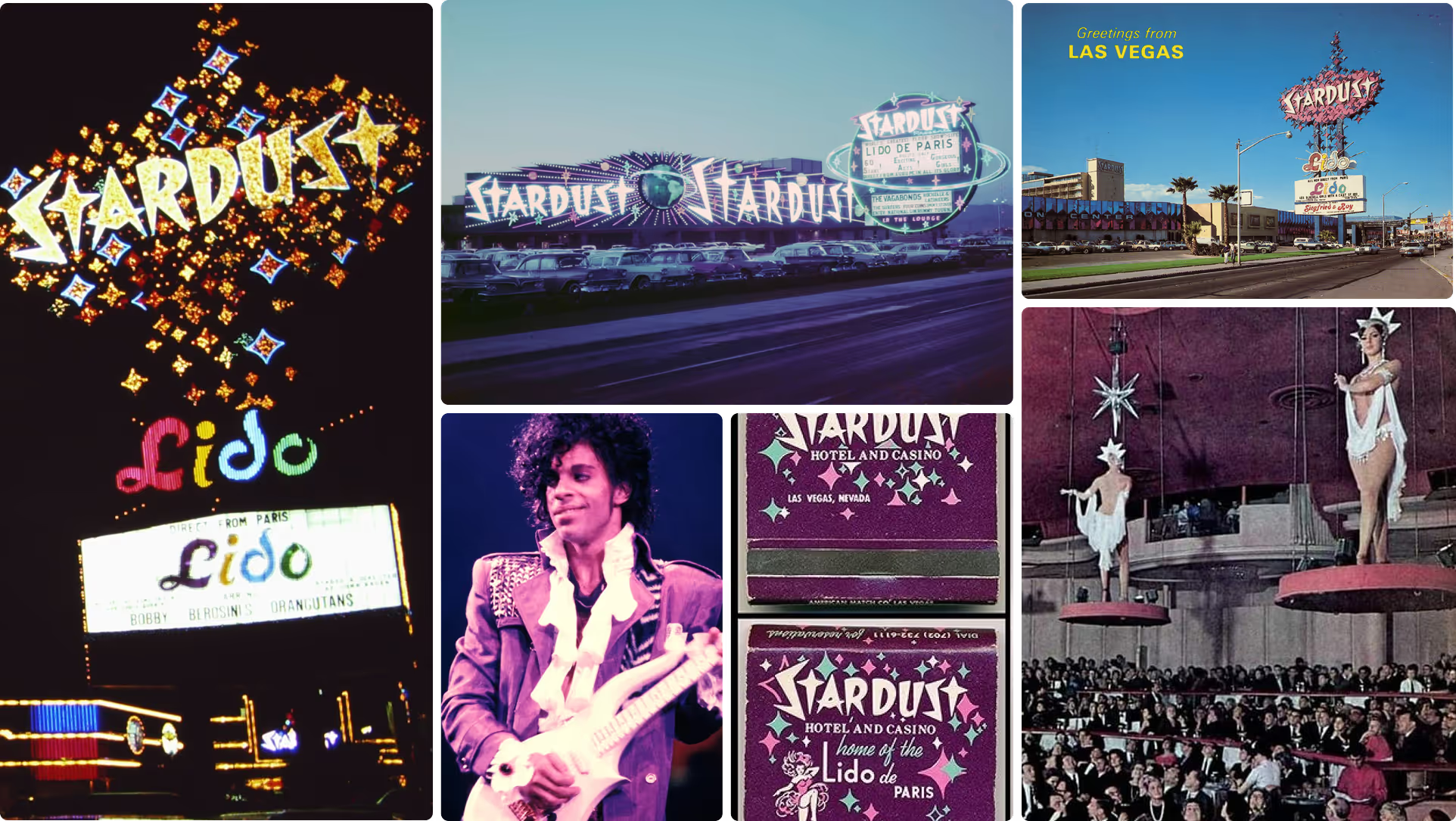
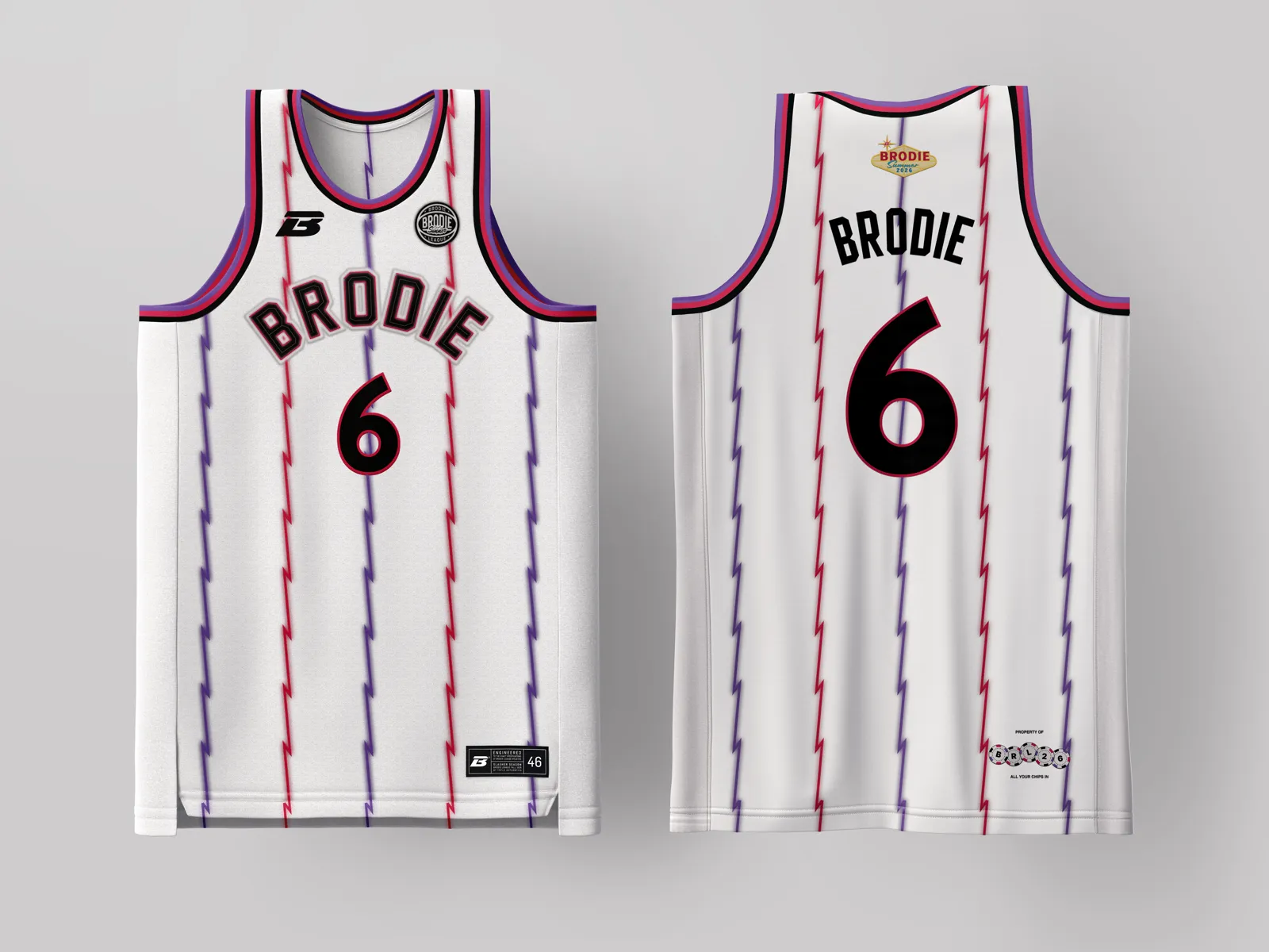
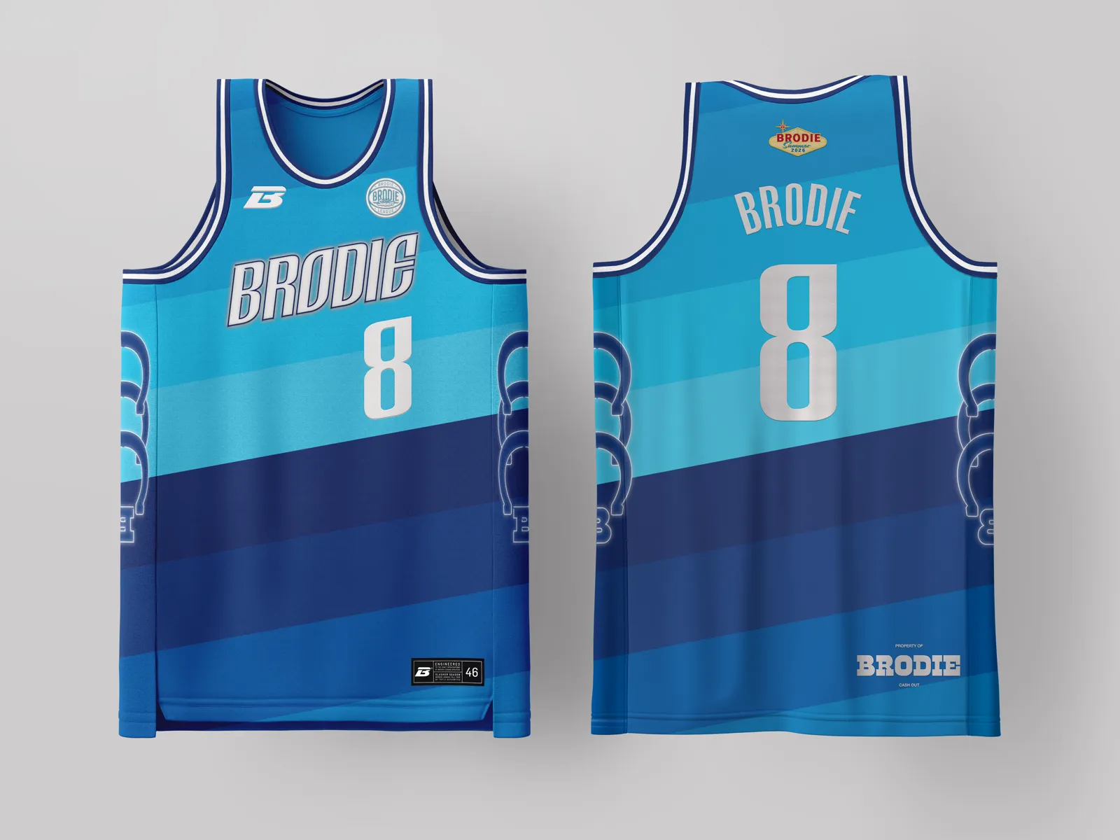
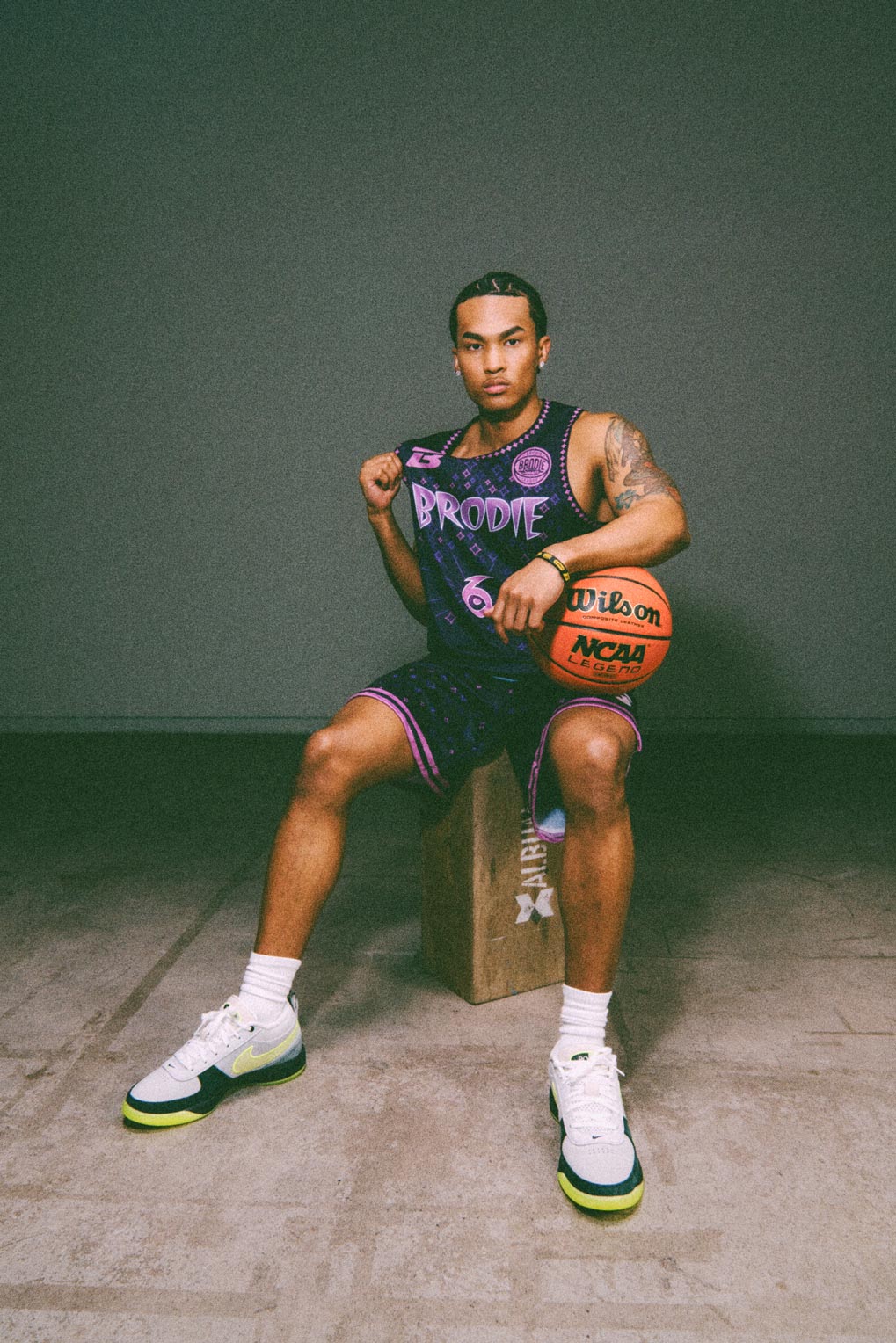
Space-age futurism wrapped in purple and pink. Cascading purple rain starburst patterns down the chest, cosmic detailing, and a silhouette that makes stepping on the court feel like entering orbit. A blacklight poster from a headliner’s dressing room.


Go All in


Rat Pack sophistication meets Chi-Town cool. Powder blue pinstripes, red iconic arched lettering, and card suit detailing down the panels evoke the elegant exclusivity of the Sands’ Copa Room, tailored for the city that invented the two-piece.

Desert mythology in wave form. Shifting sand dunes with burnt orange trim and saguaro cactus detailing that channels the Dunes’ Arabian Nights escapism under a Sonoran sky. Sun-bleached by day. Moonlit ridgelines by night. No ocean in sight but these waves rock the valley.
Imperial grandeur for the Cream City. Forest green with neon-lit Pegasus wings and Greek key trim pulled straight from the palace floor, a bold pattern and claim on the throne. The kind of jersey that should come with a laurel wreath.
Old-school neon brilliance in Philly navy with throwback red star burst, and a resplendent royal flush built into the wordmark, and a card suit collar that carries the swagger of a casino that never played it safe. The table’s hot and you’re not leaving. Practice? Nah, this kit is game-ready.
Bugsy’s neon fever dream brought to the 305. Black base with glowing pink flamingos and script lettering that bleeds light like a sign that just flickered on at 2 AM on Collins Avenue. This is the jersey that walks in, and the room already knows.
Space-age futurism wrapped in purple and pink. Cascading purple rain starburst patterns down the chest, cosmic detailing, and a silhouette that makes stepping on the court feel like entering orbit. A blacklight poster from a headliner’s dressing room.