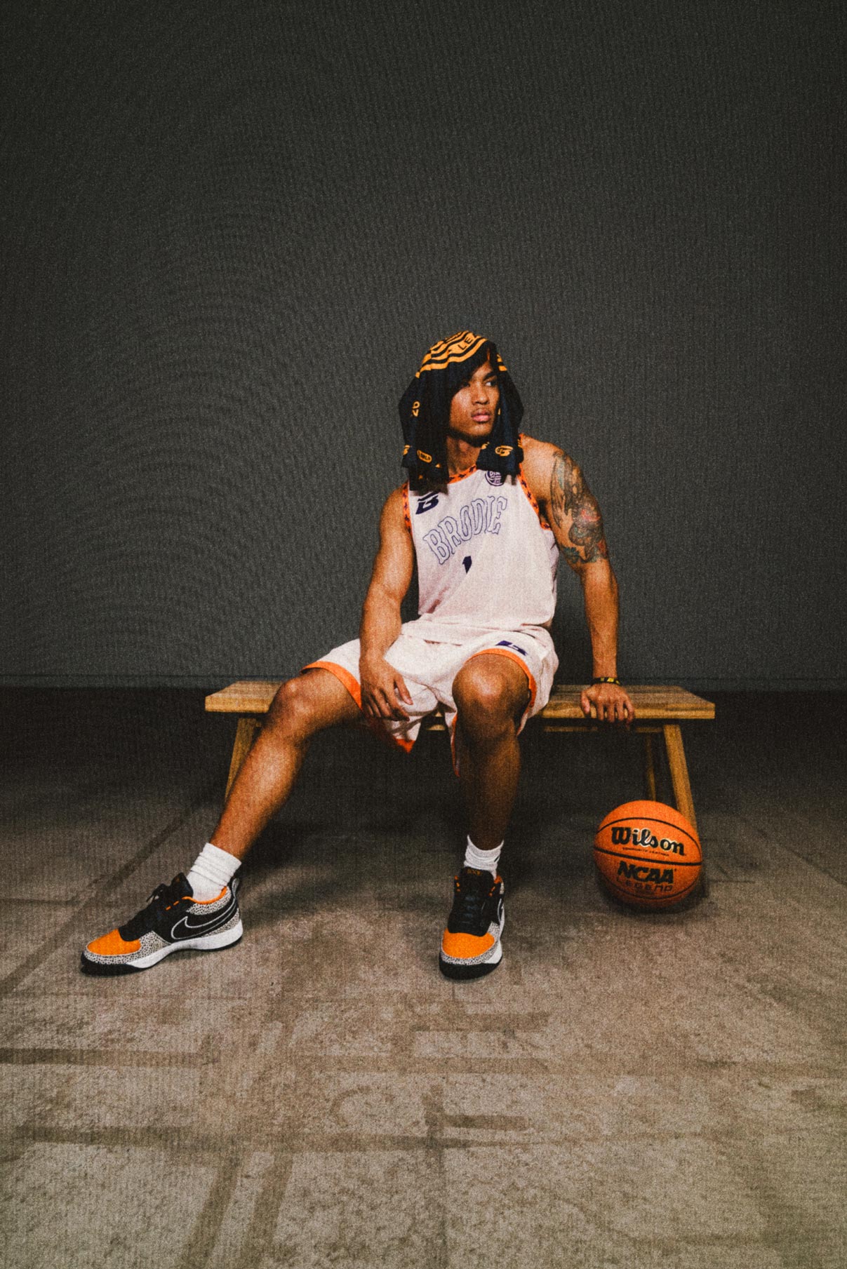
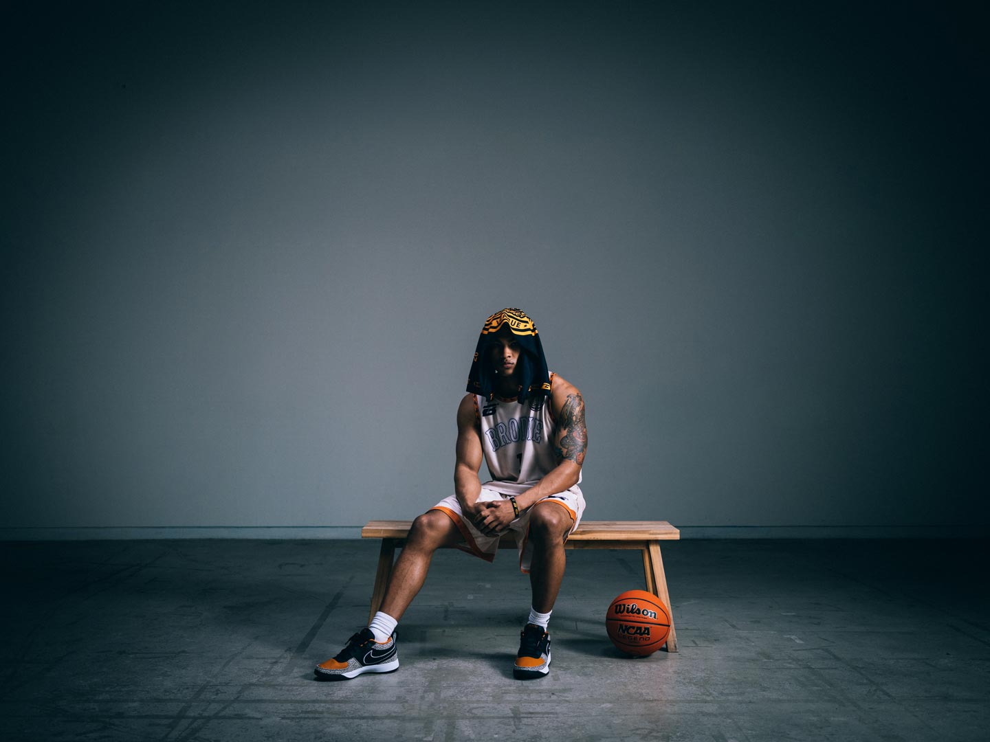
The Pack Is The Promise
What ten pieces say about what it means to be a Brodie Athlete™.

SEASONS
NEWSROOM
COMPANY
SEASONS
Summer ’26
Fall ’25
Winter ’26
Spring ’26
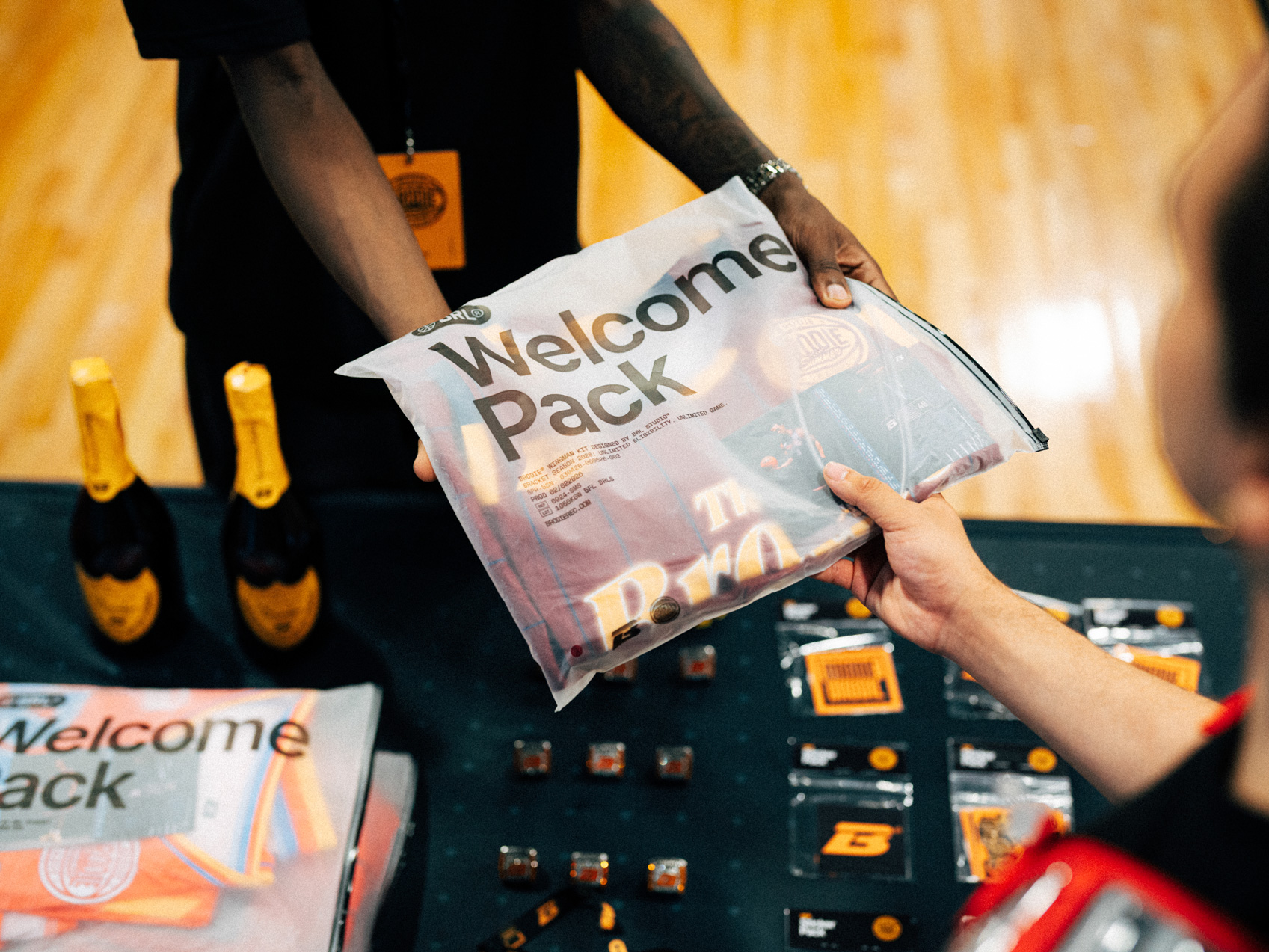
Start a team. Fill your roster of nine players and play free.
Register solo or use your team code to join a Captain’s Roster

Welcome to SLASHER SEASON
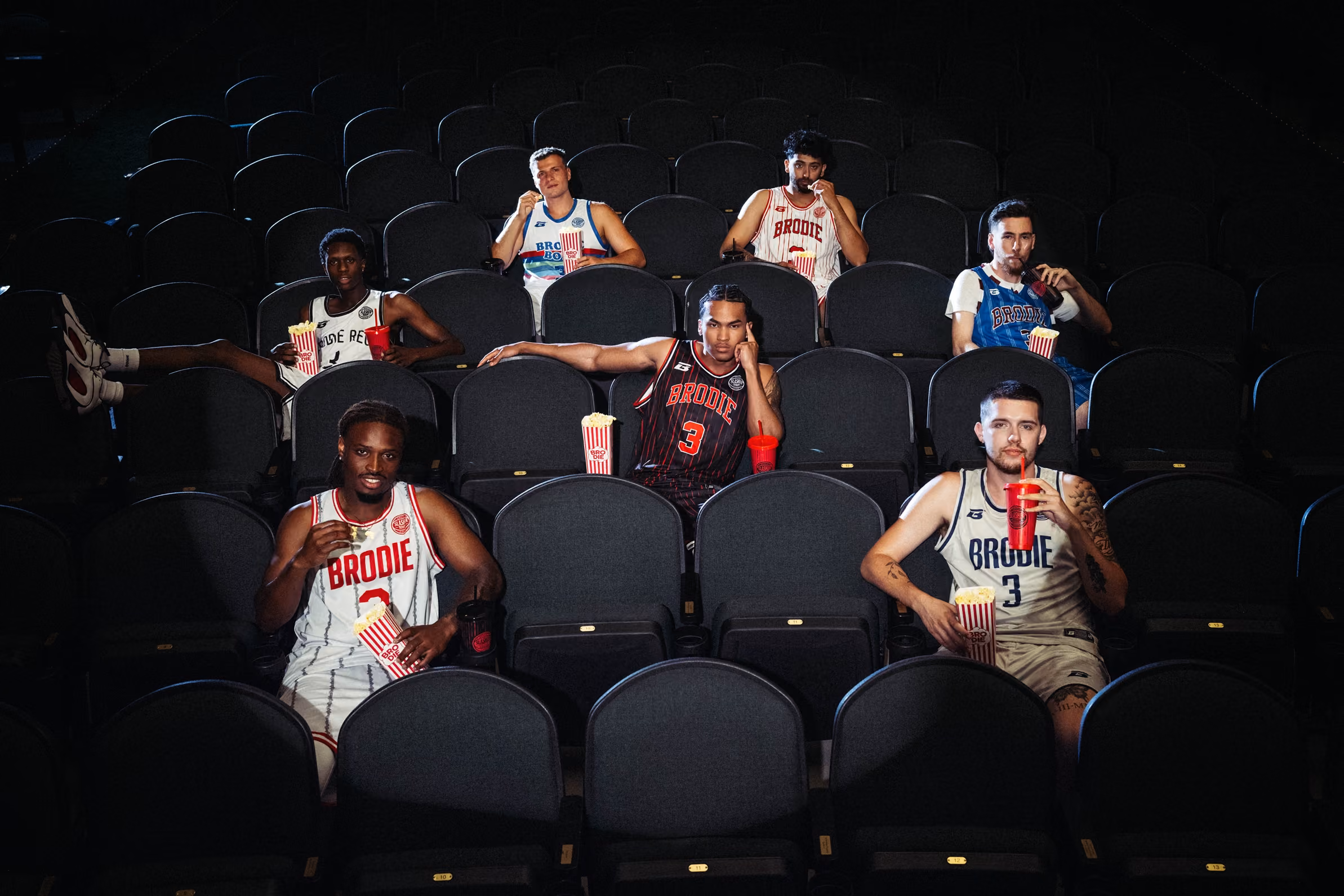
Made For Slashers.
Basketball has always had a word for the ones who take over a game and never let it go. Killer instinct. The mindset that turns a run into a takeover, a rivalry into a legacy. Slasher Season is Brodie's tribute to that mentality, filtered through the genre that understands it best.

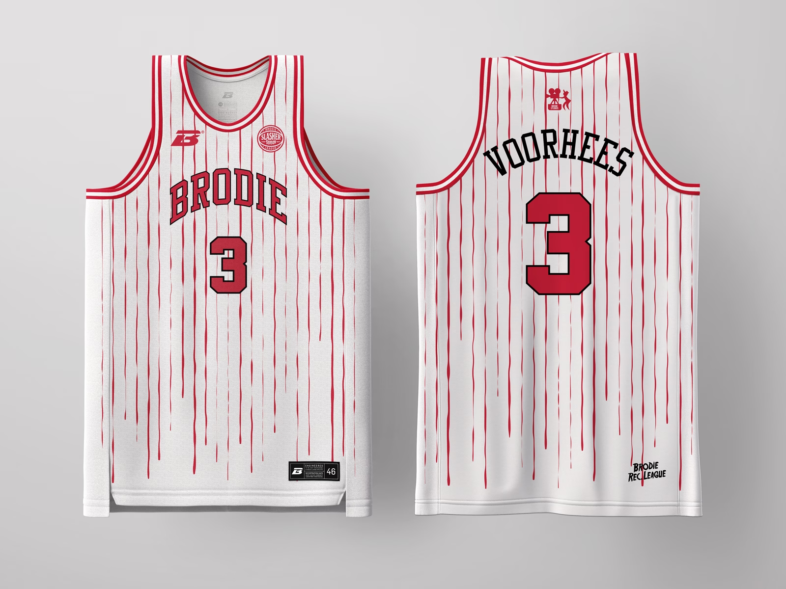
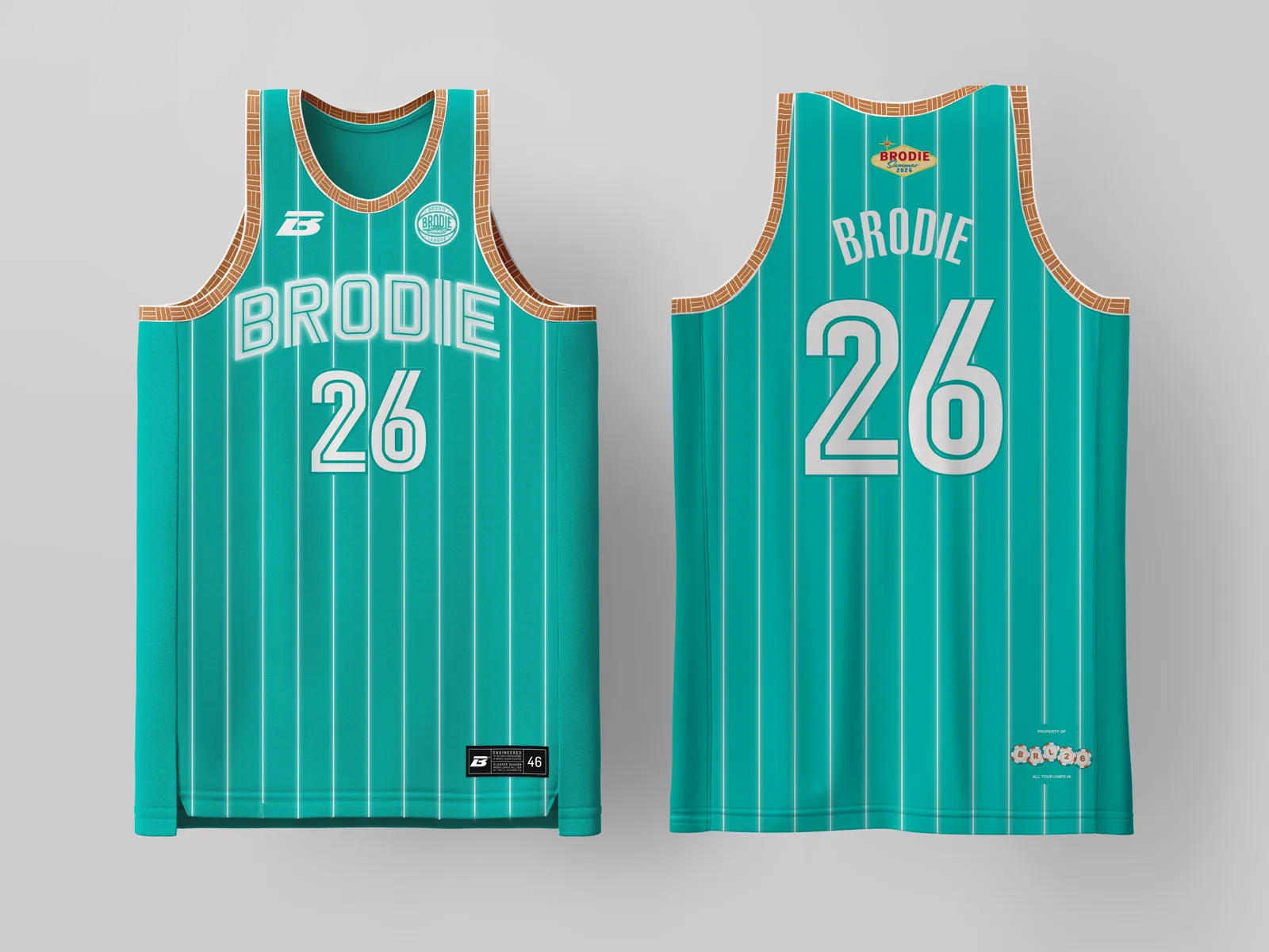
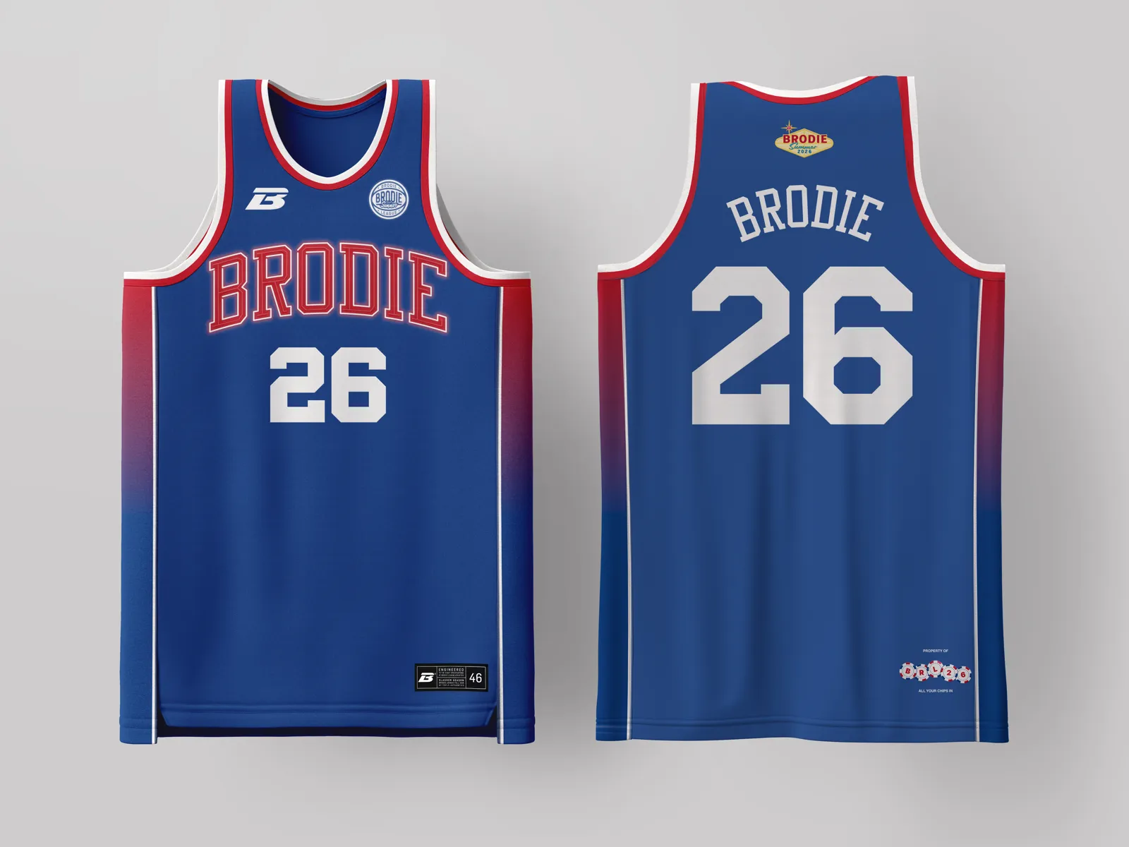
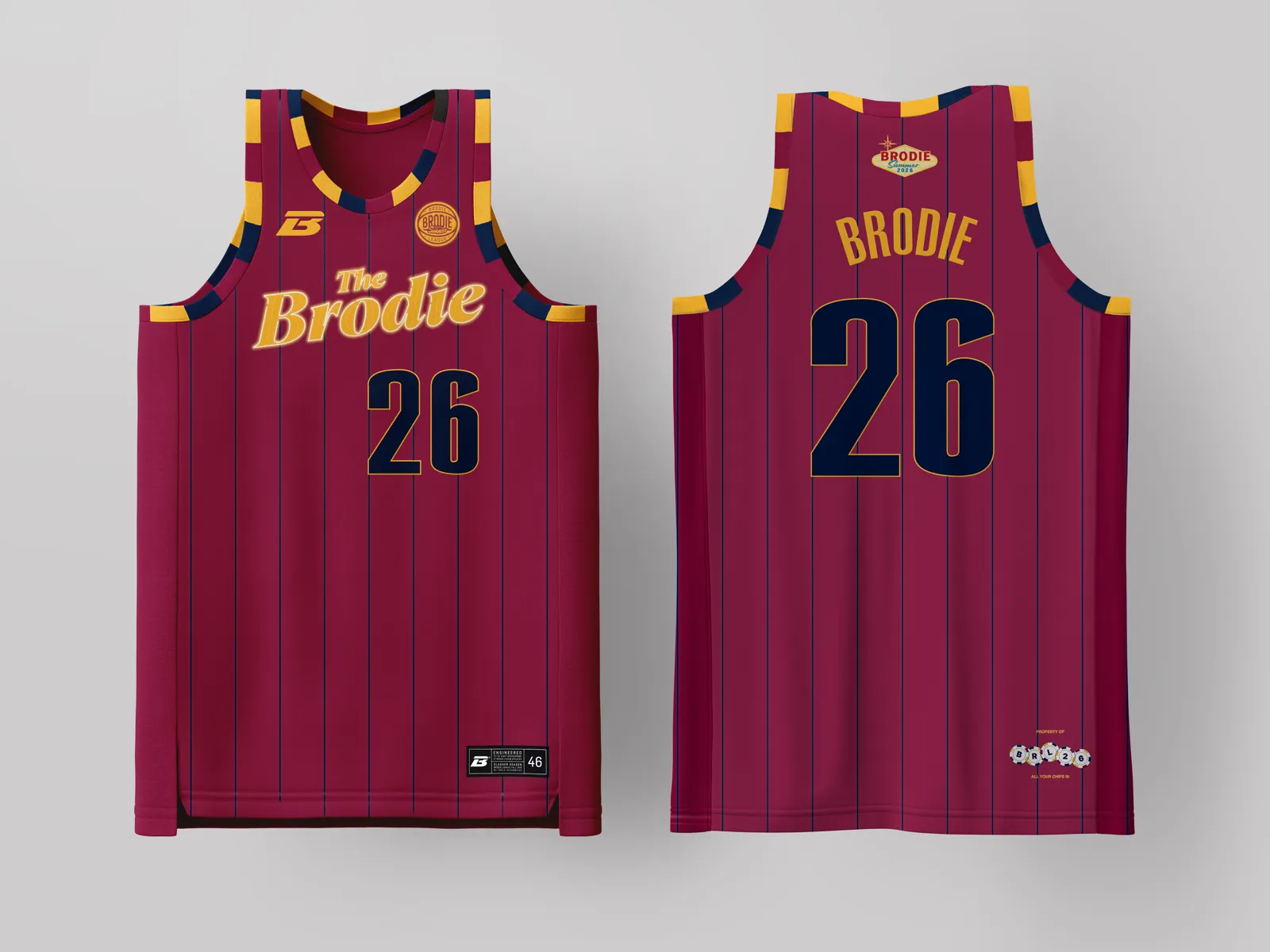
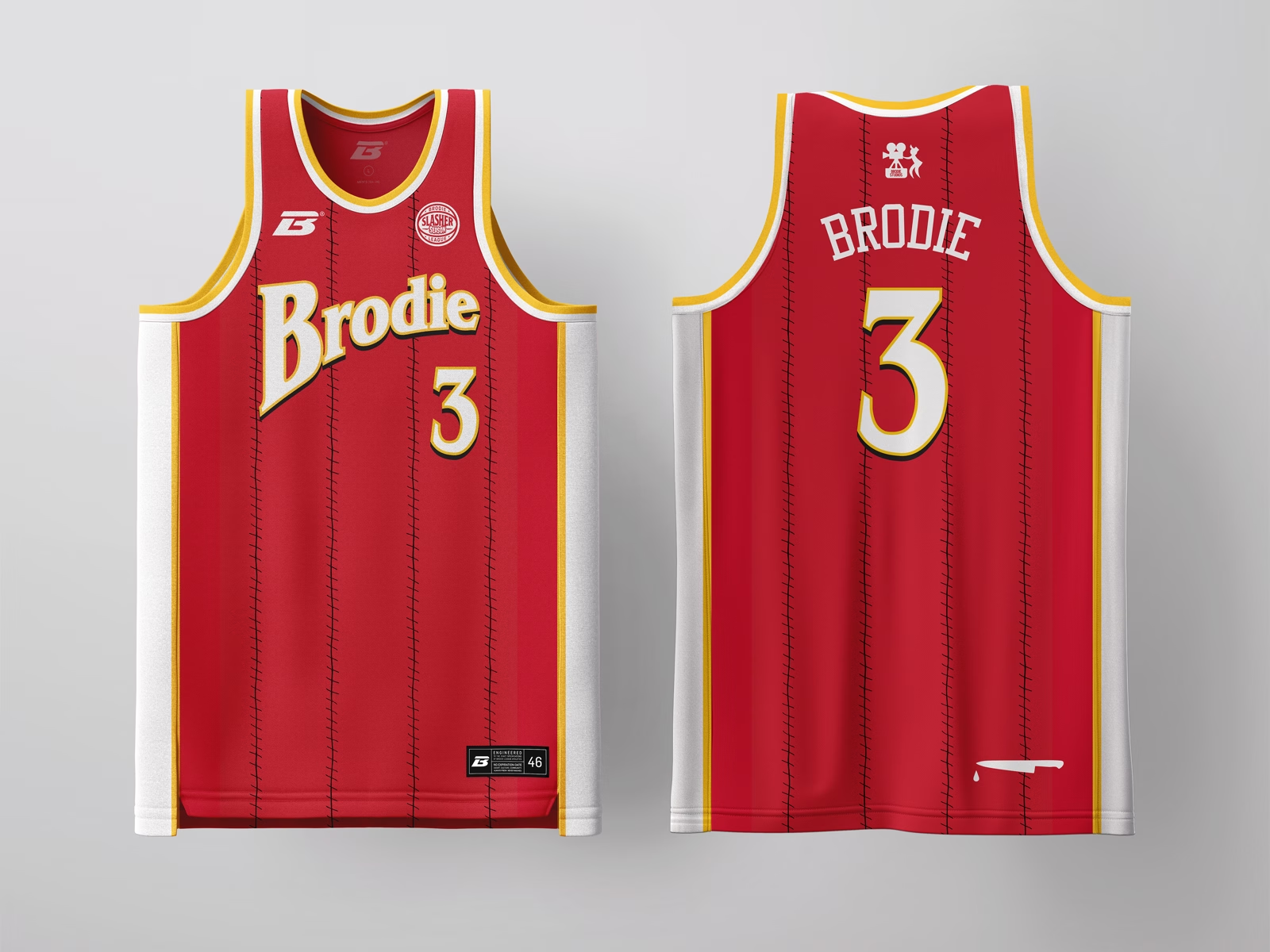
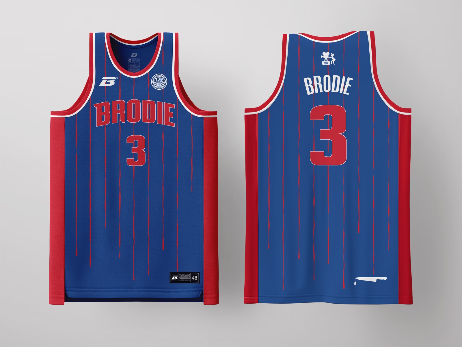
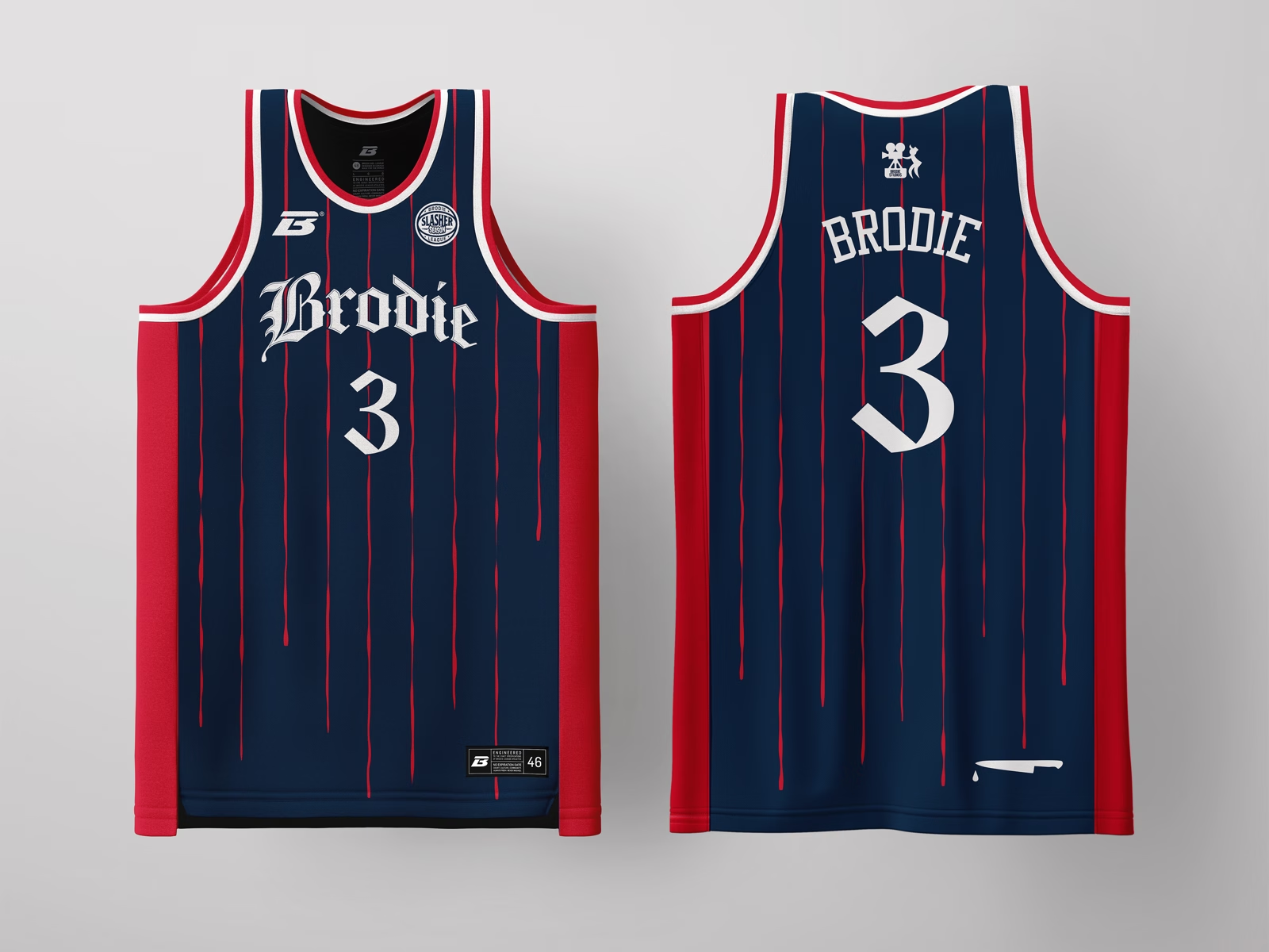
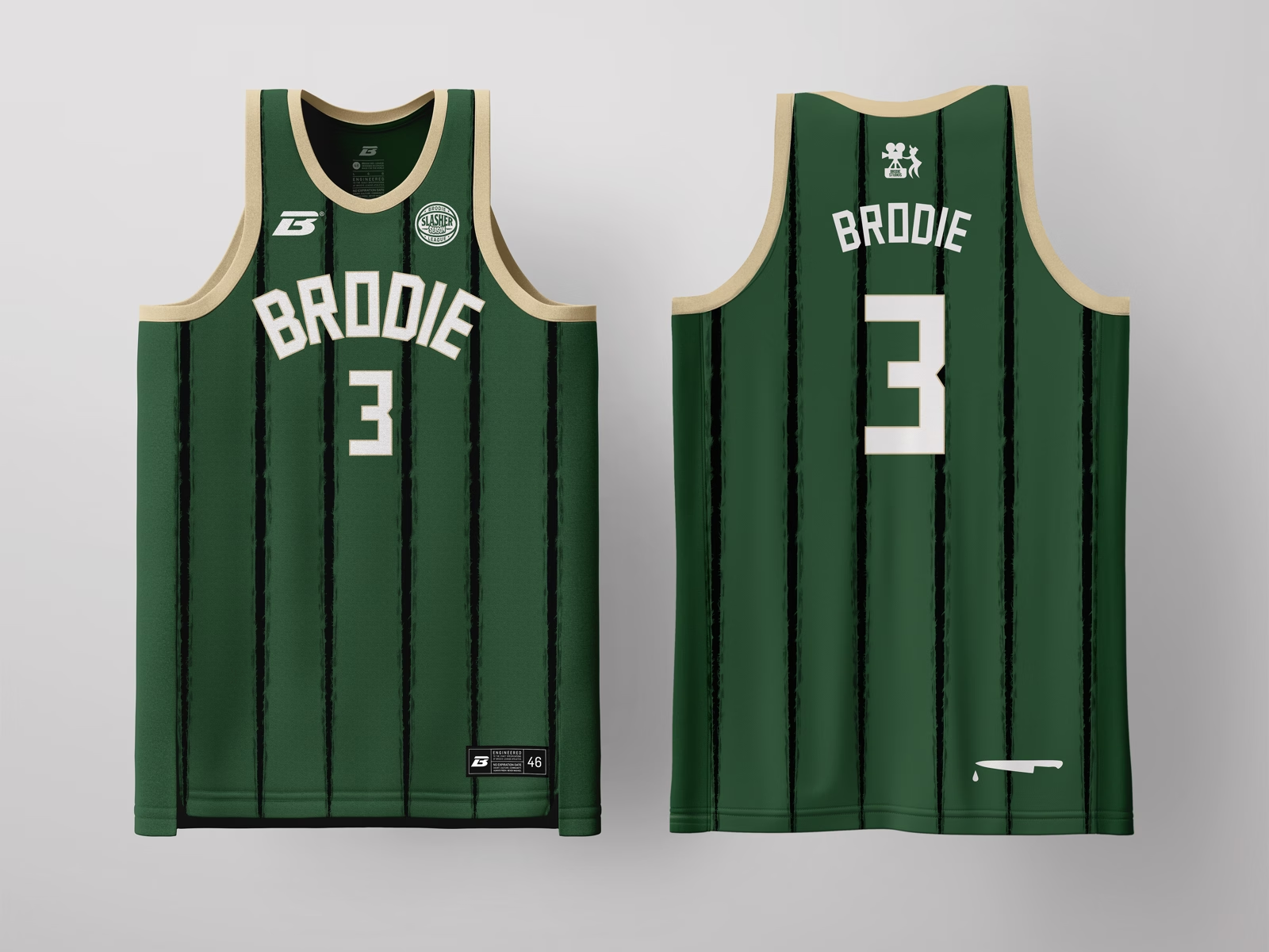
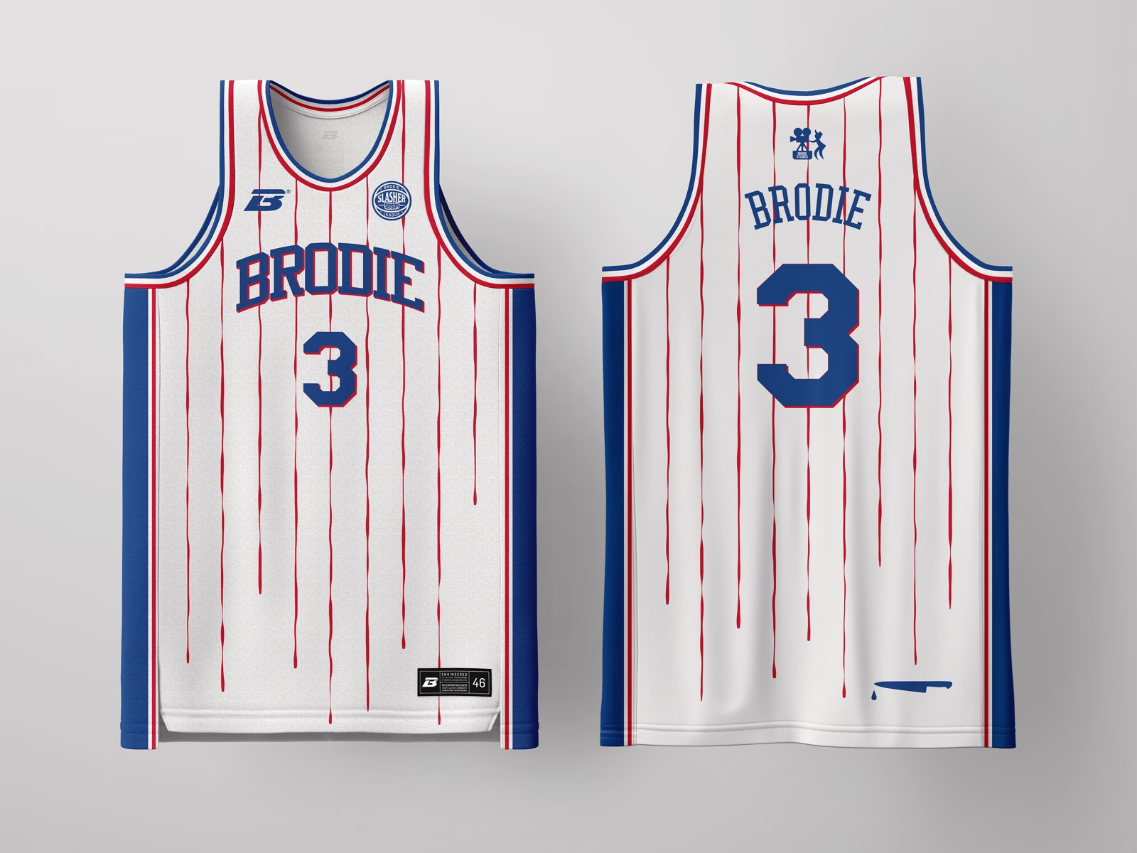
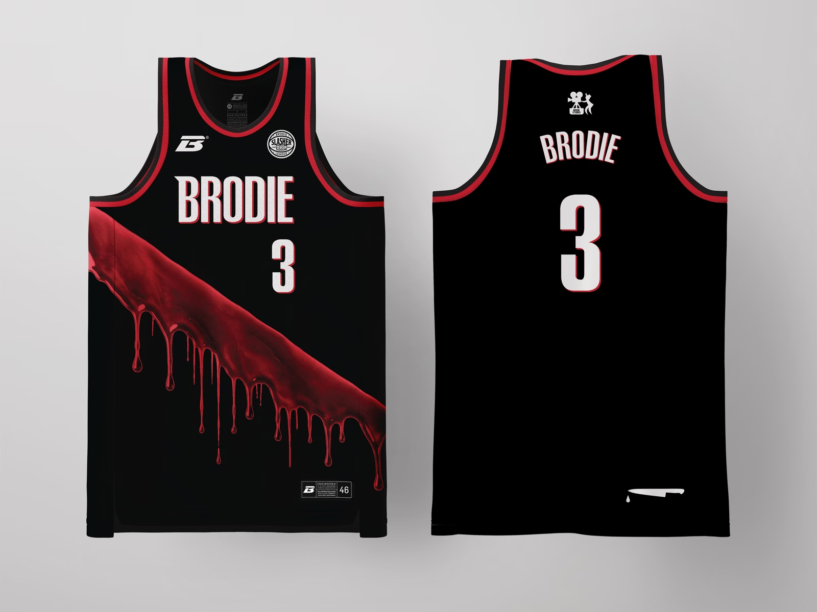
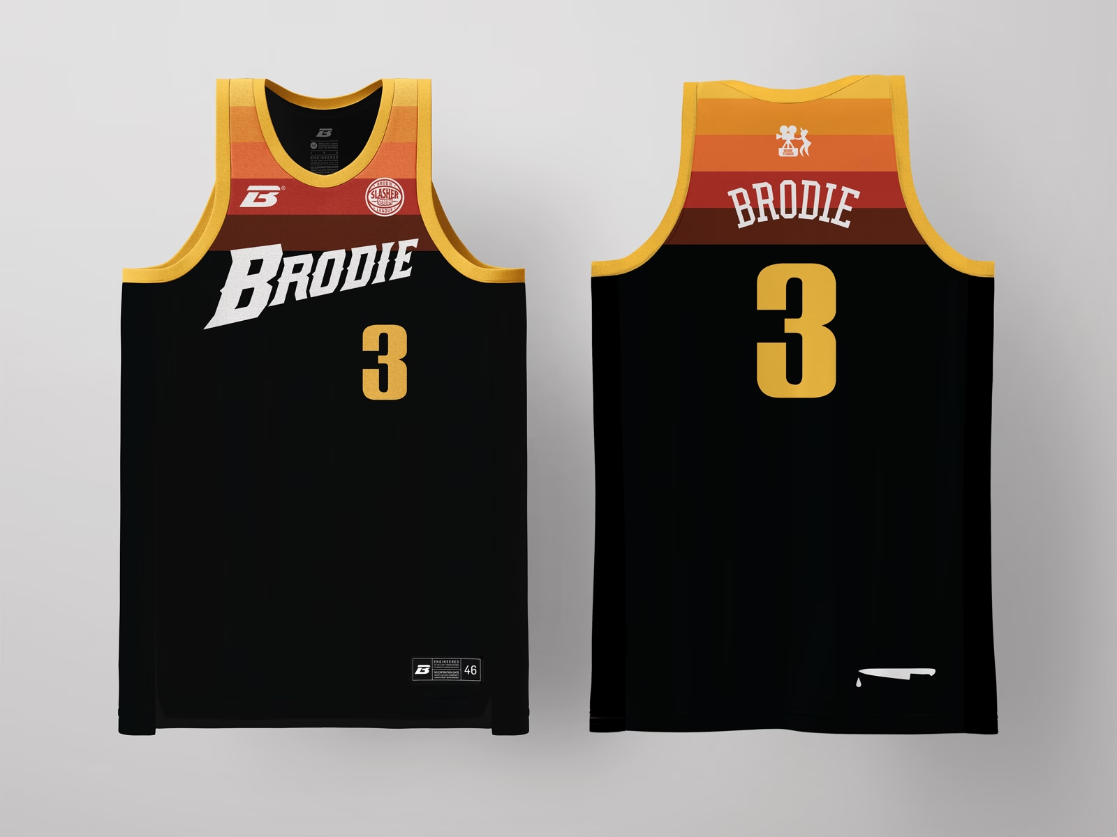
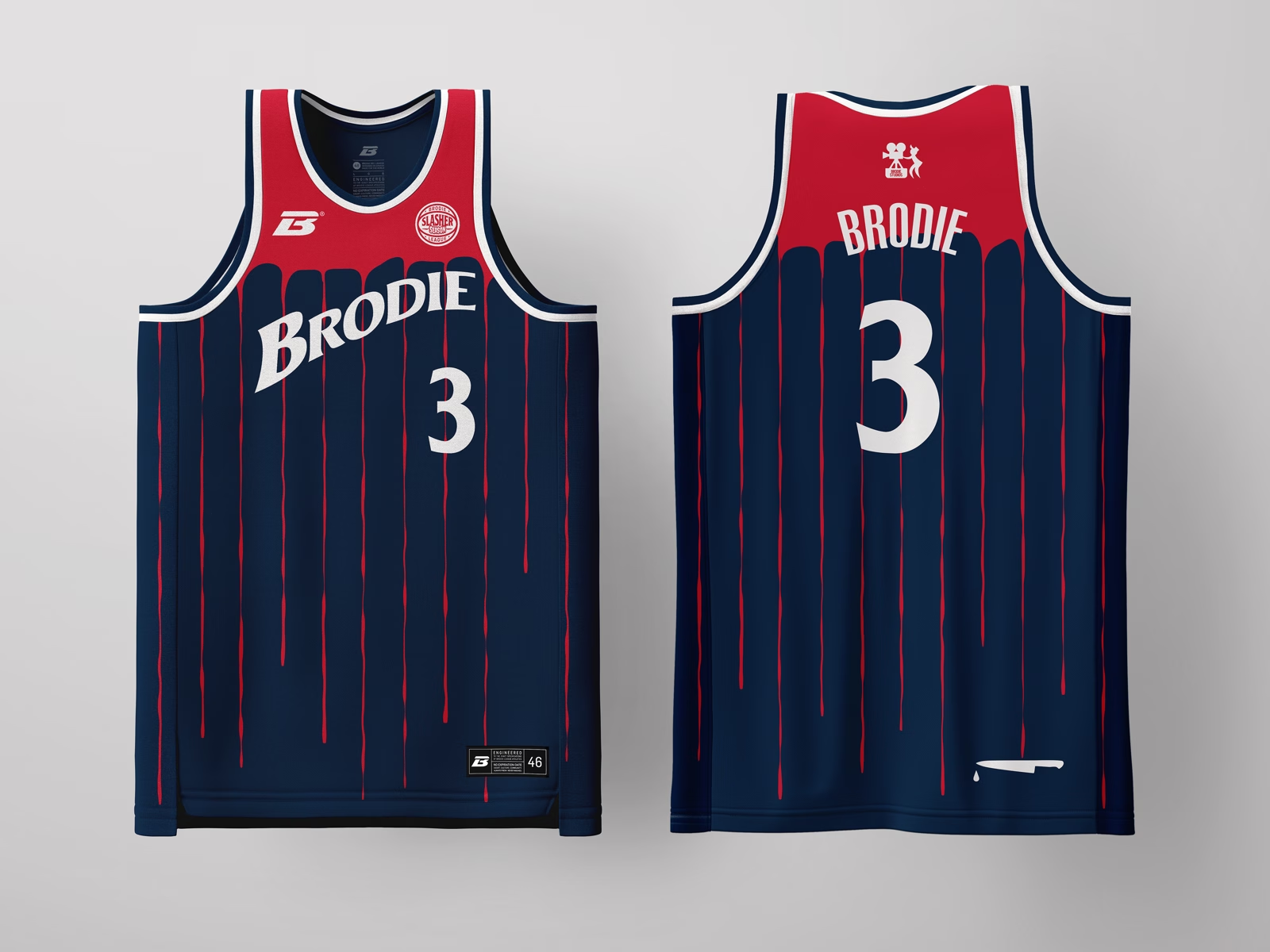
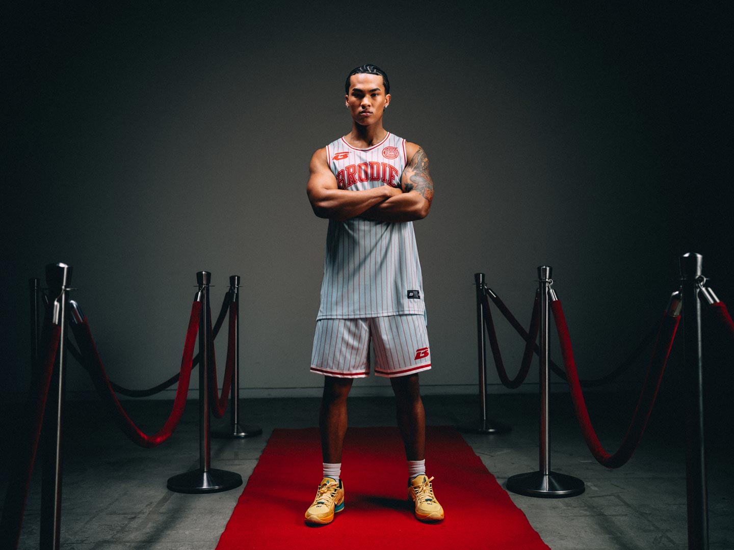
Pinstripe is the classic team-sport signifier, so we corrupted it: the stripes bleed downward as if the jersey itself has been slashed mid-game. Red-on-black keeps it a potent palette of the genres G.O.A.T. Legible from a distance and rewards a closer look with the drip detail. As the flagship colorway, this drop plays the boldest and most saturated of the six, establishing the collection's baseline grammar.
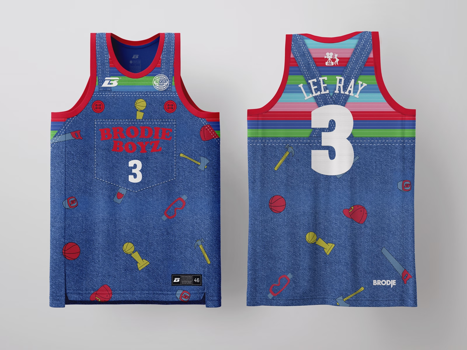
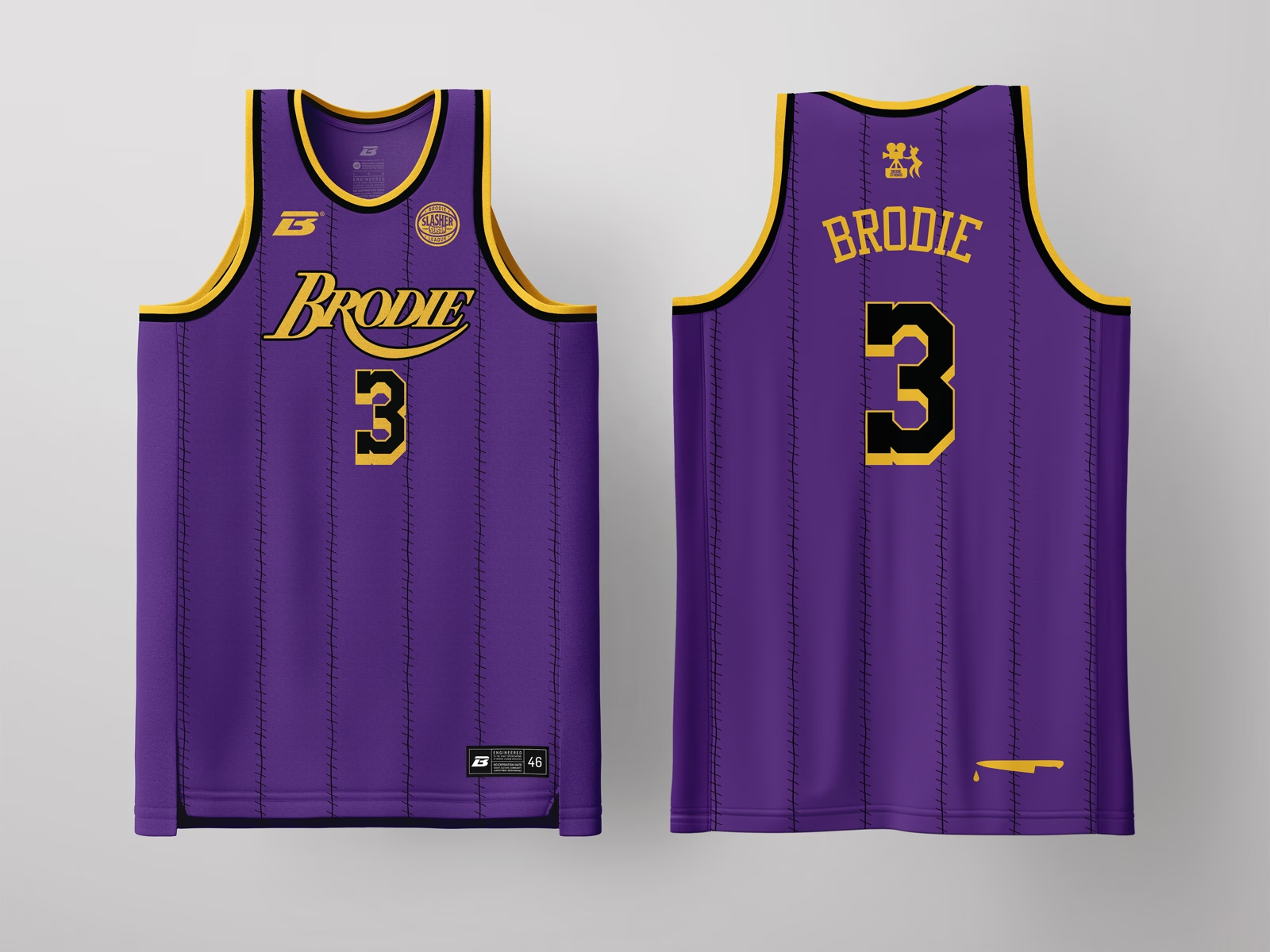
Denim overalls, mismatched patches, and primary-color stripes at the collar build the "good guy toy" vibes before you clock the tools (hammer, saw, axe) scattered across the print. "BRODIE BOYZ" on the chest patch mimics the stitched name-tag. It's the one drop in the set that smiles first and cuts second, which is the defining trick of this archetype.
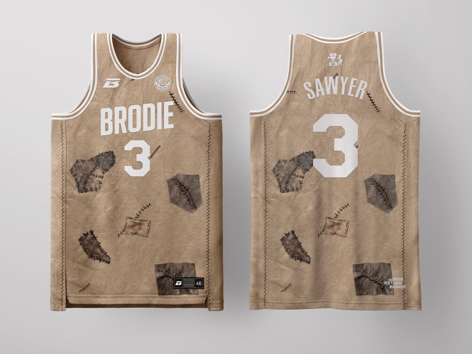
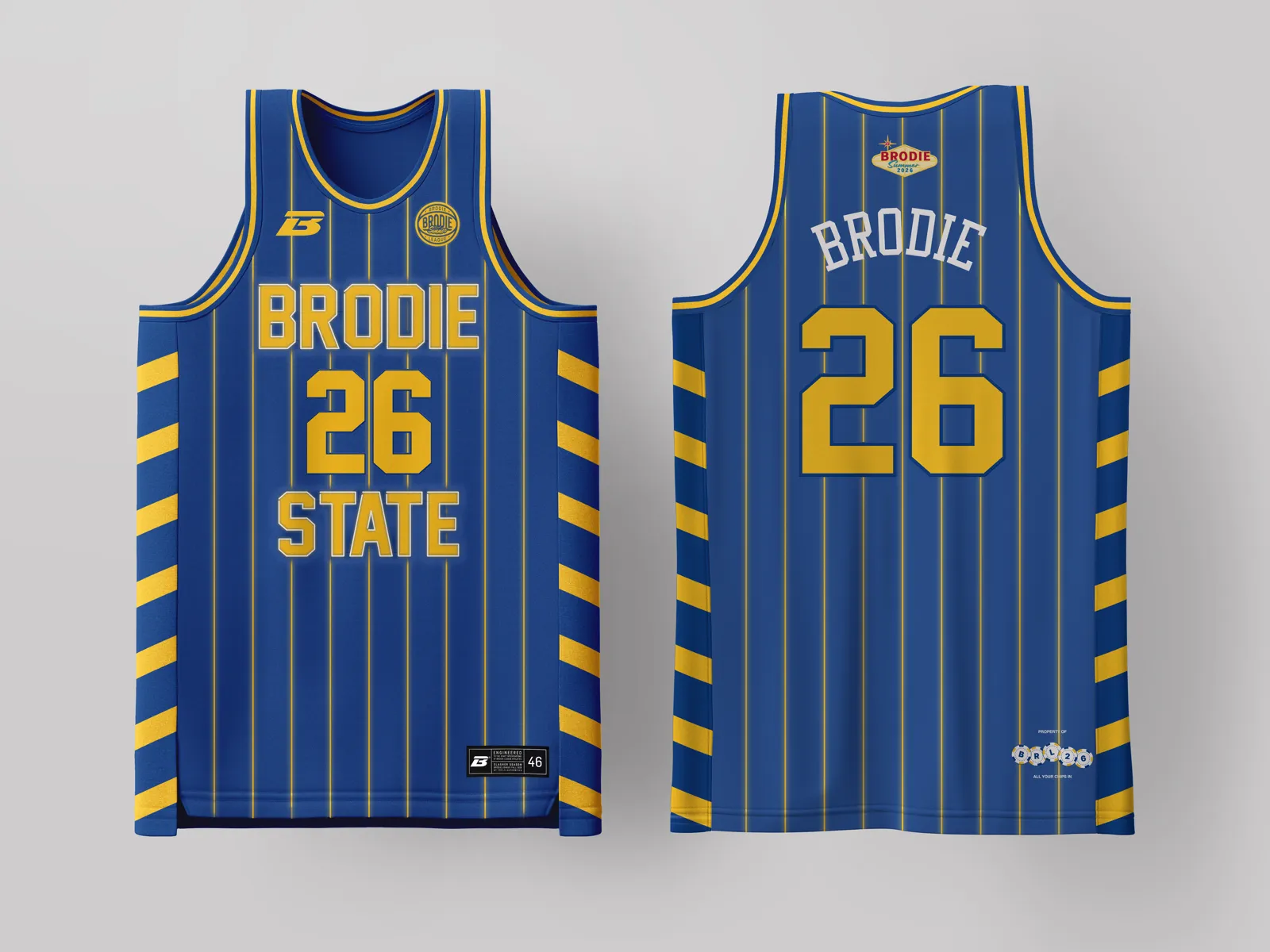
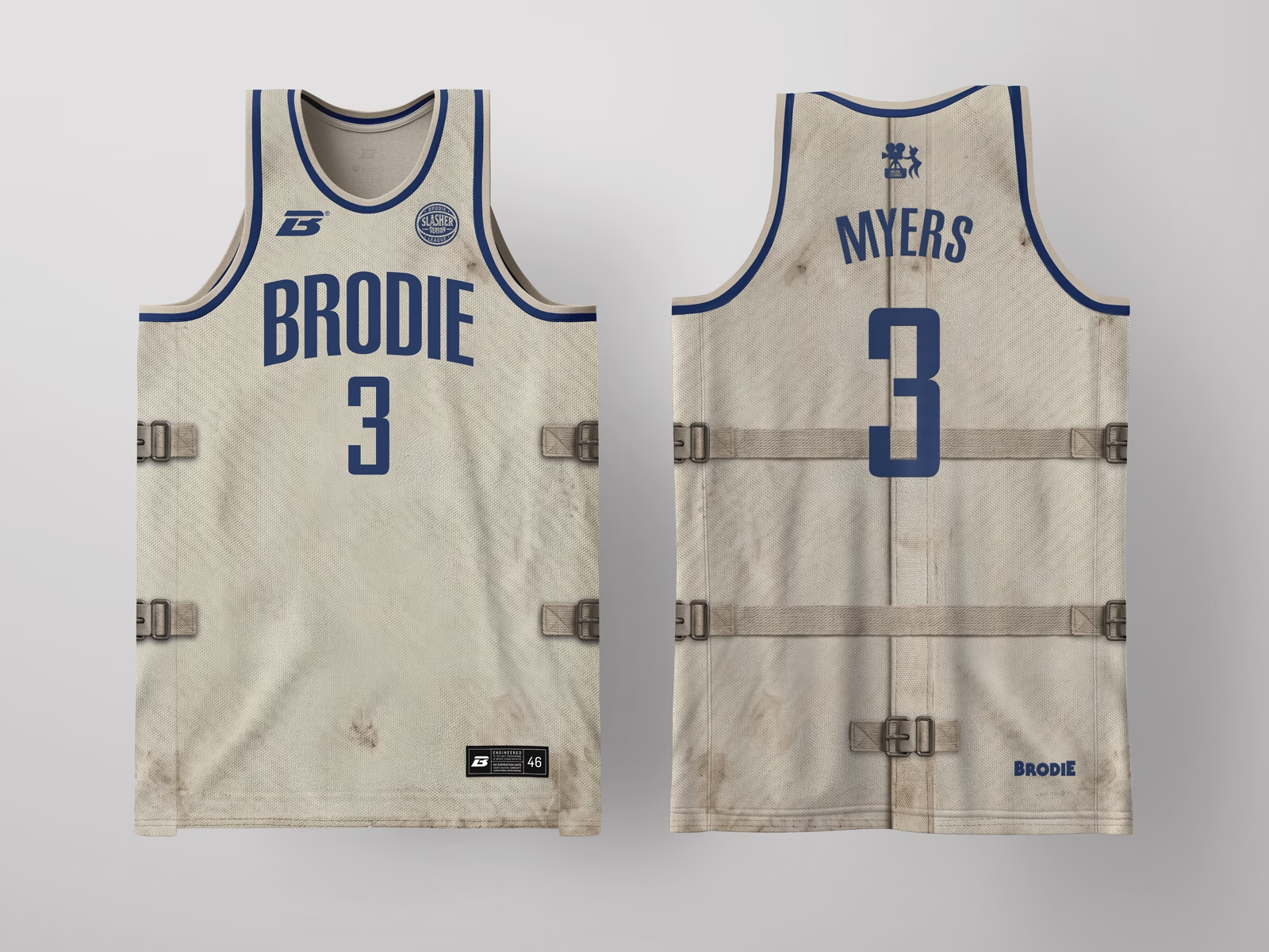
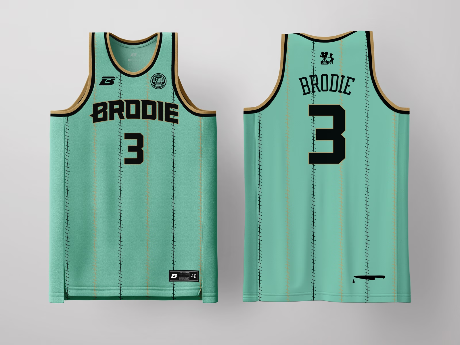
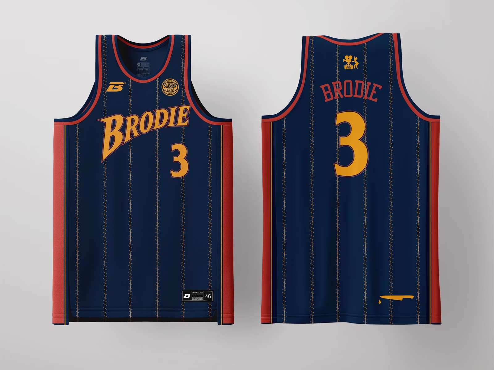
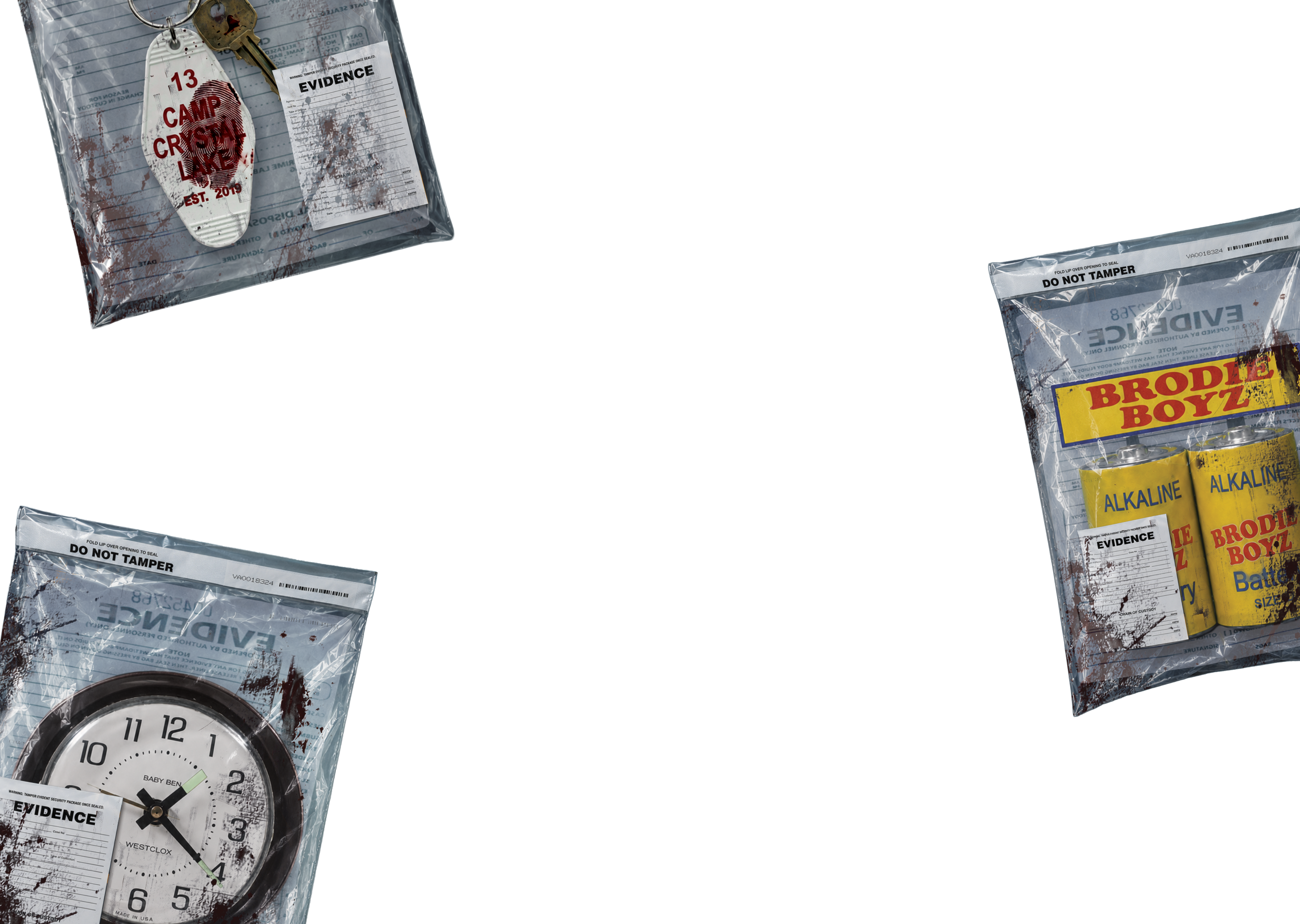
Tan, leather-look patches with stitched, weathered seams builds the skin-and-stitching reference through material and texture instead of literal imagery, keeping it wearable and on-brand rather than costume-shop literal. "Sawyer" as a family surname reinforces the legacy angle central to this archetype. The back hit, "THE BRODIE REC. LEAGUE MASSACRE," is the drop's forensic case tag.
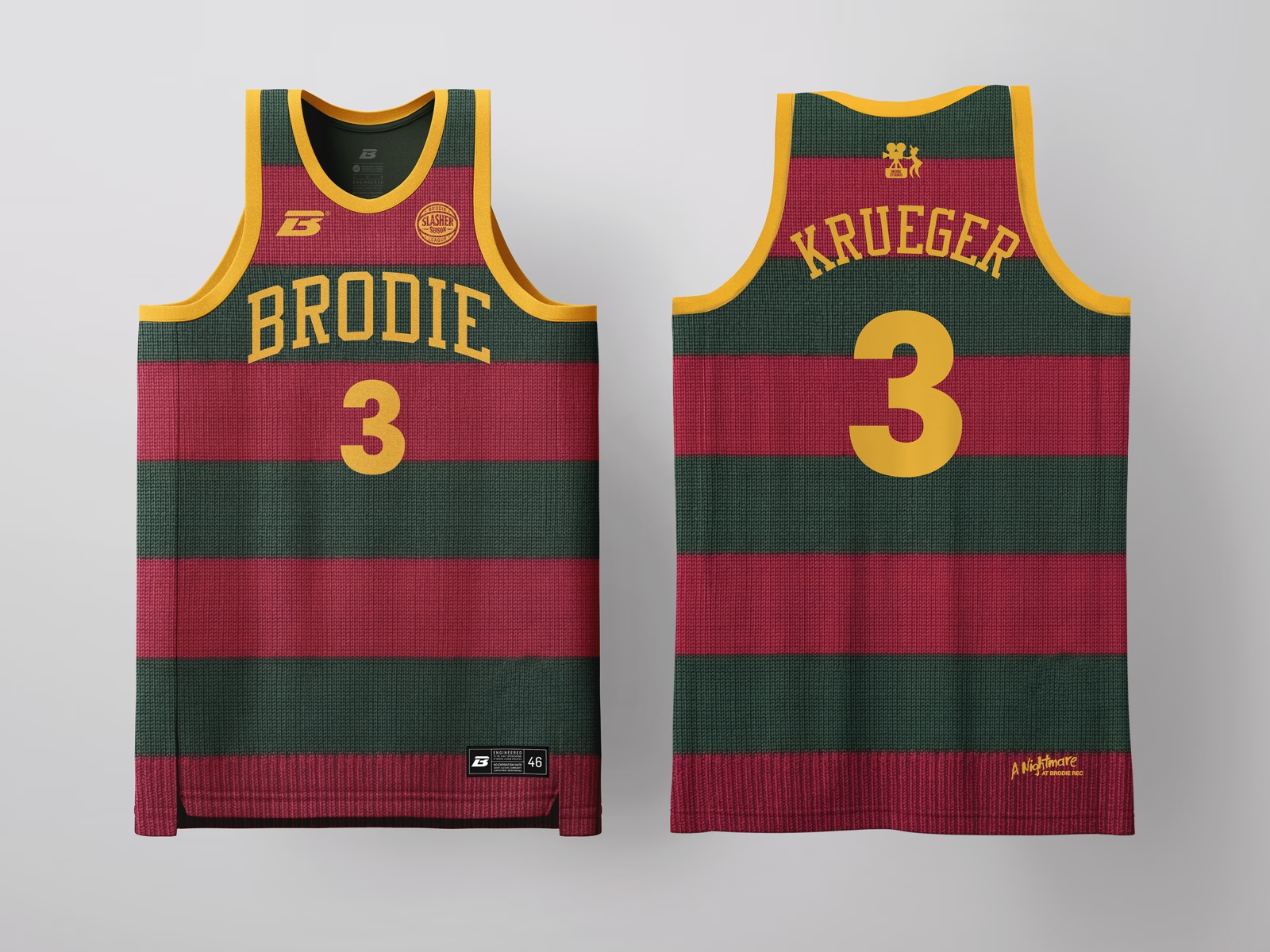
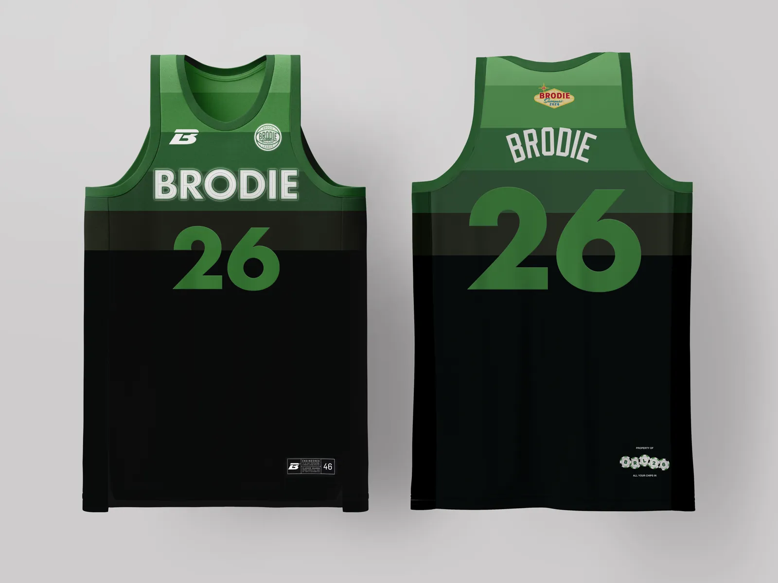
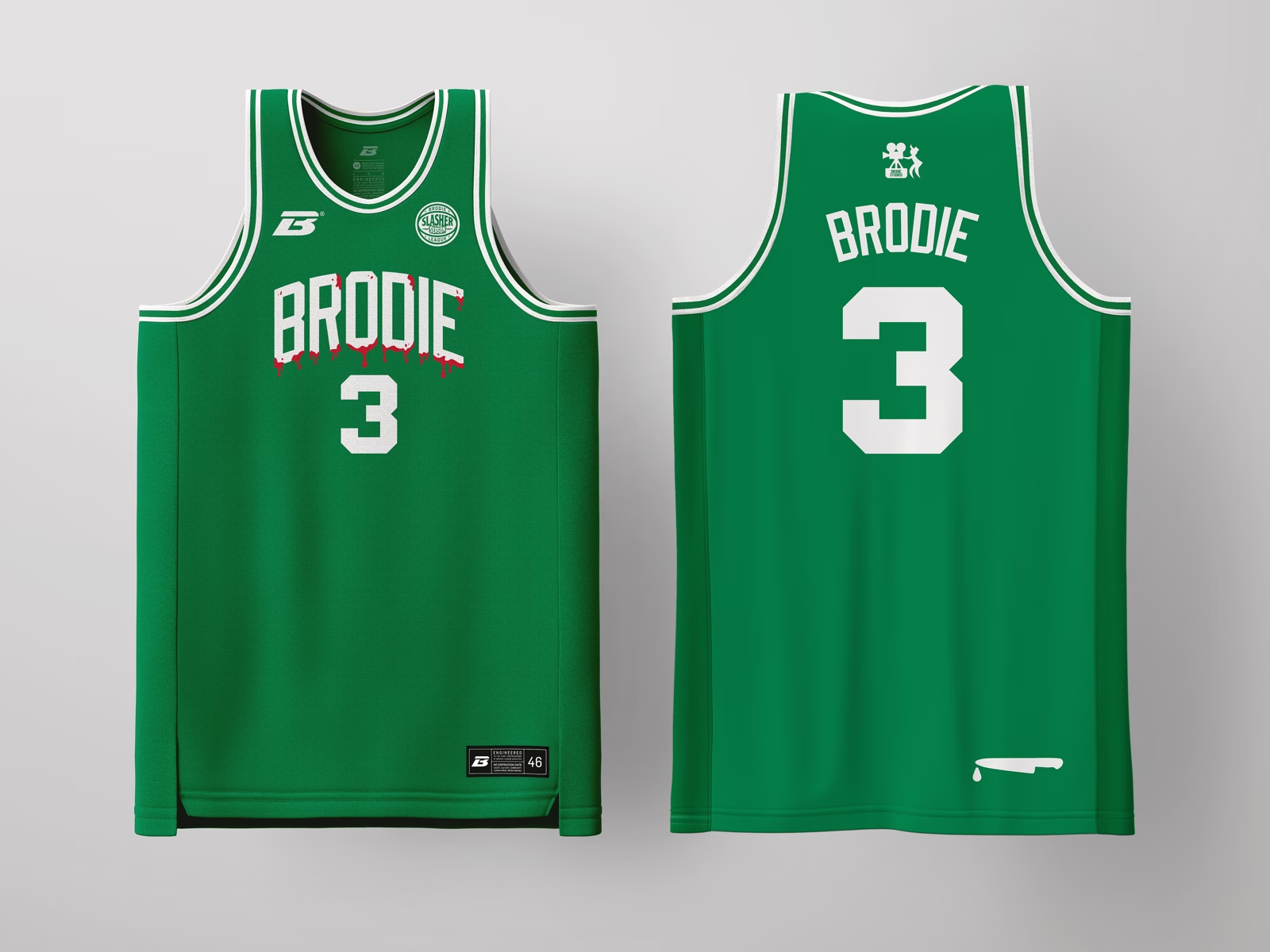
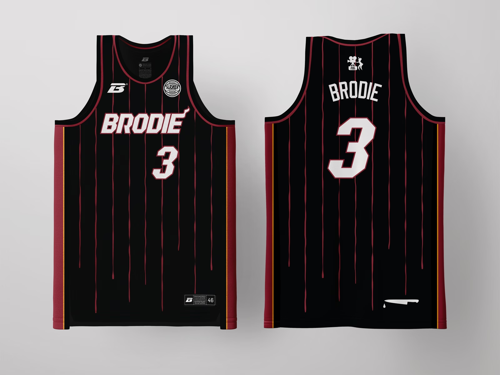
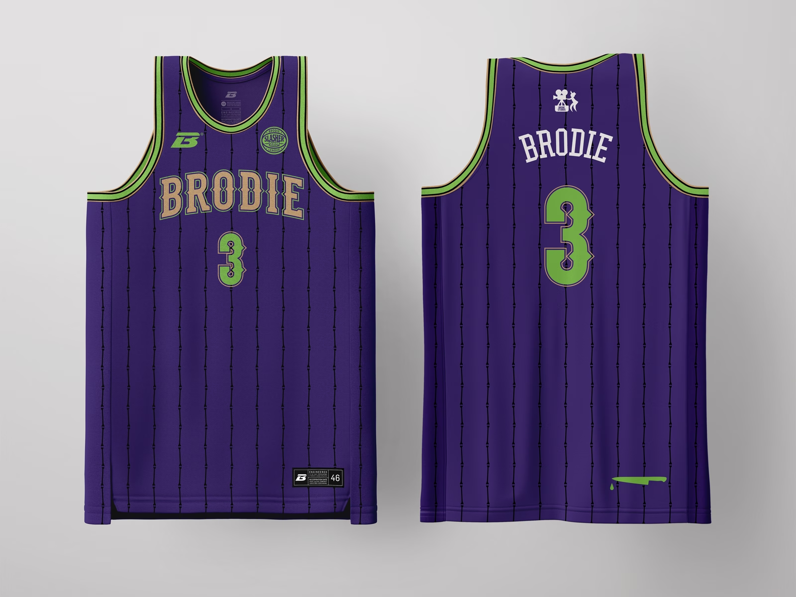
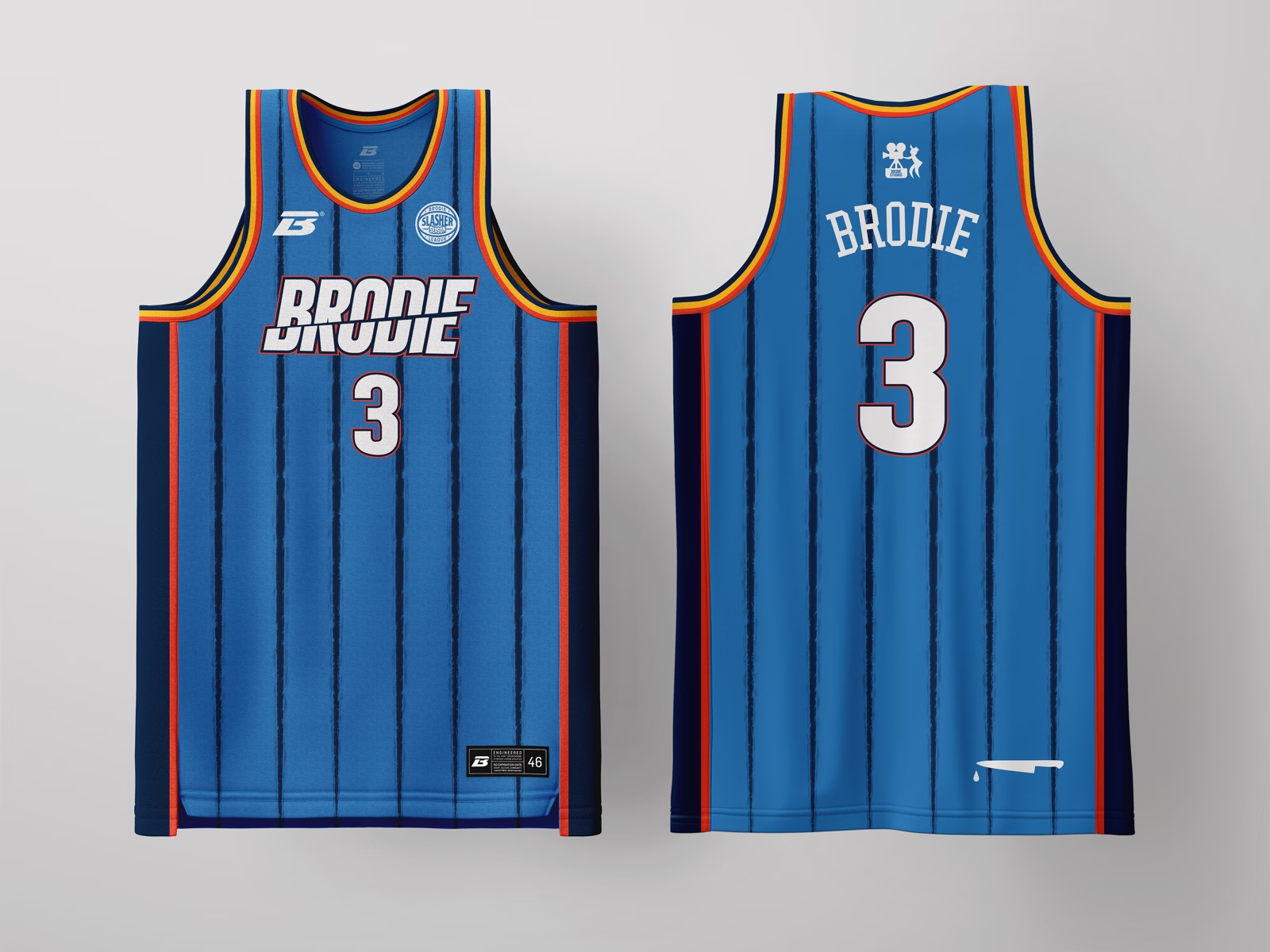
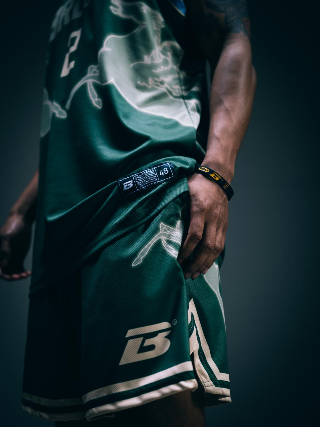
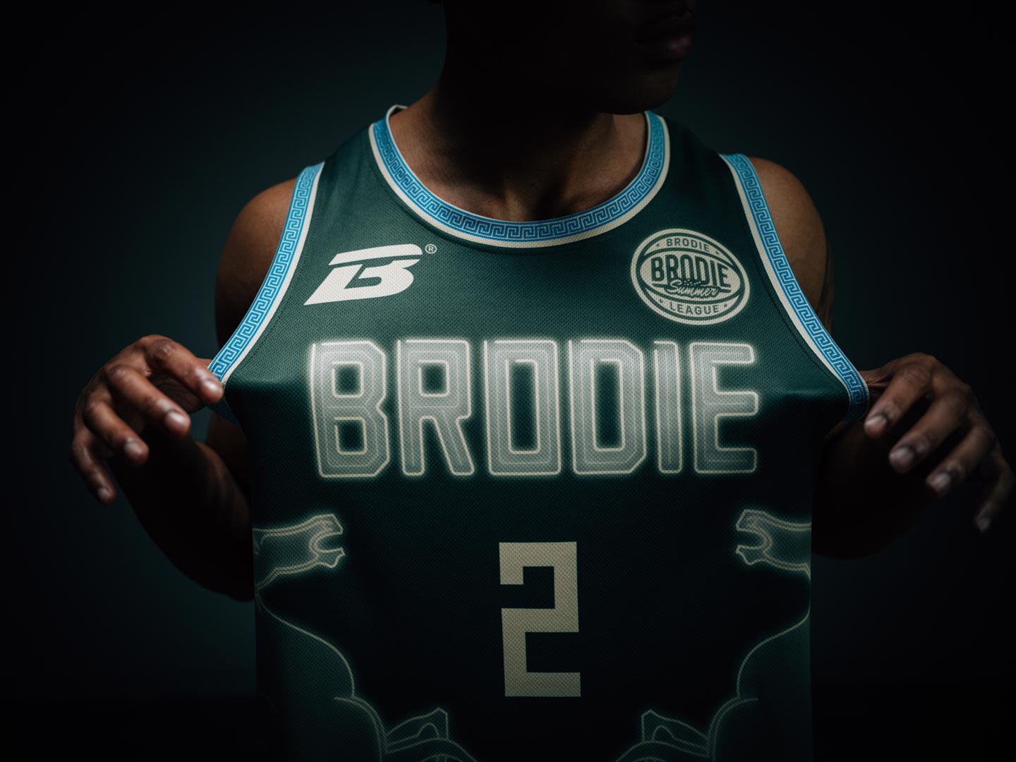
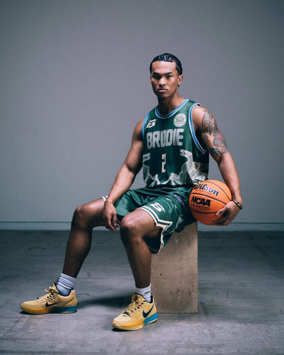
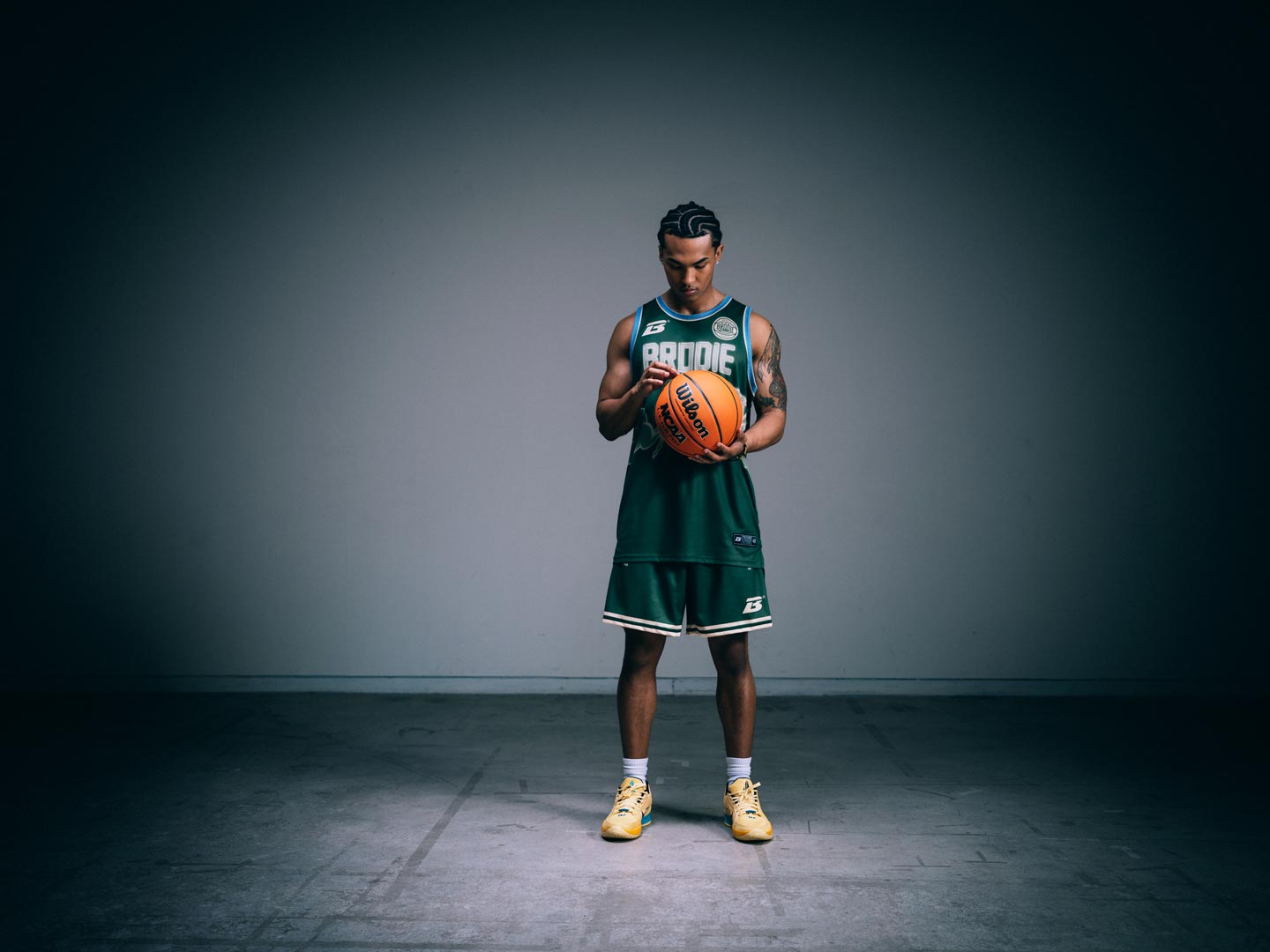
Green-and-red horizontal stripes are the single most recognizable slasher sweater in horror, so we built the jersey directly off that silhouette rather than abstracting it. Gold trim and numerals keep it bounded to hoops with a nod to the silver screen with the tag tag of "A Nightmare at Brodie Rec" flip, turning the archetype's setting into home turf.
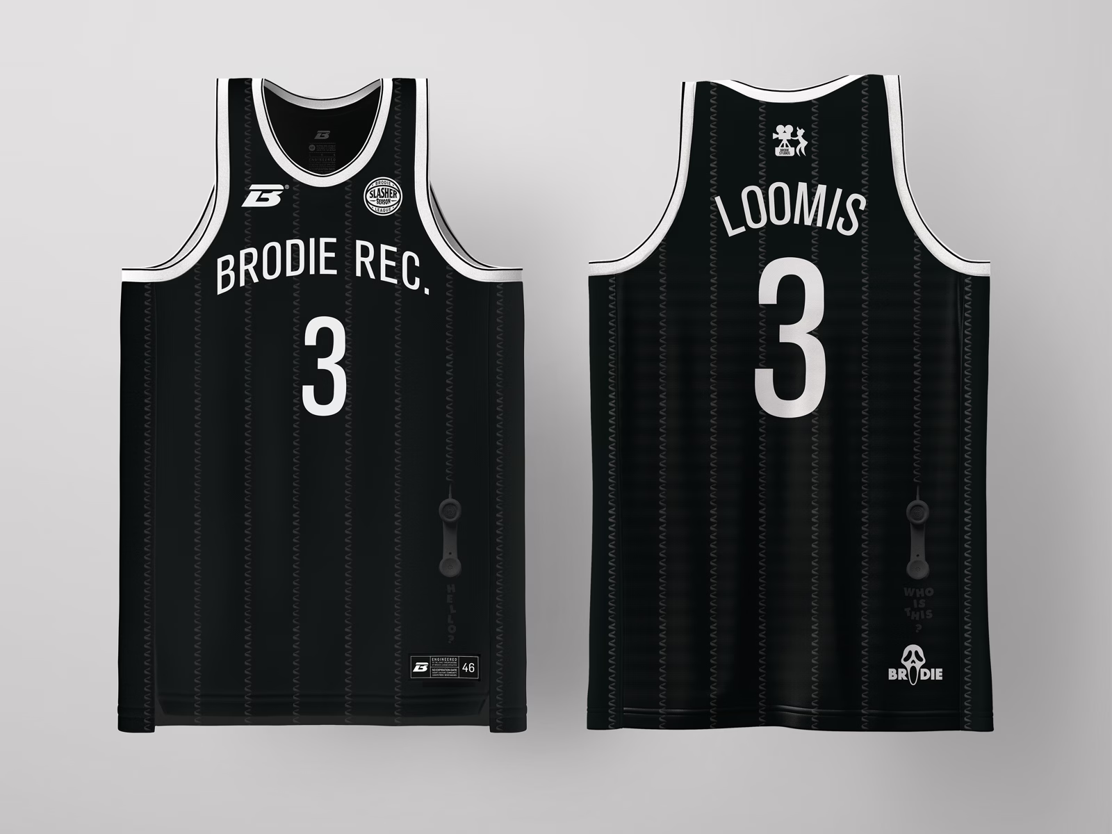
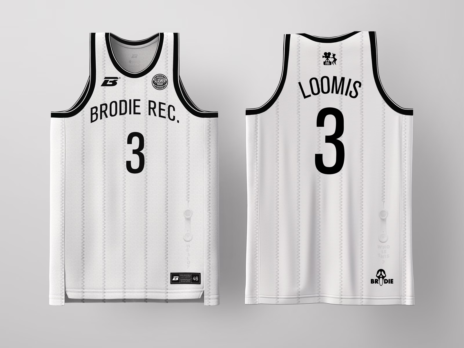
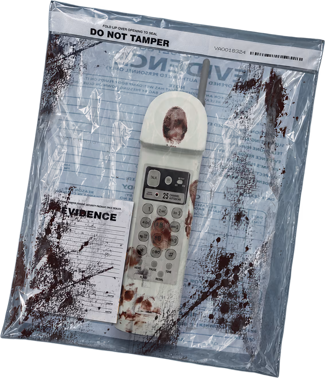
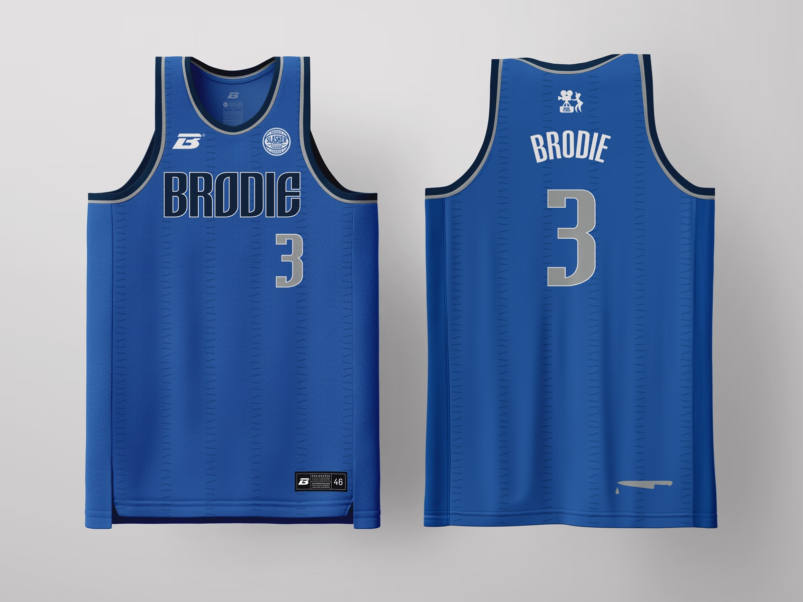
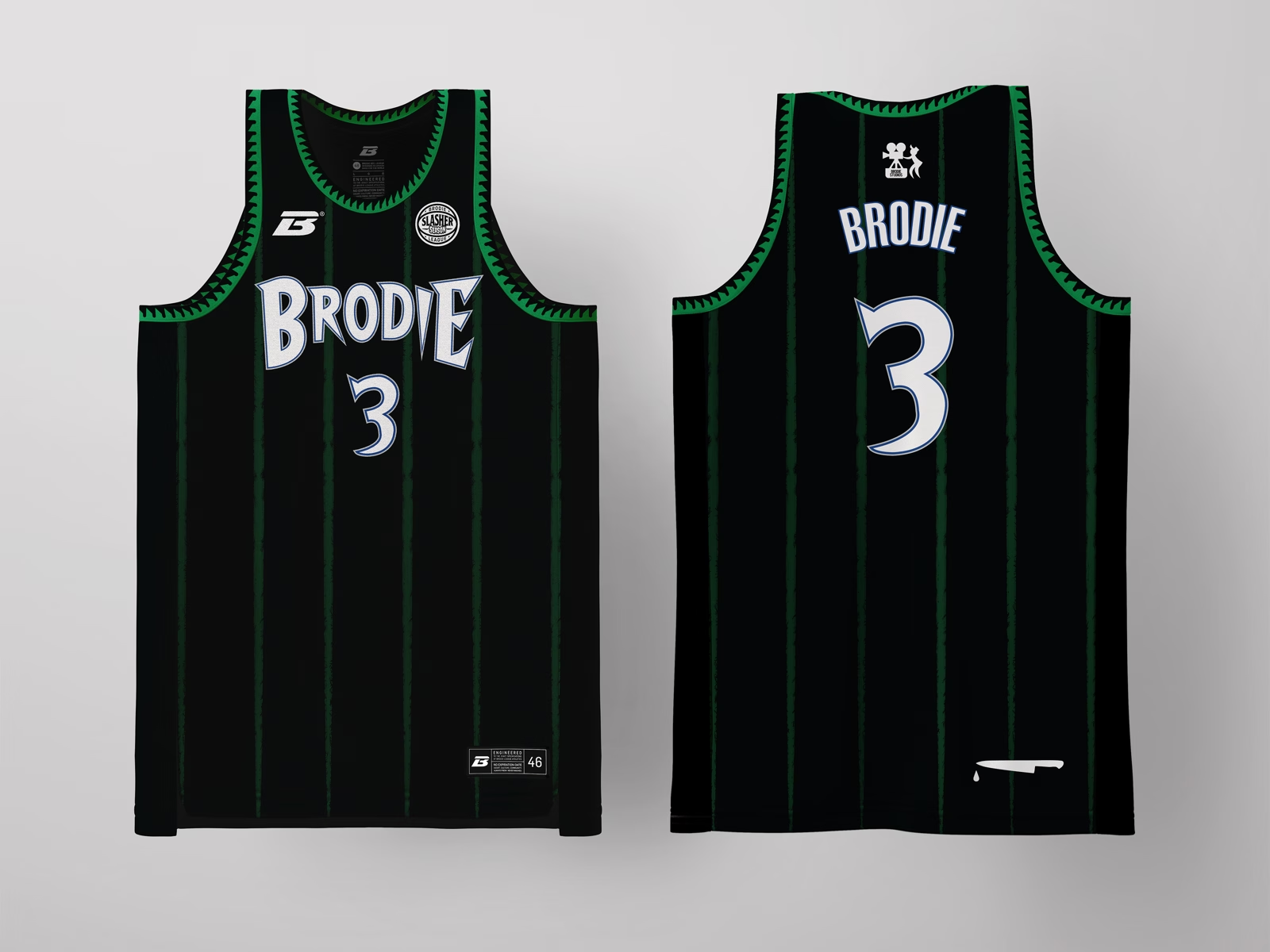
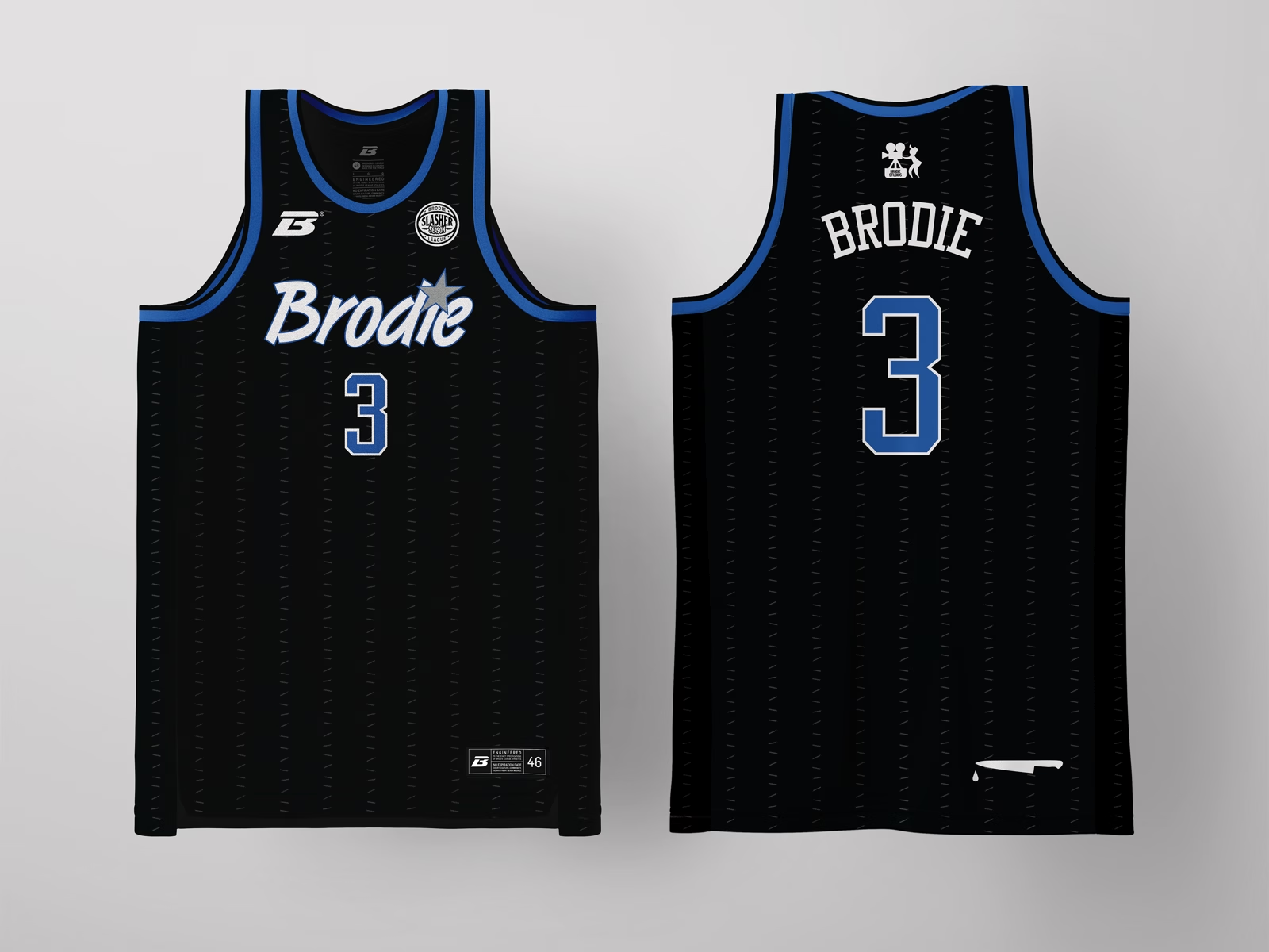
The palette drops to monochrome: black and white, because this archetype isn't about color, it's about void and voice. A phone icon and "HELLO? / WHO IS THIS?" callouts turn the side panel into a crime-scene transcript. This is the most self-aware entry in the set, the one that knows it's part of a story, so it leans on title-card typography and horror-poster restraint over gore.
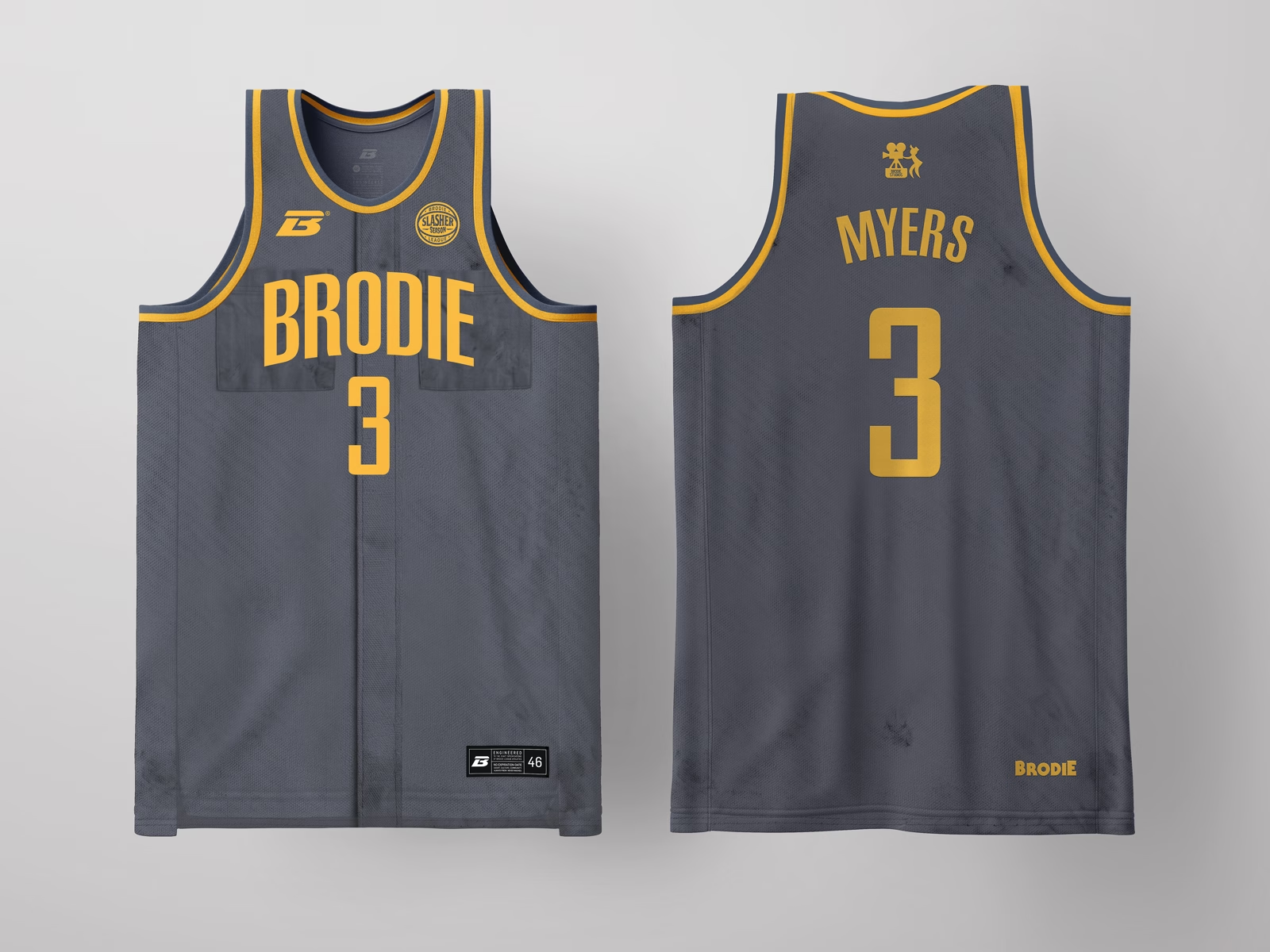
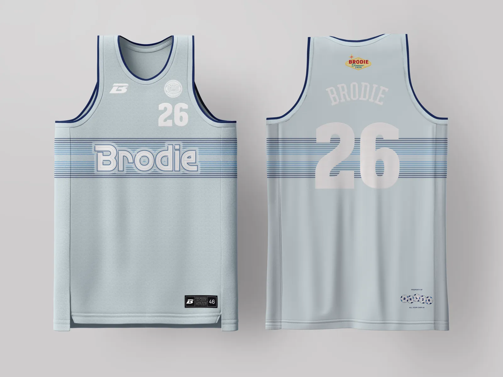
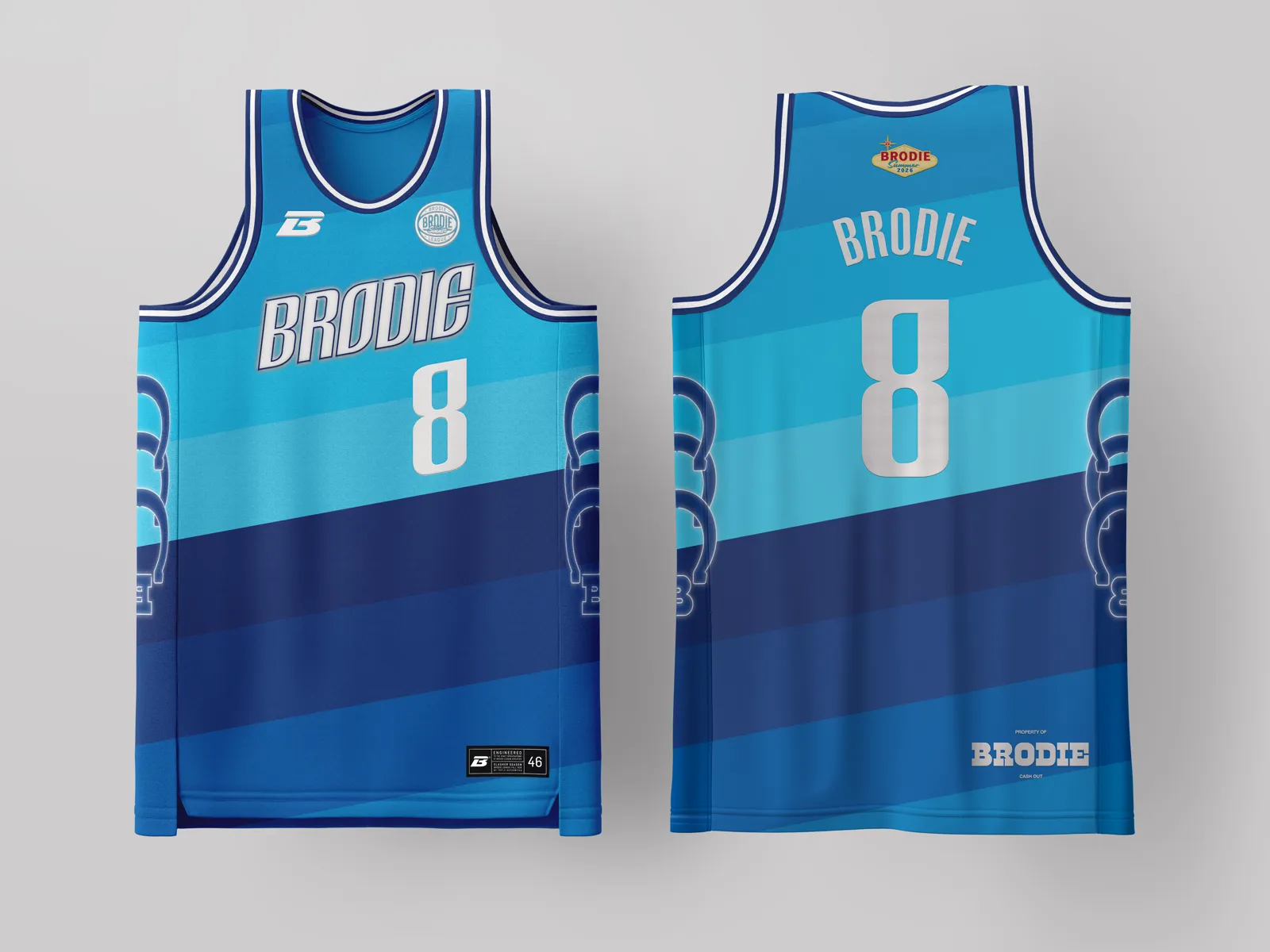
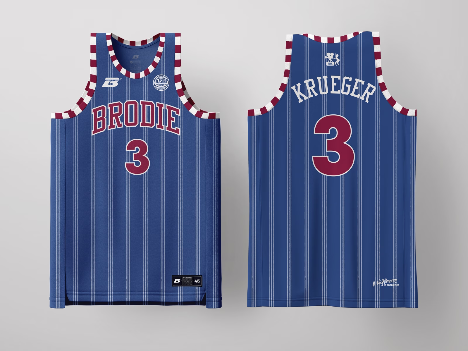
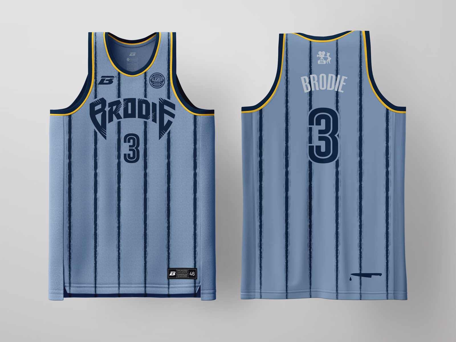
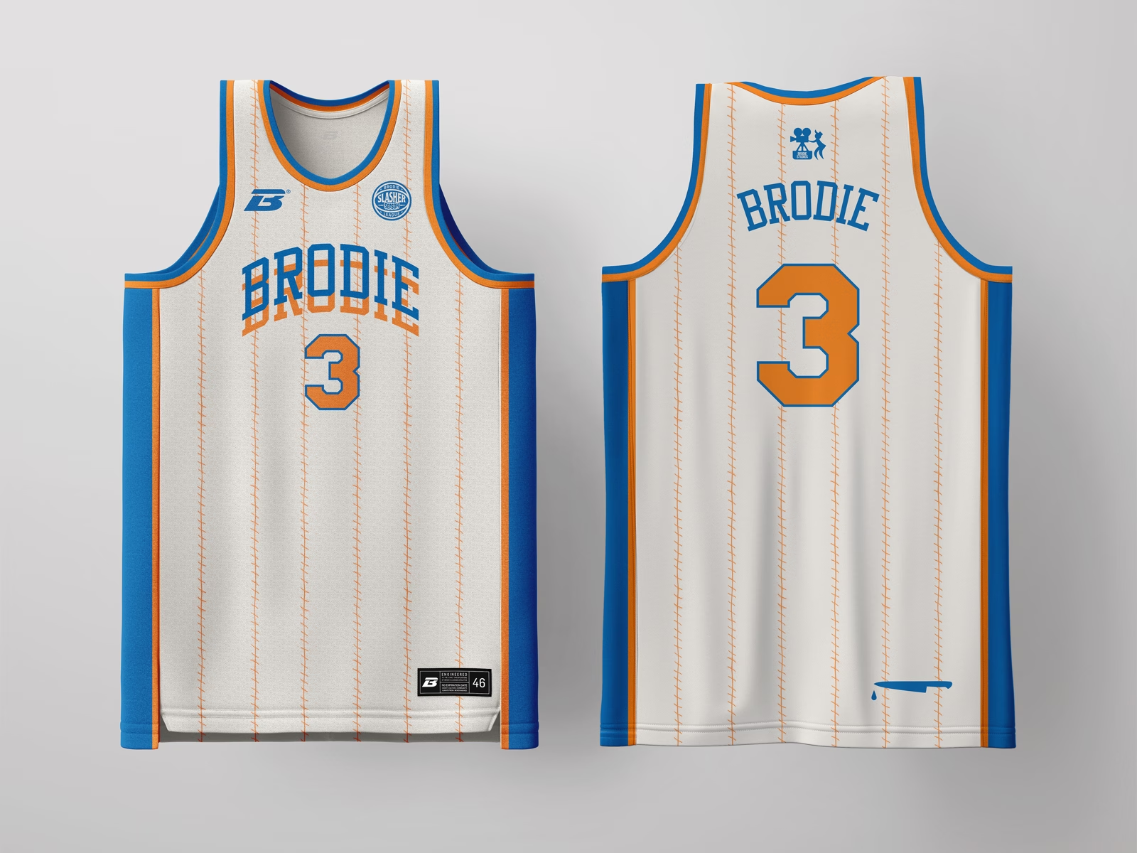
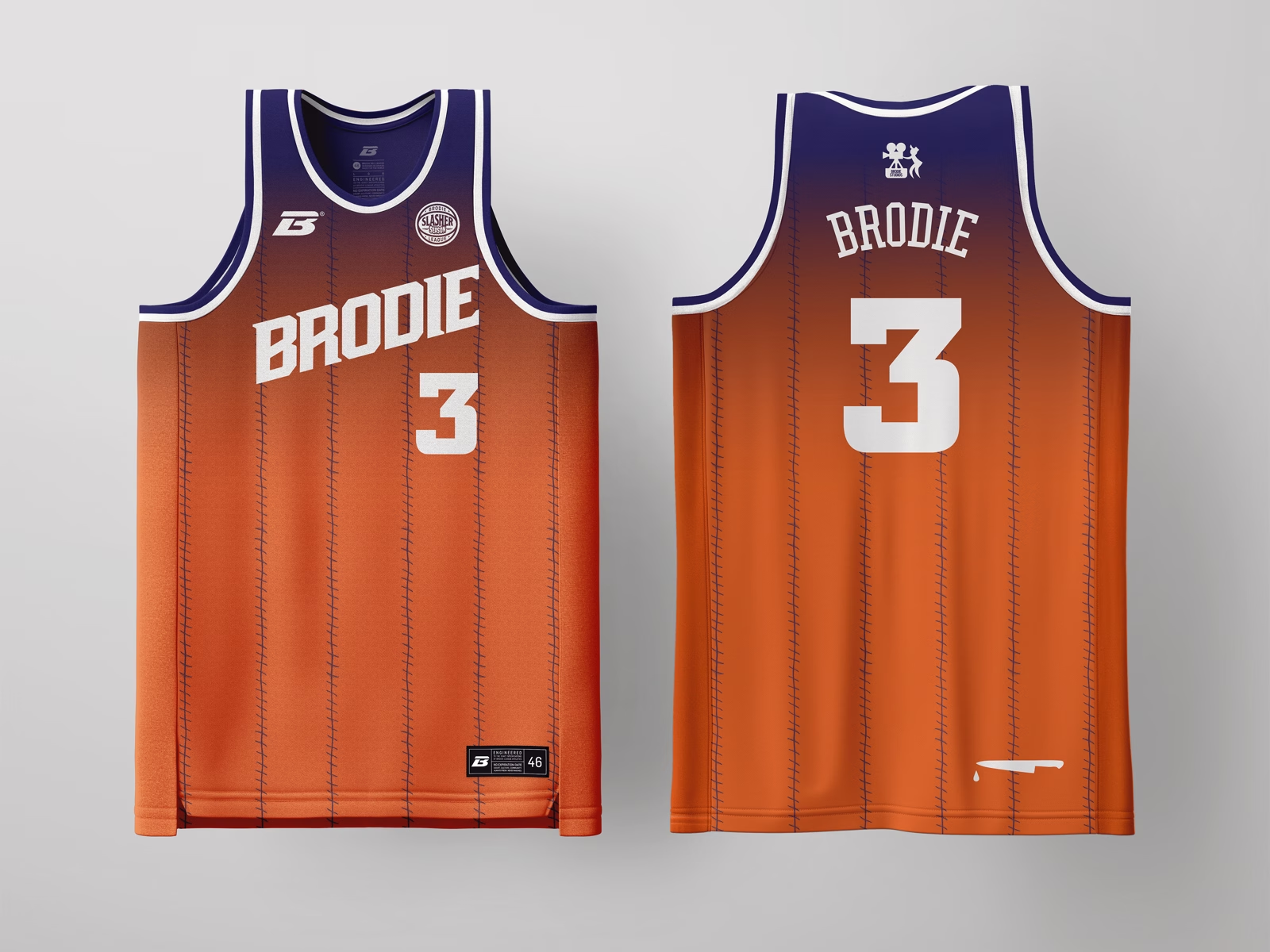
The blue-grey base reads as a stolen mechanic's coverall, the kind of unremarkable workwear this archetype dons after walking out of an institution and disappearing into a quiet neighborhood. Distressed, desaturated texture reads like worn fabric rather than a clean team grey. Gold trim keeps it premium instead of costume-y: a restrained nod to the genre's classic autumn palette.
WANNA PLAY!?!


Pinstripe is the classic team-sport signifier, so we corrupted it: the stripes bleed downward as if the jersey itself has been slashed mid-game. Red-on-black keeps it a potent palette of the genres G.O.A.T. Legible from a distance and rewards a closer look with the drip detail. As the flagship colorway, this drop plays the boldest and most saturated of the six, establishing the collection's baseline grammar.
Denim overalls, mismatched patches, and primary-color stripes at the collar build the "good guy toy" vibes before you clock the tools (hammer, saw, axe) scattered across the print. "BRODIE BOYZ" on the chest patch mimics the stitched name-tag. It's the one drop in the set that smiles first and cuts second, which is the defining trick of this archetype.
Tan, leather-look patches with stitched, weathered seams builds the skin-and-stitching reference through material and texture instead of literal imagery, keeping it wearable and on-brand rather than costume-shop literal. "Sawyer" as a family surname reinforces the legacy angle central to this archetype. The back hit, "THE BRODIE REC. LEAGUE MASSACRE," is the drop's forensic case tag.
Green-and-red horizontal stripes are the single most recognizable slasher sweater in horror, so we built the jersey directly off that silhouette rather than abstracting it. Gold trim and numerals keep it bounded to hoops with a nod to the silver screen with the tag tag of "A Nightmare at Brodie Rec" flip, turning the archetype's setting into home turf.
The palette drops to monochrome: black and white, because this archetype isn't about color, it's about void and voice. A phone icon and "HELLO? / WHO IS THIS?" callouts turn the side panel into a crime-scene transcript. This is the most self-aware entry in the set, the one that knows it's part of a story, so it leans on title-card typography and horror-poster restraint over gore.
The blue-grey base reads as a stolen mechanic's coverall, the kind of unremarkable workwear this archetype dons after walking out of an institution and disappearing into a quiet neighborhood. Distressed, desaturated texture reads like worn fabric rather than a clean team grey. Gold trim keeps it premium instead of costume-y: a restrained nod to the genre's classic autumn palette.